| Image |
Comment |
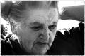
| 11/18/2004 01:25:02 PM |
Remember the Timeby anatolio25Comment: Interesting subject and expression, great use of backlighting, but I'm hung up on how tight the cropping is to her chin. |
 Photographer found comment helpful. Photographer found comment helpful. |
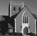
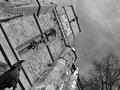
| 11/18/2004 01:24:06 PM |
"Society of Faith"by jmassungComment: There are many detailed and interesting crops available on this building, but taking it as a whole, I think those points of interest are lost. The expansive brick face isn't inherently interesting to look at, yet it commands a significant amount of the frame. The same could be said for the sky. I'd go for an angle that accentuates the main door and window above it, leaving out the distracting elements. |
| Photographer found comment helpful. |
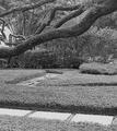
| 11/18/2004 01:21:57 PM |
Pathwaysby jaredldrComment: I think the perspective obscures the background path too much for this to work right. You'd want to be up about 5 more feet or so to bring it out. |
| Photographer found comment helpful. |
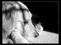
| 11/18/2004 01:20:41 PM |
Lying in the Sunby oggiComment: Seems like a touch of overexposure has lost detail in the fur. The expression, and shadow on the dog's head are great, as is the clean background created by the shadow. |
| Photographer found comment helpful. |
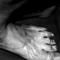
| 11/18/2004 01:19:35 PM |
Layersby FotowereldComment: Seems awkward to chop off part of the primary subject ( the foot ). |
| Photographer found comment helpful. |
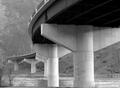
| 11/18/2004 01:18:09 PM |
Shenandoah River Bridgeby novaComment: I think the persepctive would be improved if the upper (darker) part of the bridge flowed without interruption. Other possible improvements: use 1 stop less exposure and some sharpening. Not totally sure about the exposure as you might loose some under-bridge detail, but I don't think that would hurt the overall image, and may have the effect of pronouncing the lighter stone details more strongly. |
| Photographer found comment helpful. |
| 11/18/2004 01:11:57 PM |
Grey timesby smr78Comment: Creative use of perspective makes this image stand out from being "just another building". Great exposure as well. Not too bright, not too dull. I think use of b/w works very well in thie image by drawing attention to the brickwork and the silhouette of th bare-branched tree. |
| Photographer found comment helpful. |
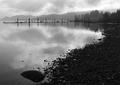
| 11/18/2004 01:10:30 PM |
Clouds in the Waterby CantiqueComment: Nice use of foreground to lead the eye througout the image. The clean texture of the pebbles is visually attractive, and the cloud reflections lend interest to the otherwise calm water. I like the rigid symmetry of the background posts; They create a nice contrast with the softness of the rest of frame's natural elements. Nicely composed. |
| Photographer found comment helpful. |
| 11/18/2004 01:08:52 PM |
The Winter Treeby RatedRComment: You did a good job not overexposing too large an area in creating this silhouette. the problem I see is that there is no clear focus, or path of discovery. The "dangling" branches in the upper left ript the eyes away from the larger branch structure. I would suggest trying some alternate croppings which perhaps draw attention to the leaves, or the symmetry of the "Y" section of the main branch near the Sun. Think about what made you want to take this picture, and then reduce it to its most direct presentation. |
| Photographer found comment helpful. |
| 11/18/2004 01:06:20 PM |
Sandblasterby secondglantzComment: What a great action shot - this could easily be Tiger Woods on the cover of S.I.. I'd have bee nervous putting myself and my glass in front of a pitching wedge, but more power to you! |
| Photographer found comment helpful. |
Home -
Challenges -
Community -
League -
Photos -
Cameras -
Lenses -
Learn -
Help -
Terms of Use -
Privacy -
Top ^
DPChallenge, and website content and design, Copyright © 2001-2025 Challenging Technologies, LLC.
All digital photo copyrights belong to the photographers and may not be used without permission.
Current Server Time: 08/20/2025 12:27:43 AM EDT.