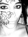
| Image |
Comment |
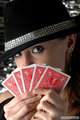
| 01/11/2007 08:11:30 AM |
Steff_066by printer4uComment: Very playful. Here I think the lighting on her eyes and face rocks. Just need to tone it down a little bit on her hands. I like the cards as bright as they are, it's just her right hand (left side of image) that feels blown out. And as mentioned on another image ... selectively sharpening the eyes after you reduce the image for the web would help. Message edited by author 2007-01-11 08:12:02. |
 Photographer found comment helpful. Photographer found comment helpful. |
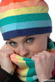
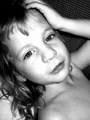
| 01/11/2007 08:10:14 AM |
Steff_122by printer4uComment: I like the pose, lighting and expression a lot. You might want to selectively sharpen the eyes just a bit more. (they may be okay in the full size print and simply lost their sharpness when you reduced it for the web) |
| Photographer found comment helpful. |
| 01/11/2007 08:09:07 AM |
Steff_172by printer4uComment: Love the playful look. Could bump the contrast just a bit more to make the colors "pop" a little more. I'd also like to see a little more light on her eyes... which you could easily do in post. |
| Photographer found comment helpful. |
| 01/10/2007 08:13:02 AM |
Frosinaby tsikakisComment: I dunno... I just prefer a lighter look / mood for the ladies, especially the pretty ones. Save the dark portraits for old men with lots of wrinkles to give them character. :-)
Anyway, a lighter image and sharper focus on the eyes would get a higher vote from me. |
| Photographer found comment helpful. |
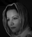
| 01/10/2007 08:11:46 AM |
Contemplationby LevTComment: I love playing with shallow DOF. But I personally would rather have seen her eyes in focus and unobstructed instead of her lips. It's a nice shot of her lips and all... I just don't feel like I get to know her because the closest eye to me is obstructed and the far one is OOF. |
| Photographer found comment helpful. |
| 01/10/2007 08:09:43 AM |
Dearest Childby MeGoobieComment: It appears that the light was too strong, or the contrast was bumped too much in post... the light on the front of the face is blown out (i.e. there is no detail left in the nose, the cheek, the forehead). Contrast that with how much detail is on her shoulders and chest and you can see the it's been blown. This was probably caused by having the light source too close to her head. Very close. Since light diminishes with the square of the distance, it would have to be very close in order to be too strong on the face, which is only inches higher than her chest. |
| Photographer found comment helpful. |
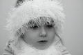
| 01/10/2007 08:07:28 AM |
Snow Princessby romiComment: A little more light on the eyes, and sharper focus on the eyes would get a higher vote from me. |
| Photographer found comment helpful. |
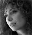
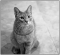
| 01/10/2007 08:06:50 AM |
Shelterby scalvertComment: Nice sharp focus on the eyes. Lovely lighting and b&w treatment. Nice out of focus, non-distracting background. Cute pose. Well done. |
| Photographer found comment helpful. |
| 01/10/2007 02:04:38 AM |
Oh! Pick Me!by PDavisComment: Thought it's not what I'm looking for (a portrait of people), I would still consider this to be a portrait (unlike some other images in the challenge). I love the shallow DOF focusing all attention on those eyes. Beautiful lighting and b&w treatment as well. Well done. |
| Photographer found comment helpful. |
| 01/10/2007 01:34:13 AM |
Self Protrait.by sarberComment: I like how sharp the eyes are... I just feel the overall image is too bright and too much detail has been lost. |
| Photographer found comment helpful. |
Home -
Challenges -
Community -
League -
Photos -
Cameras -
Lenses -
Learn -
Help -
Terms of Use -
Privacy -
Top ^
DPChallenge, and website content and design, Copyright © 2001-2025 Challenging Technologies, LLC.
All digital photo copyrights belong to the photographers and may not be used without permission.
Current Server Time: 06/22/2025 09:52:36 AM EDT.