| Image |
Comment |
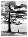
| 05/17/2004 12:37:03 AM |
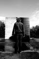
Still Growingby mariomelComment: At first I didn't think this fit the opposites challenge, but I kept it up on my screen for a while and now I appreciate it much more. The lines of the figure's body, the position of the arms and contrasted with the boughs of the tree and the framing with the background of the water is very nice. The horizon looks just slightly off a little rotation would fix that. |
 Photographer found comment helpful. Photographer found comment helpful. |
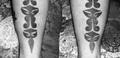
| 05/17/2004 12:30:49 AM |
Opposites O'tatsby Herblacklist12Comment: Interesting caputre. I like the balance of your subject. The shininess of the fabric in the background is a little bit hot - something more neutral or maybe indirect lighting would help. |
| Photographer found comment helpful. |
| 05/17/2004 12:29:35 AM |
"Black & White," On The Rocksby whagerbaumerComment: Wonderful idea - the concept of black and white comes across beautifully. The composition and position of the birds within the frame is a little haphazard, and I'm not quite able to follow the lines as well as possible. I think a closer crop with only the right five birds with allowing the diagonal line of the ground to lead the eye might work a bit better. |
| Photographer found comment helpful. |
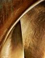
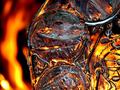
| 05/16/2004 03:02:28 AM |
Trois by HRoxasComment: Greetings from the Critique Club
Composition: You've done a great job with framing and composition, with the lines leading the eye very well. The textures add to the interest.
Background:n/a
Camera Work: (Focus/DOF/Exposure) The focus is crisp and depth of field is excellent.
Post Processing: the reflections of the metallic surface seems a tad overexposed, but it lends to the abstract quality.
My Opinion: a wonderful capture. You isolation of this most interesting part of the sculpture is a credit to your eye. The piece certainly deserved it's ribbon finish.
If these comments have been of help to you, please let me know by marking them as such. Also, I'm available by PM if you have any questions about this note. |
| Photographer found comment helpful. |
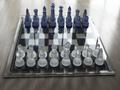
| 05/15/2004 01:14:23 AM |
The Gameby MrZedComment: The concept of this shot fits the challenge well. The focus seems a little soft and the contrast could be bumped up a little, but the translucence of the pieces may make that a little difficult. (Do you realize that the rook and knight are reversed?) |
| Photographer found comment helpful. |
| 05/15/2004 01:10:41 AM |
"Life and Death"by tfarrell23Comment: I like the starkness of the colors and the shadow - the long format composition supports that well. I wish the very edge of the palm fronds weren't cut off - or maybe they should be cropped a little more. |
| Photographer found comment helpful. |
| 05/15/2004 01:07:13 AM |
|
| Photographer found comment helpful. |
| 05/15/2004 01:01:18 AM |
Fire & Iceby mandypComment: Really lovely abstraction of the idea of fire and ice. The highlights in the foreground are great as is the off centered composition. |
| Photographer found comment helpful. |
| 05/15/2004 12:58:34 AM |
The Light and the Darkness Aheadby theantonComment: I like the balance to this and at the same time its lack of symmetry. Of course black and white is a natural choice for this and I appreciate that the contrast isn't too blown out. |
| Photographer found comment helpful. |
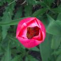
| 05/15/2004 12:55:04 AM |
Flower and Weedsby bobdaveantComment: Beautiful colors and DOF. I like the darkness at the center of the flower. The weeds don't come through as an example of opposition. A different view might be more appropriate for the challenge if you were to maintain the subject, but this photo is really lovely. |
| Photographer found comment helpful. |
Home -
Challenges -
Community -
League -
Photos -
Cameras -
Lenses -
Learn -
Help -
Terms of Use -
Privacy -
Top ^
DPChallenge, and website content and design, Copyright © 2001-2025 Challenging Technologies, LLC.
All digital photo copyrights belong to the photographers and may not be used without permission.
Current Server Time: 08/05/2025 10:29:17 AM EDT.