| Image |
Comment |
| 04/25/2005 03:38:33 PM |
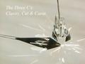
The Three C'sby PollyBeanComment: A rather abstract composition using the shadows & light to your advantage.
A little on the harsh side in my opinion and it may have helped to bring the brightess down a tad. |
 Photographer found comment helpful. Photographer found comment helpful. |
| 04/25/2005 03:36:33 PM |
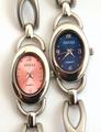
One Gucci is never enoughby SteveinnzComment: Unique submission and clever in the intent.
Right watch (in the blue) is rotated a bit CCW kind of throwing off the balance. |
| Photographer found comment helpful. |
| 04/25/2005 03:33:33 PM |
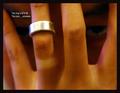
Fidelityby ergoComment: I like the message/intent of the submission here, but the focus/clarity of the ring is a bit off.
Size of teh text is a bit on the small size too in my opinion. |
| Photographer found comment helpful. |
| 04/25/2005 03:31:49 PM |
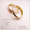
A Lifetime Together Deserves The Best...by NobodyComment: Not sure if the soft focus was an intentional effect or just slightly out of focus.
After seeing a nuber of ring compositions, had the one ring (with diamonds) been partially propped on the plain band, the overall effect would probably have looked a little better.
Still a good submission regardless. |
| Photographer found comment helpful. |
| 04/25/2005 03:29:19 PM |
Graceby gudbjargarsonComment: The composition looks like it would have worked well, but overall the image is way too dark. |
| Photographer found comment helpful. |
| 04/25/2005 11:44:46 AM |
Freestyleby pmichaudComment: Wonder how many thought this might have been my entry and you scored lower than normal because I burn out everyone on wrasslin' pics.
:) |
| Photographer found comment helpful. |
| 04/25/2005 03:59:45 AM |
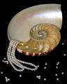
Treasures of the Sulu Seaby flip89Comment: Unique composition.
Lighting here is good, but kinda' have a little issue with all the loose pearls. Maybe less of them or just not scattered all over perhaps? |
| Photographer found comment helpful. |
| 04/25/2005 03:55:45 AM |
Wish Listby OzzieComment: Everything in this shot seems to work OK, except the two, loose stones on her hand (for em anyway) They just seem out of place there.
If they were meant as a suggestion, perhaps it would have looked better to have them on the side or in front. |
| Photographer found comment helpful. |
| 04/25/2005 02:23:18 AM |
CGby whiteroomComment: Very realistic-appearing kind of shot.
From the thumbnail, I was about to comment on the size/text used, but after looking at this a bit longer, realize you studied real ad work (assumption anyway). Message edited by author 2005-05-02 02:07:27. |
| Photographer found comment helpful. |
| 04/25/2005 02:21:08 AM |
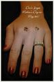
Grandma's Atticby tfarrell23Comment: Unique flair to the composition and good choice of text used.
The used factor is well represented here too, with good detail in the wear marks. |
| Photographer found comment helpful. |
Home -
Challenges -
Community -
League -
Photos -
Cameras -
Lenses -
Learn -
Help -
Terms of Use -
Privacy -
Top ^
DPChallenge, and website content and design, Copyright © 2001-2025 Challenging Technologies, LLC.
All digital photo copyrights belong to the photographers and may not be used without permission.
Current Server Time: 06/27/2025 10:58:28 AM EDT.