| Image |
Comment |
| 04/25/2005 04:34:25 PM |
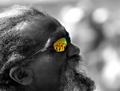
Reflecting...by LevTComment: Thought I added this one as a favorite during the challenge.
Now added, and a congrats on this one. |
 Photographer found comment helpful. Photographer found comment helpful. |
| 04/25/2005 04:27:47 PM |
Untitledby troyloxComment: Very nicely done.
Wasn't sure I liked it at first, but the longer I looked at this, the more I liked the soft & subdued look to it. Text/font works well here. |
| Photographer found comment helpful. |
| 04/25/2005 04:24:47 PM |
Southwesternby vtruanComment: Composition was pretty decent here, but the font used and it's color are hurting this submission. I have a lot of trouble reading it, particularly in the light background areas. |
| Photographer found comment helpful. |
| 04/25/2005 04:19:12 PM |
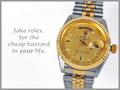
Fake Rolexby alanfreedComment: OK, this caught me off guard.
Thanks for a good chuckle on this one.
Composition is quite good, as is the lighting. Nicely done!
* as he goes on to the next one with a smile...*
|
| Photographer found comment helpful. |
| 04/25/2005 04:16:43 PM |
midas jewellersby naomikComment: Nice level of detail and good control of the lighting here.
Text/font used and maybe the placement is a bit off in my opinion.
Still a good submission regardless. |
| Photographer found comment helpful. |
| 04/25/2005 04:14:05 PM |
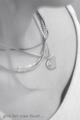
Simple Eleganceby ShannonComment: Very nice composition.
The lighting and shadows work well here. Only nitpick is the sharpness on the closest area of the pearls, but a very good submission regardless. |
| Photographer found comment helpful. |
| 04/25/2005 04:12:50 PM |
Go Aheadby StrikeslipComment: Composition here is great in my opinion.
Font size/color don't quite seem to work well with it though. Image is a bit lacking in the sharpness area, but still a good submission overall. |
| Photographer found comment helpful. |
| 04/25/2005 04:08:42 PM |
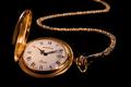
"Timeless" Classicby ZapperzacComment: Well composed shot. The lighting control here was very good and really like the added reflection on top of the watch cover. Nicely done! |
| Photographer found comment helpful. |
| 04/25/2005 04:07:27 PM |
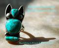
Zuni Butterflyby GeneralEComment: Main title font kind of hurts this one in my opinion.
Hard to read, and the caption "Silver, not Iron!" almost doesn't belong in an advertisement in my opinion.
A unique take on this challenge and the photography is good overall. |
| Photographer found comment helpful. |
| 04/25/2005 04:04:59 PM |
Foreverby BobsterLobsterComment: Composition has a lot of potential here, but the background simply is far too bright & busy and washes out the image overall in my opinion.
Still a decent shot regardless. |
| Photographer found comment helpful. |
Home -
Challenges -
Community -
League -
Photos -
Cameras -
Lenses -
Learn -
Help -
Terms of Use -
Privacy -
Top ^
DPChallenge, and website content and design, Copyright © 2001-2025 Challenging Technologies, LLC.
All digital photo copyrights belong to the photographers and may not be used without permission.
Current Server Time: 06/27/2025 10:54:33 AM EDT.