| Image |
Comment |
| 04/25/2005 06:01:03 PM |
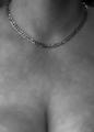
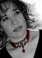
All You Need Is Goldby Mr_PantsComment: Skin that blurry gives an unnatural feeling to this image.
Composition is too much on the botom of the shot vs. the focal point on the top in my opinion. (or was the intent to draw the focal point to the cleavage?)
Detail & lighting on the necklace are good. |
 Photographer found comment helpful. Photographer found comment helpful. |
| 04/25/2005 05:58:35 PM |
|
| Photographer found comment helpful. |
| 04/25/2005 05:56:55 PM |
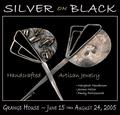
Silver on Blackby Bear_MusicComment: At first, I wanted to vote this down, as I didn't think it belonged in a magazine, then realized who said anything about a magazine only? (duh - me!)
This is a good example of an advertisement, as would be seen in a poster or similar, and is very effectively done.
|
| Photographer found comment helpful. |
| 04/25/2005 05:54:41 PM |
PURE PEARLSby mkirdalComment: Nicely composed and detail here is very good.
The small specs & "stuff" could have been cloned out to clean it up a bit, but a good submission regardless.
|
| Photographer found comment helpful. |
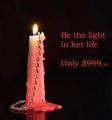
| 04/25/2005 05:24:28 PM |
Be the light...by ShamanComment: Photographically very well done, with an exceptional control over teh lighting.
Text/font used here doesn't work well in my opinion. A simple, Italic font may have done better, but a good submission regardess. |
| Photographer found comment helpful. |
| 04/25/2005 05:22:26 PM |
Glamor girlby sissiComment: Focal point seems to be directed at her glasses more than anything else, kind of taking away from the Jewellery theme. Composition/layout is good. |
| Photographer found comment helpful. |
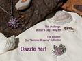
| 04/25/2005 05:20:48 PM |
Summer Dreamsby BeetleComment: A little bit "busy" in the composition overall in my opinion.
A different font and perhaps something less in the way of text like:
"Dazzle her this Mother's Day with our Summer Dreams Collection" may have faired better.
|
| Photographer found comment helpful. |
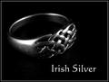
| 04/25/2005 05:18:41 PM |
Irish Silverby banmornComment: Nice use of lighting and B&W conversion to create the mood here.
Not sure about the text/font used, but still a decent submission regardless. |
| Photographer found comment helpful. |
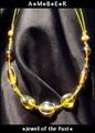
| 04/25/2005 05:17:50 PM |
Amberby DustDevilComment: Composition and background are good here. The arrangement of the folds in the cloth background are nicely done.
Text/font in the wording could be improved upon in my opinion. |
| Photographer found comment helpful. |
| 04/25/2005 05:08:25 PM |
Highlighting Beautyby Travis99Comment: Composition here is good. Not sure if her eyes looking in that direction work for this shot, as there is little area/space for her to be theoretically looking at.
Backlighting on her hair is casting a harsh appearance and makes it look oversharpened in these areas.
Perhaps a different focal point for her and/or a natural smile would have given more of a sense of ease in this shot.
The jewellery is well represented here. |
| Photographer found comment helpful. |
Home -
Challenges -
Community -
League -
Photos -
Cameras -
Lenses -
Learn -
Help -
Terms of Use -
Privacy -
Top ^
DPChallenge, and website content and design, Copyright © 2001-2025 Challenging Technologies, LLC.
All digital photo copyrights belong to the photographers and may not be used without permission.
Current Server Time: 06/27/2025 03:22:10 PM EDT.