| Image |
Comment |
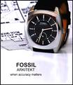
| 04/25/2005 08:42:28 PM |
Arkitektby sbeaumontComment: Well laid out and composed shot.
Background compliments the technical aspect, the text works for this shot and I like the lighting inside the band.
Well Done. |
 Photographer found comment helpful. Photographer found comment helpful. |
| 04/25/2005 08:41:12 PM |
Jewelry with a purposeby DogAngelComment: I'm having conflicts here as to what the main focal point is. My eyes keep being drawn to her face and hand, away from the main subject the challenge was about.
Still a good shot regardless. |
| Photographer found comment helpful. |
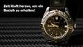
| 04/25/2005 08:39:48 PM |
Zeit läuft ausby Art RoflmaoComment: OK, I can't read this, but makes no difference regarding your submission.
Good lighting and well composed shot with a complimentary background. Text/font used works well here too. |
| Photographer found comment helpful. |
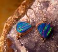
| 04/25/2005 08:38:03 PM |
Opals afireby beafliesComment: The jewelery is well represented here, but the background (quartz/geode) seems to be fighting for attention. |
| Photographer found comment helpful. |
| 04/25/2005 08:31:45 PM |
Natural Jewelryby RissaComment: Nicely put together shot here.
Perhaps a slightly tighter crop off the top (top 1/4 of shot) may have worked a little better.
Good submission regardless. |
| Photographer found comment helpful. |
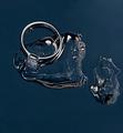
| 04/25/2005 08:29:41 PM |
Forever Iceby MatthewComment: The ring is well shown here, but the background seems to be taking center stage trying to figure out what it is. |
| Photographer found comment helpful. |
| 04/25/2005 08:28:31 PM |
Simply elegantby PascalComment: Nice composition and take on this challenge.
I would suggest a slightly different crop to have less of the wrist showing here, placing the single focal point on the hand/jeans.
Good shot regardless. |
| Photographer found comment helpful. |
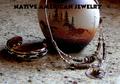
| 04/25/2005 08:27:00 PM |
Native American jewelryby dragonladyComment: Interesting composition.
Top of frame/image is a bit on the dark side, as is the side of the egg/rock. Dual light sources would have been a big help here.
Text/font used is way too dark and almost the whole word American gets kinda' lost.
Perhaps a black horizonatl border across the top with a less bold white text in it may mave looked better in this case. |
| Photographer found comment helpful. |
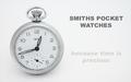
| 04/25/2005 08:01:37 PM |
Smithsby justinbrookComment: Very clear, simple & uncluttered submission.
Nice job on the lighting here. Only suggestion would be a different font for the main title, such as one that looks similar to the watch face. Good shot regardless. |
| Photographer found comment helpful. |
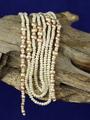
| 04/25/2005 07:59:54 PM |
Natural pearlsby aKiwiComment: Crop / framing is at odds here with the background showing above and below the wood.
Perhaps a different crop woud have helped this, either cropping off some of the bottom or the top, so the eye doesn't get pulled in two different directions in my opinion.
|
| Photographer found comment helpful. |
Home -
Challenges -
Community -
League -
Photos -
Cameras -
Lenses -
Learn -
Help -
Terms of Use -
Privacy -
Top ^
DPChallenge, and website content and design, Copyright © 2001-2025 Challenging Technologies, LLC.
All digital photo copyrights belong to the photographers and may not be used without permission.
Current Server Time: 06/27/2025 03:21:50 PM EDT.