| Image |
Comment |
| 10/04/2004 10:19:55 AM |
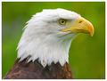
A Proud Birdby mariomelComment: Strong Points: The superb Dof on the bird along with the nice soft background make this an exceptional image. Exposure is right on, including the white feathers - plenty of detail in the white. Suggestions for improvement: A catchlight in the eye would really add more wow to a great image. The white border is ok, but I'd like it better at about 1/2 the size - or even less. |
 Photographer found comment helpful. Photographer found comment helpful. |
| 10/03/2004 11:58:28 PM |
Early Morning Seascape by jonpinkComment: Strong points: Time of day (lighting) is perfect. Shutter speed is exactly right for the texture in the water. Composition could not be better, the s-curve of the waters's edge is wowzer.. Exposure is spot on. Suggestions for improvement. The only minor suggestion I have is to re-evaluate the need for such a large border. |
| Photographer found comment helpful. |
| 10/03/2004 11:09:25 PM |
The Kozakby smokeditorComment: Strong points: Great exposure and composition. The costume looks fairly authentic. Suggestions for improvement: The whitish area of the background is ok - but make one wonder what it is. b) If you are taliking about modern English - the word is Cossack - although I believe there is a Polish spelling Kozak. |
| Photographer found comment helpful. |
| 10/03/2004 09:08:41 PM |
A Study in Colorby HRoxasComment: Strong points: Simple yet effective combination of colors. Exposure right on. Excellent DoF. Lighting handled well.
Suggestions for improvement: Composition is pretty static - consider more diagonal placement. Crowded on the left. White border ok, but not needed. |
| Photographer found comment helpful. |
| 10/03/2004 09:02:50 PM |
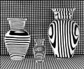
Vases Filled With Waterby GolferDDSComment: Strong points: It's an exceptionally graphic image. There is a lot of visual mystery because of the orientation of the lines in the vases - it doesn't male "visual sense." There are strong blacks and whites - but a very narrow pallette of grays.
Suggestions for improvement: Certainly an artist who could create and shoot this image could find a better title. |
| Photographer found comment helpful. |
| 10/03/2004 08:18:09 PM |
Spring Flowersby trainComment: Strong points: A true study in lighting - exceptional rendering. This image has a wide light value range - looks to be several stops - which makes it impressive indeed. Colors are great. Suggestions for improvement: May be just a bit crowded at the top edge. |
| Photographer found comment helpful. |
| 10/03/2004 08:15:14 PM |
Graceful Departureby connieComment: Strong points: Super, super, sky - the perfect time of day, The shoreline, as a leading line from the bottom right, leads well into the frame (but it does lead the viewer right back out on the left.) The "god beams" through the clouds are spectacular. Exposure = perfect.
Suggestions for improvement: There appears to be vignetting at both top corners - a bit unnatural. |
| Photographer found comment helpful. |
| 10/03/2004 08:07:57 PM |
Interludeby PedroComment: Strong Points: You've captured what appears to be a very candid image and made it into an emotional work of art. The printing is flawless with strong blacks and whites - and plenty of grays in the pallette as well. The aperture chosen blurred the background just enough to get a hint of what's back there without causing distractions. Suggestions for improvement.: The composition could be a bit better if you had taken a step or so to the left. Then you could remove the vertical metal area behind the musicians back and perhaps get more of his back. I'd also like to see his tip case all in the frame. Overall - an exceptional shot - thanks for sharing. |
| Photographer found comment helpful. |
| 10/03/2004 07:59:57 PM |
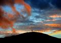
Solitudeby p_johnsComment: Strong points: a) The sky is total wow. b) Exposure is perfect c) Colors and black silhoouettes couldn't be better. Suggestions for improvement: a) The figure at the top of the mound is dead center - may be stronger if the camera was moved a bit to the left (although it's still excellent in this formal presentation.) b) May be just a bit too much base - but I would not take off more than 1/3 of the dark area. |
| Photographer found comment helpful. |
| 10/03/2004 07:55:56 PM |
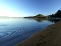
First Lightby autoolComment: Strong points: a) The leading line of the sand on the shore line coming in from the bottom left with the footprints in the sand is superb. I would however like just a bit more space where it curves back to the left - it's almost a merger with the edge of the frame. b) The patterns of ripples in the forground water are great. c) Exposure is right on - even with the bright area at the left horizon. Suggestions for improvement: If this shot was taken a few minutes earlier - the light may have been spectacular.
|
| Photographer found comment helpful. |
Home -
Challenges -
Community -
League -
Photos -
Cameras -
Lenses -
Learn -
Help -
Terms of Use -
Privacy -
Top ^
DPChallenge, and website content and design, Copyright © 2001-2025 Challenging Technologies, LLC.
All digital photo copyrights belong to the photographers and may not be used without permission.
Current Server Time: 08/24/2025 06:27:11 AM EDT.