| Image |
Comment |
| 11/01/2004 01:08:41 PM |
giving it allby aznymComment: A little contrasty - maybe that was intentional. Still represents the challenge very well. |
 Photographer found comment helpful. Photographer found comment helpful. |
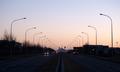
| 10/29/2004 01:31:04 PM |
To the mountainby jonrComment: I really like the composition of this photograph. They way the light poles on either side lead the eye to the mountain in the distance is very good. I also like the symetry of the stop lights. My only nit is that the image is a little flat. 8 |
| Photographer found comment helpful. |
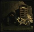
| 10/29/2004 08:18:26 AM |
"Agony of cold"by BoltiComment: Really nice effort. The exposure is moody and the elements are all good. The nits that I have are that it all looks a little too contrived. The newspaper is unwrinkled and the person that is sleeping under them probably wouldn't still be holding the beverage. I think if these people were truely sleeping on the streets, the roll of plastic would used either as a drop cloth or a covering. I know this sounds really negative but I don't mean it to be that way. |
| Photographer found comment helpful. |
| 10/29/2004 03:03:21 AM |
ready to cook, but what?by shawon13Comment: Good example that fits the challenge. I think the compositon could be a little stronger for to have more impact - maybe from a less straight-on angle to get more of a feeling of "place"? maybe a little more contrast to pop the subject? I don't know but it just needs something to elevate it to great from good. 6 |
| Photographer found comment helpful. |
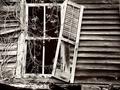
| 10/29/2004 02:59:57 AM |
Abandoned Dreamsby TuckersmomComment: The connection would be stronger for me if there was evidence that there was someone acutally living here, and not just a building in advanced decay. Having said that, this is a really nice example of decay. |
| Photographer found comment helpful. |
| 10/29/2004 02:50:17 AM |
Lady under snakeby vikingas1Comment: Did you take this from behind some glass? There are some odd reflection type highlites in this photo that are not good. Plus, maybe it's evident to some, but for me, I don't know how this figure relates to poverty. I think in a challenge such as this, the photos that do well are the one that hit people right in the face. |
| Photographer found comment helpful. |
| 10/29/2004 02:46:29 AM |
One a Dayby bigfishComment: I think the contrasts of this photo are a little distracting. The light area is blown out, and the dark area is lost, no details. |
| Photographer found comment helpful. |
| 10/29/2004 02:44:35 AM |
The Color of Moneyby Kha0SComment: I'm not saying that this picture doesn't meet the challenge, but I've looked at it for awhile and am not seeing the message you are trying to communicate. Why the wrinkled one dollar bills? Is it that there are only four of them that is supposed to convey the poverty theme? The photo is well composed and technically good, I'm just not connecting here. |
| Photographer found comment helpful. |
| 10/29/2004 02:41:07 AM |
Ramshackleby postoakinversionComment: This is great picture of some old buildings. What would make the connection even stronger to the challenge would be some evidence that there are people living here. Clothes on a clothes line, a person in the doorway, etc. |
| Photographer found comment helpful. |
| 10/28/2004 09:04:20 PM |
Abandonedby JCDeanComment: This is a really nice photo, but it doesn't scream poverty at me - something that I think the photos in this challenge will have to do for high scores. I used to live in farm country and plenty of farmers had buildings like this on their property. They were not impoverished at all. |
| Photographer found comment helpful. |
Home -
Challenges -
Community -
League -
Photos -
Cameras -
Lenses -
Learn -
Help -
Terms of Use -
Privacy -
Top ^
DPChallenge, and website content and design, Copyright © 2001-2025 Challenging Technologies, LLC.
All digital photo copyrights belong to the photographers and may not be used without permission.
Current Server Time: 06/26/2025 05:27:08 PM EDT.