| Image |
Comment |
| 09/07/2002 11:05:00 PM |
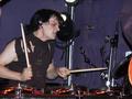
Demonic Drummerby ClubJuggleComment: Yikes. I don't wanna meet this guy in a back alley. Aptly titled. Nice composition. The orange of the drums against the purple background is nice too. 7, just-married |
 Photographer found comment helpful. Photographer found comment helpful. |
| 09/04/2002 04:11:00 PM |
Chrissie and Mayanaby emorgan49Comment: What a sweet moment. It's beautifully framed and the colors are great. The only irksome thing at all is that grass blocking the boar's face. I hope you will be able to clone it out in photoshop after the challenge because the shot is a wonderful keeper. I hereby volunteer my hubby's help (photoghop guru) if you need/want it. In my top 10 pics for the week. 8, just-married |
| Photographer found comment helpful. |
| 09/02/2002 10:44:00 PM |
Lending a helping hand.by HBunchComment: Hi Heather, I saw this photo on the forums before you decided to post it. That gives me the benefit we don't usually have with dpc of being able to discuss the before and after. I see that you cropped it to highlight the main focus of your photo. IN this case, I think that worked against you, causing or at least intensifying the pixellation of the image. I think I liked it better before anyway because it added to the candid nature of the moment. Your perspective added the photographer as a member of the photo -- by that I mean that the perspective no pronounced your presence that you were forced to consider the photographer in the shot. Which in this case added a sense of "person sitting at a ball game, all of a sudden: DOUBLE TAKE." I won't speak to the contents of the shot; I'm sure you're hearing enough about that. Also, having seen the forum post makes my opinion on the subject matter less objective. sorry for the low score, but the pixellation ruins it for me. 4, just-married |
| Photographer found comment helpful. |
| 09/07/2002 11:54:00 PM |
|
| Photographer found comment helpful. |
| 09/07/2002 11:26:00 PM |
Disagreementby stephanComment: Mood well captured. Framing well done. Was that kid's hair really THAT color? It looks like a watercolor color. good job. 7, just-married. |
| Photographer found comment helpful. |
| 08/27/2002 12:12:00 AM |
fear of the Supernaturalby sanandanComment: I think the challenge is extremely weak, sorry. As far as the photo goes, I just don't see much interest in it. It's a picture of a statue - there needs to be something special to make it more than that. 3, just-married |
| Photographer found comment helpful. |
| 08/27/2002 01:40:00 PM |
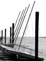
Castles and Shellsby MiekaComment: I like the contrast on the rocks in this shot, and the bucket is a nice touch. The angle is intentional, a choice you made, and maybe you love it. I can't decide. The banding in the upper left corner is unfortunate. I wonder if not compressing so much would have fixed this. Your file size would have been allowed at up to 1/3 larger. Still, the photo appeals to me overall. 6, just-married |
| Photographer found comment helpful. |
| 08/26/2002 11:44:00 PM |
My First Loveby AleciaComment: Nice lines. I like the choice of black and white. It doesn't always add to a photo, but I think it probably does here. I also like the repetition of form. 7 (would have been an 8-9, but it doesn't say childhood to me without the title, and even with, I feel it's a stretch), just-married |
| Photographer found comment helpful. |
| 08/26/2002 07:18:00 PM |
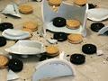
Oh No!by ClubJuggleComment: Cute idea. Poor sacrificial pot. <grin> I wish the focus was on the larger piece in the background rather than the bottom of the jar in the foreground. I wish I could see the texture in the chocolate cookies too. 5, just-married |
| Photographer found comment helpful. |
| 08/28/2002 09:52:00 PM |
Yes, sir!by stephanComment: I like the idea behind this photo. I like the coil of the belt - it's shape. The lighting although very bright on the belt even worked for me because it caused me to squint and withdraw a bit the way I might if I knew my parent was coming with the belt. My biggest concern with this photo was the belt's placement. I found it appealing and interesting - composed quite like an ad might be; but ulimately I thought it was just too much photo for such a small focal point. TOO much negative space. 7, just-married |
| Photographer found comment helpful. |
Home -
Challenges -
Community -
League -
Photos -
Cameras -
Lenses -
Learn -
Help -
Terms of Use -
Privacy -
Top ^
DPChallenge, and website content and design, Copyright © 2001-2025 Challenging Technologies, LLC.
All digital photo copyrights belong to the photographers and may not be used without permission.
Current Server Time: 12/20/2025 06:41:11 PM EST.