| Image |
Comment |
| 02/21/2006 03:49:24 PM |
bw.jpgby AzrifelComment: very interesting.
thanks for posting it. |
 Photographer found comment helpful. Photographer found comment helpful. |
| 02/21/2006 12:12:26 PM |
le petit fleur mon coeurby kiwinessComment: nice complementary colors and the unusual back view makes this a great image.
But where is the heart?
Are they the things inbetween thewords?
if so, it's very subtle and a nice touch.
if not, then I can't find them/it!!!!! |
| Photographer found comment helpful. |
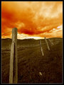
| 02/21/2006 11:53:40 AM |
The Birth of a Twisterby RikkiComment: I can't be bothered to write a long comment as I did that on your other picture.......
love the sky-except for the white part where it meets the horizon.
couldn't you clone in some orange stuff there or something? |
| Photographer found comment helpful. |
| 02/21/2006 11:50:12 AM |
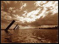
Moltenby RikkiComment: the low view definetly makes this picture.
How close were you to the actual water?
Because it does look as though you could get a few more inches lower down.
Although I don't blame you for not doing it!
it's a good picture.
Not sure if it would have ribboned.
I think the weakest part is the land on the right of the picture.
the sky is great and the "things" on the left are interesting, but the right hand side is a little too "boring".
I guess it's not your fault.
You couldn't really be expected to go and plant a few redwood trees or build a castle there or anything!!!!
anyway, you'd get maybe a 7 from me. |
| Photographer found comment helpful. |
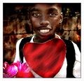
| 02/21/2006 09:54:03 AM |
Be Mineby whiteroomComment: a very good portrait, with or without the heart.
Although I think that the flowers need to be gone from the picture or be made more prominent. |
| Photographer found comment helpful. |
| 02/21/2006 09:52:32 AM |
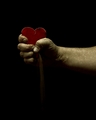
Crushed...by SJCarterComment: I like the lighting-very well done.
And the texture of the arm and hand are greay also.
I don't really like the heart it looks too 2 dimensional and it would have been nice to have seen more of the "dust(?)" flowing down.
but a good photo anyway. |
| Photographer found comment helpful. |
| 02/21/2006 09:50:52 AM |
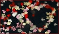
Blown Awayby CoozComment: I can just make out the heart on the right.
and the colors are good.
probably not a "strong" enough image of a heart for my liking though.
maybe I'm just too fussy-there's no pleasing some people :-) |
| Photographer found comment helpful. |
| 02/21/2006 09:49:11 AM |
Our Hearts Are With Youby jfwolpertComment: this is another one of those images that without the title it wouldn't fit the challenge.
not that I'm going to vote you down for that.
I just felt like typing something. |
| Photographer found comment helpful. |
| 02/21/2006 09:46:09 AM |
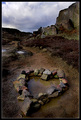
Stoneby e301Comment: great colors, and leading lines and use of the rule of thirds.
you've done this before, haven't you?
my only suggestion would be to try and get some kind of more prominent reflection in the water-like the sky or clouds? |
| Photographer found comment helpful. |
| 02/21/2006 09:43:48 AM |
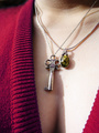
Key to Her Heartby vergComment: maybe if the other necklace had been taken off, then the key would have stood out more?
good attempt though.
and good luck. |
| Photographer found comment helpful. |
Home -
Challenges -
Community -
League -
Photos -
Cameras -
Lenses -
Learn -
Help -
Terms of Use -
Privacy -
Top ^
DPChallenge, and website content and design, Copyright © 2001-2025 Challenging Technologies, LLC.
All digital photo copyrights belong to the photographers and may not be used without permission.
Current Server Time: 06/20/2025 12:15:16 PM EDT.