| Image |
Comment |
| 02/16/2006 09:44:33 AM |
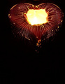
Heart on fireby kim5814Comment: hmmm, almost looks like a mushroom.
but it's probably a chocolate?
the lighting inside the heart appears to be blown out.
It would have been nice if that wasn't the case. |
 Photographer found comment helpful. Photographer found comment helpful. |
| 02/16/2006 09:41:17 AM |
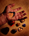
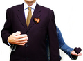
My heart is in your hand...by BrennanOBComment: it's almost painful to look at!
I think the lighting of the hearts on the table lets this shot down a little.
But otherwise a nice effect. |
| Photographer found comment helpful. |
| 02/15/2006 06:37:44 AM |
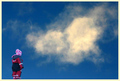
Innocenceby BrinComment: is the cloud meant to be heart shaped?
nice composition. |
| Photographer found comment helpful. |
| 02/15/2006 06:36:59 AM |
The Book of Loveby glodaComment: good colors and lighting
neat idea
only quibble would be trying to get the centre of the heart to stand up a little higher so it didn't look "collapsed" |
| Photographer found comment helpful. |
| 02/15/2006 06:35:53 AM |
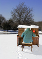
Cold Playby graphicfunkComment: i like the rule of thirds usage.
would have been nice if you had cloned out the footprints or tried not to make any!!!
the heart is very subtle-maybe too subtle?
perhaps if it was in the white of the snow it would stand out more rather than nearly getting lost on the piano.
good title. |
| Photographer found comment helpful. |
| 02/15/2006 06:33:47 AM |
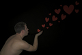
Love is in the airby michael_pComment: i like the idea of this one, but the lighting is weak.
the man could do with standing out more and the hearts suffer from poor lighting too.
good luck though. |
| Photographer found comment helpful. |
| 02/15/2006 06:32:40 AM |
I *Heart* Youby angela_packardComment: I'm not quite sure what to make of this one?
reminds me of those flashing neon signs in seedy redlight districts (Soho etc.)
the 'u' is perhaps the weakest of the letters and it may have been better if it was more upright.
but a good original idea. |
| Photographer found comment helpful. |
| 02/15/2006 06:30:22 AM |
She Has My Heartby GIS_boyComment: a nice idea.
it just took me a little too long to work it out.
maybe it's because it's early here!!!!
or maybe a larger hole would have had more of an impact? |
| Photographer found comment helpful. |
| 02/03/2006 07:31:03 AM |
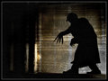
Nosferatuby RikkiComment: That's a great shot Rikki.
Stupid exif date time stamp thing!!!!!
The only thing I don't like is the head/hair/cap thing---because it looks as though he's wearing a baseball cap and I'm sure Nosferatu didn't.
Or did he?
Hmmmm, maybe he was a Yankees fan or something? |
| Photographer found comment helpful. |
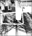
| 01/31/2006 07:42:31 AM |
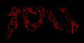
Negativismby outlandComment: some kind of loom?
or perhaps a particulary hairy eyebrow?
the negative aspect workd well except for the upper right corner which I'm nor too keen on. |
| Photographer found comment helpful. |
Home -
Challenges -
Community -
League -
Photos -
Cameras -
Lenses -
Learn -
Help -
Terms of Use -
Privacy -
Top ^
DPChallenge, and website content and design, Copyright © 2001-2025 Challenging Technologies, LLC.
All digital photo copyrights belong to the photographers and may not be used without permission.
Current Server Time: 06/20/2025 08:10:55 AM EDT.