| Image |
Comment |
| 08/10/2009 02:17:06 PM |
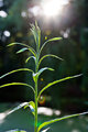
straws in the sunby oskarakComment: Greetings from Andi via the Critique Club
First Impression: Whilst I understand the reason for the 'straws' in this image if I'm honest I think removing them would make this a better image. Ok, that might have been a bit harsh �skar but the background and lens flair is what grabs my attention here not the main subject.
Composition: The plant is too central for me even though its not dead centre and the sun might have been better coming from the top right hand corner.
Subject: Yes, the union between the sun and growing plant works well but the plant isn't very interesting for me.
Technical: I'm guessing we should remove this section for this shot, there are times when the technical 'must do' 'rules' should be ignored, the overexposed sun and lens flare is what makes this shot interesting and the reason why I bumped this up to a 6. Even at F/6.3 you got some nice bokeh going on.
Final thoughts: An uninteresting subject brought to life by some nice flair. �skar, have you ever looked at a lensbaby? We often have side challenges using it and I do think looking at your porfolio you'd enjoy ignoring the rules sometimes. This is July's Side Challenge. |
 Photographer found comment helpful. Photographer found comment helpful. |
| 08/10/2009 01:57:08 PM |
The Old Inlet Pumphouseby totaldisComment: Greetings from Andi via the Critique Club. Welcome back Aaron and congratulations on submitting to 50 challenges!
First Impression: Just as Enzo (your sole commenter) says, interesting subject. All the elements seem to work well together but for me there is something missing in order to give this that WOW factor that the voters want (especially in a free study). Its a decent shot and my mind wanders along the water chute wondering where the water might end up.
Composition:A strong composition that allows the water to flow into the water chute thingy.
Subject: Yup, its interesting, it must be a pretty strong pump as swimmers are advised to stay 75 feet away. The two small objects on the horizon are a bit of a distraction for me and as they don't really add to the image think you'd have been safe removing them. I like the pumps reflection and shadow in the water. The sky in amongst the wires seems odd to me, almost as is if a couple of sections have been edited but not all of them? The aged pumphouse looks like a great subject to photograph.
Technical: The exposure is ok but maybe a little flat, is the vignetting from post processing or from the lens at 10mm? Maybe a slightly different angle as the pump house is suffering from a ultra wide angle and looks lob sided and I keep getting drawn to the sky on the right side of the pump.
Final thoughts: Its a decent image (I gave it a 6) and considering it was submitted to a free study think it finished about right and its not a bad score. |
| Photographer found comment helpful. |
| 08/08/2009 07:07:36 PM |
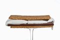
Double Deliciousby DebbiComment: Greetings from Andi via the Critique Club
First Impression: A nice capture and doubt you had long to shoot this before it became a runny mess, the right hand 'ooze' looks like it was about to become a mini river. Almost a nice white background (the bit you missed has already been mentioned).
Composition: A little too central for me and would have prefered you to have balanced the sandwhich more forward on the glass to hide the rim.
Subject: Definately one for the ladies! Ice cream must be a tricky thing to photograph under lamps, I remember my dad went to a product photo shoot many moons ago and they used mashed potato instead of ice cream, it worked wonders and never melted!
Technical: The biscuit is nice and sharp and the ice cream is pretty well exposed. The background is almost white, just missed that top right bit. It might be the lighting but the stem of the glass doesn't look 100% straight.
Final thoughts: A nice clean and crisp shot, I gave a speed vote of 6 during the challenge and thought I may have been harsh, a 5.2 is underrated imho. |
| Photographer found comment helpful. |
| 08/08/2009 03:54:11 PM |
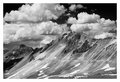
Engineer's Passby jhess77Comment: Greetings from Andi via the Critique Club. First off congratulations on your #2 image!
First Impression: An interesting landscape, its quite a barren looking place and probably not much different in colour. Whilst the clouds look ok I think some careful dodging and burning would make them more dramatic,
Composition: My initial thought was to crop the bottom 1/3 off however that would be a mistake as your lose the road and the little bit of foreground that anchors the image and becomes a platform to enter the rest of the image
Subject: Mountain ranges and good skies often do well here though to score very well they need to be perfect and maybe even better looking than real life. This is a strong image and am sure it would look good as a large print.
Technical: Well, am guessing you have a post-it note on your camera that says 'Check ISO' now? We've all done it but maybe getting into the habit of a quick review of the setting before a new shoot would be prudent? That said I don't think the image was really harmed though the shutter speed was a little extreme and you probably lost some detail.
Final thoughts:It might have been taken in Ansel Adams territory but don't think it comes up to his standard however, its a great shot and easily worth its score/placement in the June FS. |
| Photographer found comment helpful. |
| 08/08/2009 02:48:45 PM |
Leadenhall Market from a Different Perspectiveby bobonacusComment: Greetings from Andi via the Critique Club
First Impression: You need to go to extremes to get a WOW! shot on dpc these days and gladly this is one of those shots - WOW! The colours really pop and it was fun viewing the image and knowing the location and what it actually looks like.
Composition: Once you get into the image the composition is excellent and I like the placement of the main roof window with the two rows of shops leading away.
Subject: This is a great place for shooting but have never seen it look like this before, I think I'll fall over next time I'm there lol.
Technical: 3 images 2 stops apart? I can see that being simple on a tripod but how did you do it hand held? with a 'normal' image you can crop to get everything lined up but would image it would be almost impossible with a lens that produses a circular image (or did the camera expose the same single shot 3 times.
Final thoughts: I thinking renting this lens would be the way to go as whilst I'd use it lots for a while I imagine it would soon just sit in my bag. A great shot and a decent placement in a FS with (as you say) an image that the average dpc'er might not approve of. You are getting quite a collection of 'unusual' images in your portfolio now, keep them coming! |
| Photographer found comment helpful. |
| 08/08/2009 11:10:41 AM |
Fireworks, 2009: "Like Some Diamonds in the Sky..."by 777STANComment: Greetings from Andi via the Critique Club.
First Impression: Not sure about the fireworks being totally blown out, the horizon is a little off, I love the reflection in the water and the fountain.
Composition: This could almost be 2 images and whilst I know you can't always predict where the firewoks will explode a slightly lower angle for the camera would have helped remove some of the dead space between the water and fireworks. I like the fact you have the 2 main subjects in opposite corners
Subject:. Fireworks are something I've never tried to shoot but understand its a tricky subject and takes some planning to do well. For something like this to score well in a FS it has to be perfect.
Technical: Intentional or not I don't care for the lack of detail/colour in the fireworks and whilst 1/10 sec exposed the foreground nicely maybe a graduated filter would have retained some detail in the fireworks?
Final thoughts: I voted this a 5 during the challenge and would have given it at least a 6 if the image was straight and the fireworks were better exposed. That said, if you had cropped the fireworks out altogether I might have given you a 6 for the fountain. |
| Photographer found comment helpful. |
| 08/08/2009 08:47:28 AM |
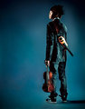
Portrait of a Modern Violinistby zackdezonComment: Greetings from Andi via the Critique Club.Well, how can you critique an image that finished 7th in a FS? I recognise this guy from the footwear challenge, he seems to have an 'attitude' that I'm sure will do him well for the future. I'd have liked to have seen some info about him in the photographers comments.
First Impression: The complimentary colours help add 'mood' to this image as do the deep shadows.
Composition: A good choice of model placement, as a square crop this would easily do well as a cd cover.
Subject: Always nice to have a fresh take on a portrait, the image conveys the violinists attitude well.
Technical: Spot on with the techincals, a bright and modern image. My only thought would to have had more light on his hair as it lacks some detail on my monitor.
Final thoughts: An excellent 'product' shot and I'm sure you are both very pleased with the result. |
| Photographer found comment helpful. |
| 08/08/2009 08:16:58 AM |
The First Dateby JEasonComment: Greetings from Andi via the Critique Club. Congratulations on a new personal best Justen. consider this your 'bench' score, I'm pretty sure it won't be long before you get a new pb ;)
First Impression: A well thought out shot that didn't really need a title as the story is quite obvious to me. If you had straightened the bench I think the image would have been better received.
Composition:A wise choice to have your model on one side of the frame, the shadows nicely fill out the negative grass space. Focus is right where it should be and the dof is spot on.
Subject: I'm thinking many of your lower scores were from voters that were looking for the footwear to fill the frame more however, I much prefer the fact that you included more of the model to tell the story. The models hands and leg placement is great and no need to include any more of her.
Technical: The shadow/light on your models legs is very nice and agree with the earlier comment about a boost on contrast to help the overall feeling of the image.
Final thoughts: A well thought out shot, its an image that tells a story so well done and I'm looking forward to more from you Justen! |
| Photographer found comment helpful. |
| 08/06/2009 07:44:24 PM |
Ménage à Troisby Love6Comment: Greetings from Andi via the Critique Club
First Impression: Critiquing a top 20 shot can be difficult and if its the submitters highest scoring image its even harder! That said, this is a nice bright image and a very unusual situation, I've never seen 3 butterflies on a single flower before (thats worth at least 1 point)
Composition: A square crop was the way to go here, the butterflies fill the frame well.
Subject: Yup, its from above and meets the challenge well, flowers and butterflies might be seen as cliche at dpc but are most often well received. Kudos for an 'of the moment' shot.
Technical: The backgound is a little noisy (ISO 1600 would cause that) and I'd prefer a little more definition on the butterflies (esp the right one)
Final thoughts: A great shot for the challenge and might well have ribboned in a 'three' challenge. Thanks for showing this to us! |
| Photographer found comment helpful. |
| 08/06/2009 07:06:16 PM |
Summer Clogsby paully2k1Comment: Greetings from Andi via the Critique Club
First Impression: Crocs! somebody threw one at me a couple of weeks ago, nice and light and didn't hurt a bit lol. Nicely set up shot that fills the frame well
Composition: I like your composition/placement of the Crocs, the foregound is in good focus with the background nicely oof yet retaining enough detail.
Subject: Certainly meets the challenge with complementary colours, well shot and not a boring image of a boring subject.
Technical: Focus is good but not pin sharp, the black circle on the Croc could have been lit from inside but thats maybe going overboard on a simple shot.
Final thoughts: A good shot of a simple subject, the light patch top left is a little off putting for me. Maybe playing with Sharpening and Blurring (Neatimage or the like) would have helped smooth the background keeping the foreground sharp? I voted it a 6 btw.
|
| Photographer found comment helpful. |
Home -
Challenges -
Community -
League -
Photos -
Cameras -
Lenses -
Learn -
Help -
Terms of Use -
Privacy -
Top ^
DPChallenge, and website content and design, Copyright © 2001-2025 Challenging Technologies, LLC.
All digital photo copyrights belong to the photographers and may not be used without permission.
Current Server Time: 06/24/2025 01:32:34 AM EDT.