| Image |
Comment |
| 08/30/2009 09:12:41 PM |
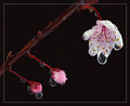
"Weeping" Cherry Blossomby bcenuComment: Greetings from Andi via the Critique Club
First Impression: A good shot but don't like the border and would have prefered more negative space, on my monitor whilst there is plenty of pink the reds seem to be dominant.
Composition: I think this type of shot would be better received following the rule of thirds and would need more negative space around the subject.
Subject:The 3 stages of the Cherry Blossom work well and nice and pink but the overall feeling is of red. If the main blossom was larger in the image with more space to the right (without the border) this would have worked better for the challenge I tink.
Technical: Am confused by your choice of settings, F/13 and a 15 second exposure? not sure what lighting you had but at F/13 the entire image should have been in sharp focus and most of it is quite soft on my monitor.
Final thoughts:A good shot and whilst I like the subject and drops I think it would be better if it was sharper with more negative space around the main subjects. |
 Photographer found comment helpful. Photographer found comment helpful. |
| 08/28/2009 06:54:11 PM |
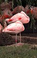
Nap Timeby danculwellComment: Greetings from Andi via the Critique Club
First Impression: Rather than being drawn to the Flamingoes my eyes keep settling on the grass and its quite distracting for me.
Composition: I think the almost central subjects work well here with just the right amount of foreground and an interesting background, maybe a slightly lower perspective would have helped remove some of the boring middle ground.
Subject: Yup, Flamingoes are pink, a good/obvious choice for the challenge and meets it well. Yes, there were a few in the challenge but you didn't need to get 'that' comment (they left similar on several shots and should be ignored imho).
Technical: I think the technicals are what hurt your score, too much of the main subjects are blown and not very sharp. Not sure of your post processing but what looks like too much shadow/highlight has been applied resulting in odd colours in the bg birds and the great looking branches hanging down. The foreground grass is an odd colour and looks over sharpened.
Final thoughts: With some better editing this image could/should have scored higher than a 5. |
| Photographer found comment helpful. |
| 08/28/2009 04:14:34 PM |
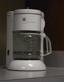
12-Cup Coffee Makerby 777STANComment: Greetings from Andi via the Critique Club
First Impression: A little plain and flat for me, maybe if there was some coffee boiling away it would add a little interest to the shot?
Composition: I quite like the strong lines you have in the shot but would like to see the left of the coffee maker dead straight with the edge of the frame. A couple of commenters mentioned a lower angle but you'd lose those nice lines - maybe more from above would be better?
Subject: There were some very creative shots with ordinarily boring images in the challenge but sadly you didn't get this image to 'pop' or show any real creativity.
Technical: This worries me a bit as if that long list of editing steps was for this image I think you might be in for a call from Site Council and, imho you didn't need most of the tools to produce this image as its still quite flat and lacking in any contrast on my monitor.
Final thoughts: I do think it probably ended up with the score it deserved. Yes, its a shot of a 12 cup coffee maker but I (like most viewers) would be looking for something a little more interesting. |
| Photographer found comment helpful. |
| 08/27/2009 06:49:37 PM |
Blironingby TimosabyComment: Greetings from Andi via the Critique Club
First Impression: Certainly grabs my attention, I'm a big fan of negative space even with the small dpc images. Crisp, light, bright and humorous, I like it!
Composition: I do like the dynamics of your composition and did I mention I love the negative space? Maybe if you had cropped out the bottom of the Blironing board it would have been more pleasing and removed most of the blue bottom left. I'm a fan of odd angles as well, it works well for me here.
Subject: Nice idea to juxtapose the 2 main subjects however an ironing board doesn't shout appliance to me. Plenty of humour here, did you think of getting somebody to flick the switch on the wall for your final shot and blend the fruit?
Technical: A couple of minor niggles, the blue remnants of your post processing to get the bg bright and white background bottom left might have stopped this scoring the 6+ it deserved and the focus/colour on the arms is a little off for my liking.
Final thoughts:Love the idea and the shot you submitted, imho it was a couple of minor issues away from a ribbon so well done! |
| Photographer found comment helpful. |
| 08/27/2009 04:03:36 PM |
The television and the babyby drynComment: Greetings from Andi via the Critique Club.
First Impression: Love the reflection of the cheeky little face in the TV. Sadly (for me) its overpowered by the colours that look a little 'odd' to me.
Composition: A few commenters mentioned the tv should have been the main subject and I tend to agree with them and would have preferred seeing a little more of it.
Subject: A lovely portrait shot and am sure it will look great in the family album. The backgound is a little cluttered for me (again thats more for the challenge than family album shot). I had thought about a square crop but then you'd have lost that great carpet. Maybe nitpicking but the cut off arm is a little distracting.
Technical: I think this area let the image down the most, the overuse (imho) of the shadow/highlight & possibly saturation tools have messed with the colours - almost HDR like but don't think it helps the image at all.
Final thoughts: Although the link to household appliances is here its rather vague and feel in challenges its important to make the challenge topic stand out. Granted some shots ribbon when only marginaly meeting the challenge but they are normally excellent images in their own right. Keep them coming Dirk! |
| Photographer found comment helpful. |
| 08/27/2009 02:47:35 PM |
Curvesby mBastinComment: Greetings from Andi via the Critique Club Mike and congratulations on a great score in your first challenge here!
First Impression: A well lit shot with some great contrasting curves. Sadly my eye is constantly drawn to the small shadow on the left most paper.
Composition: The shot nicely fills the frame and the idea to have opposing angles and an odd number of curves is excellent.
Subject: Yup, its pink so meets the challenge and whilst folded paper is becoming quite common here a well shot example is always pleasing to view so thanks!
Technical:Lovely pastel colours with the darker constradting right subject gives the shot the edge, lighting is almost perfect (that 1 shadow spoils it a little for me). Maybe if the 3 subjects were totally symmetrical the image might be improved slightly?
Final thoughts: Great choice for the challenge and in my book should have been a 6+ however you now have that joyous occaision to come ;) Good luck for future challenges! |
| Photographer found comment helpful. |
| 08/26/2009 06:09:32 PM |
Flying in pinkby brentg3Comment: Greetings from Andi via the Critique Club
First Impression: Yup, thats certainly pink! Nice and bright compared to the bland background. I thought you'd used selective desat but reading your notes understand it was taken on a bad day.
Composition: Subject fills the frame nicely, might have been even better if you had included all of the 'exit' sign top right (quite comical).
Subject: Like one of your commenters I was thinking Barby Doll Helicopter, fits the challenge well for me, maybe not the most interesting subject out there but plenty to look at and love finding the houses/offices and rails in the reflections.
Technical: I like the exposure though maybe a small boost in contrast would have helped as would a light run in neatimage as there is a fair amount of noise at the base of the helicopter.
Final thoughts:Fits the challenge well and whilst not exactly a WOW image it does hit the spot and feel a 5.1 is a low score. Though, saying that I noticed its bang on the average so a low scoring challenge. |
| Photographer found comment helpful. |
| 08/26/2009 05:31:07 PM |
Sew me..by chestomComment: Greetings from Andi via the Critique Club Chester and congratulations on an excellent score in your first challenge here (and obviously your new personal best lol).
First Impression: Don't normally notice nor comment on borders unles they clash with the image and sadly I'm constantly drawn to the border rather than the image within.
Composition: A pretty good composition and reading your comments I agree that it would have been better with the machine on the right, getting all of the baseplate in the shot and moving the bobbin to the left with a little space between it and the sewing machine.
Subject: Yup, meets the challenge well though like others am not convinced by the hand sewing needle though guess you shoot what you have. An interesting take on the challenge, I like it.
Technical: The background is great with the pastel colours though there is a little blown out area in the centre. I believe the reason why this didn't crack a 6 is the detail (or lack of it) in the sewing machine. For me it lacks detail and another light source on the machine would have made this image pop.
Final thoughts: A decent image well shot so well done and I look forwards to more of your work - good luck in future challenges. |
| Photographer found comment helpful. |
| 08/26/2009 04:53:18 PM |
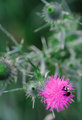
Thistle Bee Goodby posthumousComment: Guess who!!!!!!
First Impression: Am thinking there wasn't enough pink here and whilst I do like the background I think there might be too much that doesn't add to the overall image.
Composition: Maybe a square crop would have helped emphasise the focal point here
Subject: Yup, a nice bright pink but maybe not enough of it for the challenge? Oh, and there is a Bee in the shot, your getting too mainstream for my liking!
Technical: Whilst I love the background there is quite a lot of noise in it. Something I've started playing around with is resize to twice the final size, give the entire image a run through neatimage or similar then sharpen (the plain sharpen) a couple or 3 times resize to the final size and maybe try a light sharpening. Messing around with the amounts can often leave the background nice and smooth with a sharp subject.
Final thoughts:Loving the title Don and didn't have this down for one of yours. Personally, whilst it scored slightly above your average (unrecognised genious) vote I prefer your off the wall images much more.
|
| Photographer found comment helpful. |
| 08/25/2009 06:05:52 PM |
Life in Eden and the Death of Innocenceby rpethelComment: Greetings from Andi via the Critique Club
First Impression: Kudos to John and Mandy for doing what you asked Richard! Sadly (for me) things start to go downhill from there.
Composition: I feel John and Mandy are too central in the image and probably more importantly you didn't need to show so much of the lower regions and if John's left hand was a little higher on the waist you would have a less compromising image.
Subject: The idea of Adam and Eve was a good one with Adam taking the bite however, I don't think the final image gives that idea justice.
Technical:Focus should be sharper on your models and on my monitor Mandy's hair has no detail. They have different skin tones but neither seem to fit the scene you are tring to depict (or my idea of Adam and Eve). The overexposed background is a little distracting and you already mentioned the overexposed area on Mandy's left (not right) breast.
Final thoughts: A tough subject to shoot and sadly (for me) it was a good idea let douwn mainly by technicals and composition. Again, go John and Mandy for agreeing to this! |
| Photographer found comment helpful. |
Home -
Challenges -
Community -
League -
Photos -
Cameras -
Lenses -
Learn -
Help -
Terms of Use -
Privacy -
Top ^
DPChallenge, and website content and design, Copyright © 2001-2025 Challenging Technologies, LLC.
All digital photo copyrights belong to the photographers and may not be used without permission.
Current Server Time: 12/21/2025 09:01:28 AM EST.