| Image |
Comment |
| 05/25/2006 06:42:47 PM |
|
 Photographer found comment helpful. Photographer found comment helpful. |
| 05/21/2006 05:47:49 PM |
|
| Photographer found comment helpful. |
| 05/21/2006 05:46:07 PM |
|
| Photographer found comment helpful. |
| 05/21/2006 05:45:11 PM |
|
| Photographer found comment helpful. |
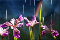
| 05/07/2006 04:34:01 PM |
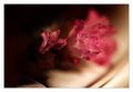
Summer Rainby 2mccsComment: This is sweet! I like the motion of water droplets and the way you singled out the one iris (blue flag?). Two elements detract from the whole: The one background flower at the left of the frame competes with the sharp one infront of it...if it were in shadow as much as the one at far right there would be better separation of the subject; the other detractor is the orange line...it just takes so much attention by its color and placement in the composition. I think a little time in photoshop could fix these objections of mine. |
| Photographer found comment helpful. |
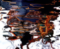
| 05/07/2006 04:30:53 PM |
... canal colours ...by GuGiComment: Interesting abstract! I like the strong colors in the water...almost like an oil slick. Think perhaps the neon orange (on the left) might be a bi heavy on the saturation...it's feels like it draws undue attention. |
| Photographer found comment helpful. |
| 05/07/2006 04:29:05 PM |
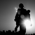
In Memoryby JPRComment: Interesting use of lens flare...I think it adds the right kind of impact to the photo. It might be a bit too much as it begins to overpower the lovely silhouette. Skyline being uneven adds a minor distraction...wonder if this was taken a little more to the left and slightly lower if the shapes would have been better separated.... |
| Photographer found comment helpful. |
| 05/07/2006 04:26:59 PM |
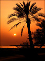
A Peaceful Time of Dayby tembaComment: I guess I'm just a sucker for palm trees at sunset...but as common as they are they aren't usually as successful as this one. Love the silhouette against the perfectly orange sky! Nice! |
| Photographer found comment helpful. |
| 05/07/2006 04:25:21 PM |
Combinedby Dax-Comment: I like the softness and mood of this image. The colors are so pleasing to look at! The one thing I think would help this most is cropping a bit of the dark space from the left and up a little from the bottom. I think the space on the left adds little and cropping might place the subject a bit better. The contrasty ribbing on the bottom seems to demand undue attention as well. |
| Photographer found comment helpful. |
| 05/07/2006 04:22:45 PM |
~ Rhythm ~by yankoComment: Great subject! The selective desaturation feels forced a bit...no doubt in an attempt to get rid of background distractions...just not really working so perfectly. For me, it's an "almost." |
| Photographer found comment helpful. |
Home -
Challenges -
Community -
League -
Photos -
Cameras -
Lenses -
Learn -
Help -
Terms of Use -
Privacy -
Top ^
DPChallenge, and website content and design, Copyright © 2001-2025 Challenging Technologies, LLC.
All digital photo copyrights belong to the photographers and may not be used without permission.
Current Server Time: 08/26/2025 02:16:41 AM EDT.