| Image |
Comment |
| 01/21/2003 06:16:14 PM |
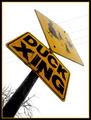
Duck's Eye Viewby jodiecostonComment: I like the concept - as explained by the title. I find the whitish sky a little too intense, especially at the top point of the sign. Also the yellow portion of the border looks great as the signs base but is washed out at the top of the image. Overall though, not a bad photo at all - certainly has some interest to it. |
 Photographer found comment helpful. Photographer found comment helpful. |
| 01/21/2003 06:09:34 PM |
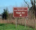
A Politically Incorrect Drinking Establishment?by ChrisW123Comment: Your focus seems very good on the sign, but it looks like a shallow depth of field when I look at the tree and reeds on the left. Colouring is good and the sign certainly stands out as the main focus point when I first glanced at the image. |
| Photographer found comment helpful. |
| 01/21/2003 06:07:56 PM |
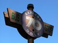
Artificial Heartby ndsComment: I like the composition and framing of this shot. The tree seems to tower on forever. Unfortunately I don't find the sign very interesting, althugh I do understand the title well. Focus is very good. I actually find the brightly lit top-left of the sign a little distracting. |
| Photographer found comment helpful. |
| 01/21/2003 12:29:01 AM |
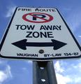
Can't park here.by Fibre OptixComment: It looks like you struggled slightly with depth of field - which is understandable. It also looks like you took the image very slightly off centre - the bottom bolt is near the centre, but the top one is definitely off. This isn't a big deal though - I guess I just like symmetry. |
| Photographer found comment helpful. |
| 01/21/2003 12:20:37 AM |
the Madnessby moondoggieComment: Nice use of selective colouring - there's just one tiny red light on the leftmost building. I like the title as well - very smart. The simple border is nice - just enough to frame the image without taking it over. Well done. Any reason why the sign is partially cropped? Is it just to stop the sign from totally taking over the image? |
| Photographer found comment helpful. |
| 01/21/2003 12:18:05 AM |
Grillby ArtifactsComment: Nice exposure and focus (very sharp), and colour. Why is the last L partly cropped? |
| Photographer found comment helpful. |
| 01/21/2003 12:15:38 AM |
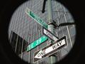
at the end of the tunnelby BeeGeeComment: Ok, let me be the hundreth person to question the black circle. I'm guessing it was taken through a piece of card and the DOF provides the blurred edge. If so, well done it looks like post processing. Focus and exposure of the signs is very good. |
| Photographer found comment helpful. |
| 01/20/2003 10:55:05 PM |
Waiting aroundby decoteauComment: Very interesting lighting. Normally I might have thought "poorly lit" but it adds an element of interest to the photo. The framing is nicely balanced. Some of the edges look just a little bit harsh - did you sharpen this photo? Otherwise it's very nice - and the blue sky background is wonderful. |
| Photographer found comment helpful. |
| 01/20/2003 10:53:09 PM |
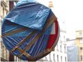
Falling Rocks - Floating Signby DigitalGravyComment: Ok, this is one of very few photos where the border really adds to the photo - well done. I'm glad you chose a thin yellow line and didn't over do it. The floating effect is also quite nice - it's a simple elegant photo. Framing is also nicely balanced. |
| Photographer found comment helpful. |
| 01/20/2003 10:43:21 PM |
lollipopby miss parkerComment: I like the shallow depth of field - it brings attention to the sign. I think you may have cropped it a little too tightly though, especially at the top. With the shallow depth of field I would have tried to include a bit more background - it wouldn't have distracted the viewer much. Also, since you chose a new sign (still wrapped up) I was expecting something in the title to reflect that fact, like "brand new lollipop" or "coming to a street near you soon". The focus and exposure win good points though. |
| Photographer found comment helpful. |
Home -
Challenges -
Community -
League -
Photos -
Cameras -
Lenses -
Learn -
Help -
Terms of Use -
Privacy -
Top ^
DPChallenge, and website content and design, Copyright © 2001-2025 Challenging Technologies, LLC.
All digital photo copyrights belong to the photographers and may not be used without permission.
Current Server Time: 08/26/2025 08:50:37 AM EDT.