| Image |
Comment |
| 10/20/2004 05:03:07 PM |
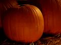
Pumpkin Patchby PDavisComment: This framing is very limiting. I would like to see more above, or to the left of the pumpkin. You have the right idea of using the rule of thirds with placing the pumpkin off center, but it is much too tightly cropped around the rest of it. At least a little more information (space around the pumpkin) would be good. |
 Photographer found comment helpful. Photographer found comment helpful. |
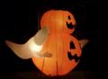
| 10/20/2004 05:01:48 PM |
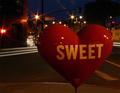
SWEET Heartby sfaliceComment: hmm.... Perhaps this image is too 'smack dab in the face' for me... perhaps if it was at a bit of an angle, or taken from something other than i would have seen it walking down the street, it would have created more interest. |
| Photographer found comment helpful. |
| 10/20/2004 05:00:42 PM |
Clotheslineby JiaBobComment: I would sudjest using your limit of 640 pixels wide, that always makes for a more attractive image. Otherwise, interestingly shot, i like the shadows and variety of light. |
| Photographer found comment helpful. |
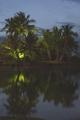
| 10/20/2004 04:58:03 PM |
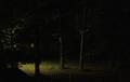
Fall Night Oasisby wkoffelComment: I can't say this is one of my favorites. I am not sure why.. perhaps it doesn't hold my interest, I am not sure i see anything sharp.. what am i to look at. If the image was of fall colors of the tree, perhaps a closer shot of the tree or some leaves might be good... or a tighter crop. Perhaps it would be interesting if the shot was taken from farther back, where the street light (?) is in the center with the black of the night around it and the tree. |
| Photographer found comment helpful. |
| 10/20/2004 03:09:59 PM |
Sistersby myqylComment: Well i suppose this may have been taken 'at night' but i don't see any night in this image which i would have liked to. It is an ok portrait, but perhaps somewhat uninterestingly poses, or shot. it seems like the very first thing i would think of when taken a picture of someone in this position. perhaps a different, more obscure viewpoint would have made this image more interesting. |
| Photographer found comment helpful. |
| 10/20/2004 03:08:49 PM |
Relaxationby KekiinaniComment: this image is perhaps a tad too light, or low contrast. It also seems that it was taken with a long delay, with a sligh breeze in the air, creating what seems to be camera shake... which i imageine is not. I think the biggest problem with this image is the range of shades of black to white.... it seems very middle grey. |
| Photographer found comment helpful. |
| 10/20/2004 03:05:44 PM |
Ghostly Delightby eaponygyrlComment: This image is very blurry which is one reason i gave it a low mark. Perhaps you were wanting to use that as part of the effect, but i don't feel it helps it at all. The subject is also placed DIRECTLY in the center of the image which makes for an 'uninteresting' composition... perhaps if it was moved to the left side more, that would help. |
| Photographer found comment helpful. |
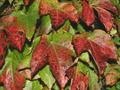
| 10/20/2004 03:04:40 PM |
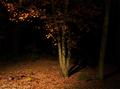
Autumn Night Coloursby SteveJComment: the direct lighting of the flash makes for a very cotrasty stagnant photo. The subject is nicely colored, but is the subject is not presented in a way that makes me think, or is anything other than what i would see if i looked at it for one second in real life. show me something i would miss if i wa walking by. The image also does not show any 'night' in it... it just happened to be dark when you shot the image. |
| Photographer found comment helpful. |
| 10/20/2004 03:02:39 PM |
Standing Tall - Against The "Flash"by DrakeComment: An allright, image, with decent cropping, but it doens't have much appeal for me. It appears there is one direct light sourche which makes for a very contrasty uninteresting image.... i guess the subject doens't appeal to me that much.. it would take a creative viewpoint to creat interest for me. Perhaps next time, take an obscure vantage point, or one not normally seen. |
| Photographer found comment helpful. |
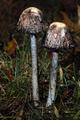
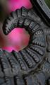
| 10/18/2004 12:20:36 PM |
Curlby blemtComment: nice detail and attention to parts. it is not quite as sharp as i would like it.. perhaps a square framing would work better for this, i am not sure what bothers me about it. Decent image.. good background color, perhaps a little boost of contrast would help this image a little.
-from the critique club. |
| Photographer found comment helpful. |
Home -
Challenges -
Community -
League -
Photos -
Cameras -
Lenses -
Learn -
Help -
Terms of Use -
Privacy -
Top ^
DPChallenge, and website content and design, Copyright © 2001-2025 Challenging Technologies, LLC.
All digital photo copyrights belong to the photographers and may not be used without permission.
Current Server Time: 08/26/2025 05:54:03 PM EDT.