| Image |
Comment |
| 11/04/2004 04:51:51 AM |
Shifting Sands by photomComment: This image is really great. I love the simplicity of the deep blue sky and the yellow sand. It looks quite neatimaged and soft.. and i think it is a bit overdone... but it is still a very nice image, with great abstract shapes. |
 Photographer found comment helpful. Photographer found comment helpful. |
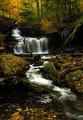
| 11/04/2004 04:50:07 AM |
October colorsby Dim7Comment: I think it is a good idea to have the tree in the foreground to creat depth but it is too much 'smack in the middle' and looks like it just 'got in the way' of the photograph.. If you moved it to the left perhaps, that might be helpful... put it on the 1/3 line on the left, or a little more over. |
| Photographer found comment helpful. |
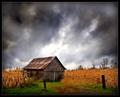
| 11/02/2004 04:45:05 AM |
Autumn Corn Fieldsby mariomelComment: well... after just parusing through heida's portfolio... i would guess that this is another one of hers, or someone inspired by her.... in any case... yeah.. strong image. I really like the wheat, and the large space given to the sky in the image. |
| Photographer found comment helpful. |
| 11/02/2004 04:43:49 AM |
Autumn Serenityby traserComment: This looks like a picture from a 1980's calender.. with really strong yellows and oranges. hmm yeah.. nice scenic... |
| Photographer found comment helpful. |
| 11/02/2004 04:42:59 AM |
|
| Photographer found comment helpful. |
| 11/02/2004 04:42:21 AM |
The Muse of Autumnby magnusComment: well..... interesting.. i'll give you that. it makes me think of a peacok... i think the cropping on the chin is a little tight. nice expression thought.. perhaps a little softer lighting would have been good. |
| Photographer found comment helpful. |
| 11/02/2004 04:41:29 AM |
Subjectiveby TranquilComment: nice contrast and i really like the windows in the background. i think they make this image work really well. I am confused about what the object in the middle bottom part of the image is... whatever it is, it is obviously not too important to the image (since the viewer is unclear as to what it is... perhaps an arm though).. I think it is a bit too bright there... or too much light is reflected off of it, compared to the very subtle face and window. otherwise nice image. |
| Photographer found comment helpful. |
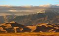
| 11/02/2004 04:39:32 AM |
The Dunesby SammieComment: Interesting image. Perhaps a little too busy with the couds.. but perhaps they reflect the mountains and dunes.. .. there are a lot of layers.. but i think perhaps 1 too many... nice image though |
| Photographer found comment helpful. |
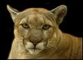
| 11/02/2004 04:38:17 AM |
Feline Portraitby moodvilleComment: very intense.. and am curious if you burned the background to isolated the couger.. it looks a little bit that way.. since there are three light spots in the background that happen to be the exact same distance from the couger.. meaning you used a brush of some sort.. anyhow.. despite the isolation that could have been done better, there is great tones in the couger and great detail. nice image. |
| Photographer found comment helpful. |
| 11/02/2004 04:35:39 AM |
|
| Photographer found comment helpful. |
Home -
Challenges -
Community -
League -
Photos -
Cameras -
Lenses -
Learn -
Help -
Terms of Use -
Privacy -
Top ^
DPChallenge, and website content and design, Copyright © 2001-2025 Challenging Technologies, LLC.
All digital photo copyrights belong to the photographers and may not be used without permission.
Current Server Time: 08/26/2025 01:20:38 PM EDT.