| Image |
Comment |
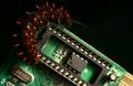
| 05/13/2004 12:27:19 PM |
Nature and Technologyby bledfordComment: Nice colors, composition and concept, but if you are going to go for a studio still life (sort of still anyway) and you don't nail the focus across a solid DOF it will cost you points. Other than the focus and the extranious gold triangle leading the eye off the lower right corner, a very nice shot. |
 Photographer found comment helpful. Photographer found comment helpful. |
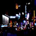
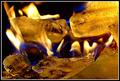
| 05/13/2004 12:17:39 PM |
Bright Night in the Big Appleby janoComment: Either more focus of more blurring is needed here. As it is it looks like you missed the shot rather than chose to shoot soft. |
| Photographer found comment helpful. |
| 05/13/2004 12:09:29 PM |
|
| Photographer found comment helpful. |
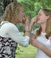
| 05/13/2004 12:07:40 PM |
Like Mother Like Daughter (Left and Right Profiles)by WildflowerJoyComment: I enjoy the light heartedness of this shot and realise it was probably a spur of the moment thing, but the backround is distracting and dosen't help you tell this story. The fact that the mother seems to have sprouted a twig from her belly button ect. Same shot with a solid backroung and shot about two feet to the right so you were square on would have been much stronger |
| Photographer found comment helpful. |
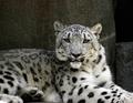
| 05/13/2004 12:02:33 PM |
Nature in Black and Whiteby dixonp1Comment: Great expression on the beasty, but the framing puzzles me. I would have either pulled back and gotten his whole body and the architecture of curves of this feet and tail, or moved in so his face filled the frame to maximise the power of his gaze. This composition does a bit of both but neither all the way. |
| Photographer found comment helpful. |
| 05/13/2004 11:43:10 AM |
|
| Photographer found comment helpful. |
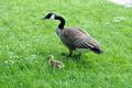
| 05/13/2004 11:42:12 AM |
Adult - Childby lightpro1Comment: I think this would have been stronger with less grass, and with out the distracting triangle of white in the upper right corner. Crop it square and make it bigger |
| Photographer found comment helpful. |
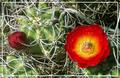
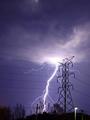
| 05/13/2004 11:35:19 AM |
Unbridled versus Restrained by BikeRacerComment: Wow, this shot makes quite an impression after 200 staged shots. I think you could have cropped down and right to increase the impact of your central elements, after all this is about power not clouds, but that is nit picking, this one is in ribbon territory. |
| Photographer found comment helpful. |
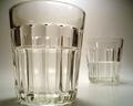
| 05/13/2004 11:31:57 AM |
The Optimist and the Pessimistby L1Comment: I wish you had left a tiny bit of space around the top and bottom of the glass in the foreground. Given the area left and right the bottom and top feel squeezed. Very tough subject matter well shot. |
| Photographer found comment helpful. |
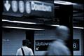
| 05/13/2004 11:24:48 AM |
Opposite Worldsby the-O-sterComment: two things that would have made this a stronger shot. If the white guy was walking in the other direction, it would have compleated the opposition. If the downtown sign was more firmly in the frame it would have given it more power to balance out the softness of focus, as it is it has less impact than the uptown sign, where as the two figures balance very nicely because of their solid placment in the frame. Nice to see a non studio/ posed shot here. |
| Photographer found comment helpful. |
Home -
Challenges -
Community -
League -
Photos -
Cameras -
Lenses -
Learn -
Help -
Terms of Use -
Privacy -
Top ^
DPChallenge, and website content and design, Copyright © 2001-2025 Challenging Technologies, LLC.
All digital photo copyrights belong to the photographers and may not be used without permission.
Current Server Time: 08/05/2025 02:31:07 AM EDT.