| Image |
Comment |
| 05/27/2015 04:12:13 PM |
Turbulent Flowby MelethiaComment: This is a shot that rewards slow inspection. I love the little holes of focus and the oblongs of blur. I agree with skewsme about the top distracting from the action even it if provides much needed green for the challenge, it steals power. If you view a shot for 3 seconds in scoring, this level of complexity is tough to enjoy, and on that level it is a "meh" shot, not super green, not at all simple. The correlation between a great photograph and great entry in a challenge is not robust. |
 Photographer found comment helpful. Photographer found comment helpful. |
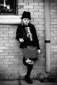
| 05/27/2015 03:54:13 PM |
Only the Good Die Youngby chazoeComment: This reminds me of those long ago handbills for punk shows. Both in content (youth don't five a f*ck about you) and the high contrast in your face editing (a look that started because of printing on cheap paper for mass distribution, and became a it's own aesthetic). I like it alot.
That said, if you actually care about getting a higher score on this site I have started looking at my editing here as I do for my cooking at a dinner party. Have a little something for everyone, and spice to soften and fill out flavors rather than to heighten one flavor. If you had edited this as if it was a glamour shot with a soft glow to the skin and lots of pretty detail in the bricks, I bet it would have done about 6.2. Harsh shot gets soft edit, soft shot gets harsh edit, so you can please more of the people, more of the time.
Now I need to get a shot of my daughter flipping off the camera in a challenge and see if I can do it so it offends fewer people by making the edit sweet enough to send diabetics into a coma.
Or you can just go with the old punk philosophy, if they don't like it, f#uck those people, this is our music! |
| Photographer found comment helpful. |
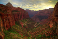
| 05/27/2015 03:31:23 AM |
Canyon Overlook by scarbrdComment: There are far more creative shots in this challenge, but this is the best. Some times a deftly handled straightforward presentation of the subject matter is the best approach. And this is a spectacular landscape. |
| Photographer found comment helpful. |
| 05/26/2015 05:31:14 PM |
The Salt Pond by markwileyComment: A bit more of that spectacular crepuscular light in the upper right would not have been a bad idea, but this is one of the best images in the challenge thus far, its just that the top feels a bit squeezed. |
| Photographer found comment helpful. |
| 05/26/2015 05:27:04 PM |
My landby hajekaComment: I like the colors and the environment, but I keep looking for the big thing in the image and the only candidate is the high tension line in the distance. Using that fence line in the mid distance might have worked with different framing. I like the feeling of a big quite place, but I keep hunting for the unifying element. |
| Photographer found comment helpful. |
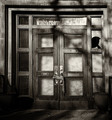
| 05/21/2015 06:17:58 PM |
Lostby DCrest01Comment: Glorious light with interesting asymmetry. I like the blues and the yellows with that hint of pink at the ceiling. It reminds me of the work of Robert Irwin.
My one quibble is the skewed roof beam. It would have made a more pleasing image (for me alone perhaps) had you skewed the image to justify that beam and the side walls from keystoned,into perfect symmetry to allow the walls and the decayed roof to be the only things out of balance. It is pretty easy to do and legal in this rule set, and the sort of edit that would have stilled the image into a pure exploration of light |
| Photographer found comment helpful. |
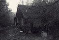
| 05/21/2015 06:09:37 PM |
they made a living here, years agoby jmritzComment: I like the brooding tone and I see why you have the big branch in the upper right to lead in the eye, but I think the structure is playing second fiddle to the foliage. More house being swallowed less trees doing the swallowing might have been stronger. those fleck of white trash in the foreground and in the tree are bothersome; pick them up, burn them down a bit or toss in more to make them a theme, all would have worked, but as they are they are distractions. |
| Photographer found comment helpful. |
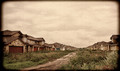
| 05/21/2015 06:05:04 PM |
Village Interruptedby LindaLeeComment: Im of two minds here. I like the highly stylized approach of heavy frame and subtle hues, yet this is such a great find for the challenge that I wonder if you didn't give up too much in the textures and richness of tones to get that effect. I would love to see some outtakes of this set with a more documentary approach perhaps with a more burnt in brooding sky rather than the wash of empty we see here. |
| Photographer found comment helpful. |
| 05/21/2015 06:01:06 PM |
Bound and Brokenby markwileyComment: Elegant, subtle and minimal. The contrast in textures between the rope and all the hard surfaces really works here. |
| Photographer found comment helpful. |
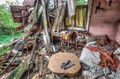
| 05/21/2015 05:59:35 PM |
Open Houseby MargaretNetComment: Gloriously found, framed and captured. But for me, some of the magic spilled away in your editing. The pastel hues and lack of a true black, take some of the brooding mystery of the subject matter and spill it away into the land of tone mapped blah. Sure you get all the details in the shadows, but you give up so much, including, I expect, the blue ribbon. Still my second favorite, but it could have been the clear winner.
Coming back to praise rather than carp about what isn't there. I truly love the way the eye is lead through the frame. The spiral from the glove, through the bedding across the chair, desk and out into the explosion of destruction and decay is just lovely. |
| Photographer found comment helpful. |
Home -
Challenges -
Community -
League -
Photos -
Cameras -
Lenses -
Learn -
Help -
Terms of Use -
Privacy -
Top ^
DPChallenge, and website content and design, Copyright © 2001-2025 Challenging Technologies, LLC.
All digital photo copyrights belong to the photographers and may not be used without permission.
Current Server Time: 08/01/2025 03:19:24 PM EDT.