|
|
|
Showing 701 - 710 of ~830 |
| Image |
Comment |
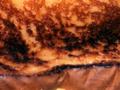
| 05/05/2004 09:05:18 AM | The Accidentby KylieComment: I think it's a chevrolet (badge is a givaway), though i couldn't say what part... This is a very lovely image, that is certain. I wish my monitor was of widescreen proportions, becuase i really like the way this has been cropped. And the colours are wonderful (beautiful blue goes with the chrome very well), and the metal looks almost liquid. depth of field is spot on, and it's not too sharp which also suits the subject matter. excellent work. 10 |  Photographer found comment helpful. Photographer found comment helpful. |
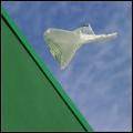
| 05/04/2004 05:19:56 PM | Yellow Birdby dixonp1Comment: With a bit of fancy (legal?) editting at the front end by making the prop blurry, you could have made it look dead impressive. As it is - it still took a double take to realise you weren't hanging on the back midflight about to let go and plummet to a messy end. Is it abstract - not sure in real terms, but not really in accordance with the challenge description. but it's sharp, full of lovely colours, is taken from an original angle which i do like, and is a pleasing image. I might be wrong, but i don't think it's really abstract enough - so i can only feel happy giving a 7. | | Photographer found comment helpful. |
| 05/04/2004 05:05:28 PM | FIRE!by kevrobertsonComment: It looks too much like a flag to be an abstract! i know it's NOT a flag, but it looks too much like what it isn't to not be, from my point of view. It's a very modernist piece of art, which i'm sure galleries would love. But is it really photography? I mean, the only real slight flaw is loss of pure white in the top right. Paradoxically, for some thing so simple and comprising of only two colours, this is the hardest image one to vote on this week. Is it too abstract? For art, 8. For a photo - 2.5. That's an average of, oh, about 4.5. 5 it is. dang it, 6, coz i DO like it. | | Photographer found comment helpful. |
| 05/04/2004 04:51:20 PM | Gnarledby orussellComment: The detail of the subject matter (whatever it is) is very good - but i can't help but feel that it's been let down by the floating appearance and the blandness of the background. Emotions aren't being stirred. However, in a technical sense, it looks great! | | Photographer found comment helpful. |
| 05/04/2004 04:39:03 PM | sunriseby litboltiComment: I don't normally react well to overtly editted shots. this however, rocks! Indeed, methinks it would make a terrific record sleeve. The shades of yellow are perfect, and i honestly can't think of a way i might've tried to improve. if i were ever skilled enough to get to a result such as this, i would leave well alone. Well done - 9. | | Photographer found comment helpful. |
| 05/04/2004 04:53:20 AM | ?by tolovemoonComment: Good title. I have no idea. it could be one of any number of things - including the nexus in one of those star trek films (the one where kirk fell off a ladder). Could almost be a closeup of a pint of guiness settling. the image is a little bit too fuzzy for my liking though, and noise levels on the lower quarter are excessive. | | Photographer found comment helpful. |
| 05/04/2004 04:32:09 AM | Widgetsby GolferDDSComment: Now THIS is abstract as defined by the challenge, and no mistake (surprisingly few of these about). You know, i would rather preferred to have seen this for real, with the doo-dahs mounted on white card and displayed somewhere like the Tate or MOMA. I have no idea what those things are. Being largely clueless in this field, so i might be wrong, but i would have suggested that you took the shot with a smaller ISO and maybe with less exposure - it only just appears a tad noisy and from the pinks, a teeny bit over-exposed. But don't get me wrong, i love this to bits! Very deceptively simple, classy, effective, ABSTRACT, and a definite favourite. 9. | | Photographer found comment helpful. |
| 05/04/2004 04:25:59 AM | Freedomby leafComment: So, do you like American Beauty? I'm not sure if this is abstract in terms of the challenge description (though i don't necessarily agree with the recognisable part of it) but it's certainly quite arty. I do very much like the bold colours evident here, the green of the wall is wonderfully contrasting with the sky, and the bags lettering matches the green wall rather well. Your choice of location is terrific. I'm not a big fan of borders (i ignore them largely when voting) but why you didn't select to use a dark green is unclear. Your focus on the bag is very good. Technically i think it is very good, and you evidentally considered and thought about the shot (the only thing missing is the tinkly and deep music). 8. | | Photographer found comment helpful. |
| 05/04/2004 04:15:58 AM | Light Reflectedby PoobaComment: Of course, shiny cds are hardly a new subject matter, but here at least this is a challenge where they rightfully belong. I think the quality of the photo is slightly hampered with the spindle / hole bits being so prominent a feature in the bottom left - if it were i doing this one, i might have been inclined to come in closer and focus more on the (strikingly pretty) colours actually reflected on the metallic part of the discs. Also the dot-matrix type lettering on the discs are a bit distracting. | | Photographer found comment helpful. |
| 05/04/2004 04:09:27 AM | Jby bobdaveantComment: Unfortunatley, this doesn't really scream "abstract" to me, or at least, within the specific parameters defined by the challenge description. There is certainly the material there for suitable manipulation, such as focusing exclusively on the ear-piercing and some slight mucking around with photoshop / paintshoppro. The lighting is also a little harsh and the background seems a little fake (given the halo effect around the hair). That aside, technically i felt it to be a good shot, it's just i feel it would be better suited to an alternative challenge (hopefully not the rusty run if your model stands in the rain too long ;)) | | Photographer found comment helpful. |
|
Showing 701 - 710 of ~830 |
Home -
Challenges -
Community -
League -
Photos -
Cameras -
Lenses -
Learn -
Help -
Terms of Use -
Privacy -
Top ^
DPChallenge, and website content and design, Copyright © 2001-2025 Challenging Technologies, LLC.
All digital photo copyrights belong to the photographers and may not be used without permission.
Current Server Time: 09/04/2025 08:23:32 AM EDT.
|