| Image |
Comment |
| 06/03/2004 03:18:27 PM |
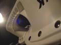
Blades of Steelby Toby-DogComment: This has a lot of compression that is a bit distracting (maybe when you resaved it your softwre program did something to it). IT's also hard to tell what it is, which could work as an abstract, but there aren't any compelling things to look at to draw the eye in - something with richer colours may have worked better. This is a bit creamy and needs something punchy to attract the eye. |
 Photographer found comment helpful. Photographer found comment helpful. |
| 06/03/2004 03:17:17 PM |
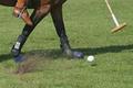
Polo Matchby sn4psh07Comment: Really cool shot. TOo bad th elighting is a bit harsh, but it's really cool nonetheless - 9 |
| Photographer found comment helpful. |
| 06/03/2004 03:17:00 PM |
Home Stretchby LokiComment: Beautiful colours. I relaly like this one. it's very compelling. 9 |
| Photographer found comment helpful. |
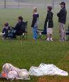
| 06/03/2004 03:16:29 PM |
Between Inningsby KoolDudeComment: There's something that just doesn't feel very compelling about this image. it also seems very pixelated and compressed (maybe when you resized your software program did something). The lighting seems a bit muted. The grass is a nice rich colour, but there isn't anything to draw the eye in and encourage movement. Maybe think abou tnegative space. |
| Photographer found comment helpful. |
| 06/03/2004 03:15:29 PM |
Central Park Rainoutby BikeRacerComment: I think this is really good - but may have been even betterif shot from a slightly different angle - maybe more to the right or the left. While not every picture is enhanced by a rule of thirds, this one may have been ehnanced by using that principal. Love the buildlings in behind. This image really captures a mood. Good luck -7 |
| Photographer found comment helpful. |
| 06/03/2004 03:14:36 PM |
Side Outby qmdiComment: Really interesting photo. It's too bad the life saver thingy is in behind the screen. The image seems slightly pixelated (may have happened when you resampled). However, it's a very good idea. Love the colours. - 9 |
| Photographer found comment helpful. |
| 06/03/2004 03:13:29 PM |
|
| Photographer found comment helpful. |
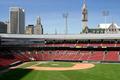
| 06/03/2004 03:13:17 PM |
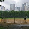
Home of the Buffalo Bisonsby lwkimagesComment: Really interesting angle. I like that the colours are rich enough - even the far away seats - that your eye is drawn where it should be drawn. I like the buildlings peeking over the top. I realize logistically it may have been trouble, but may have been an even better shot if shot at sunrise or sunset. good luck 8 |
| Photographer found comment helpful. |
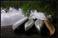
| 06/03/2004 03:11:59 PM |
Canoeingby MonaComment: Really beautiful. Lovely use of negative space. 9 |
| Photographer found comment helpful. |
| 06/03/2004 03:11:47 PM |
Ski Footballby basia03Comment: Ths looks very comrpessed - very pixelated. I'm wondering if your software program is doing something to decrease saturation as well. I think this would have been a good image, but the compression is very distracting. |
| Photographer found comment helpful. |
Home -
Challenges -
Community -
League -
Photos -
Cameras -
Lenses -
Learn -
Help -
Terms of Use -
Privacy -
Top ^
DPChallenge, and website content and design, Copyright © 2001-2025 Challenging Technologies, LLC.
All digital photo copyrights belong to the photographers and may not be used without permission.
Current Server Time: 07/23/2025 08:24:03 AM EDT.