| Image |
Comment |
| 04/17/2006 08:35:40 AM |
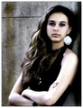
Using the Pool for Children Portraitsby moonjeongComment: While you might get voted lower for not being a 'studio' portrait, I reallylike it. I love the blue of the water. It makes her face really stand out. Great eye contact (and an adorable little girl1). I would have cropped more off the top(maybe including some off the top of her head). It would bring her eyes up higher in the frame, and eliminate the distracting line coming out of the back of her head. |
 Photographer found comment helpful. Photographer found comment helpful. |
| 04/17/2006 08:28:46 AM |
Meninaby anthonyczajaComment: Beautiful. I love her pose and her model stare. I love the lines of her arms. I would tone down the hot spot on her left arm, especially her elbow and shoulder; they distract from her face. The one big earring is also distracting. 7 from me. |
| Photographer found comment helpful. |
| 04/17/2006 08:19:40 AM |
Are you being served?by MajankaComment: I love the angle, tilt and perspective on this shot. Very cool and fun. The lighting and white backdrop are very well done as well. The only thing that detracts for me is the black tray/light yellow shirt/black apron. My eye sees the tray first, and then down to the apron and misses his face. Regardless, this is one of my favorites. 8 from me. |
| Photographer found comment helpful. |
| 03/22/2006 01:09:09 PM |
Low rideby ergatesComment: I love the idea of this. The long shadows are great and I love the way they lead from the lower corner up to her feet. The backlighting is cool and the angle works very well for the shot. I really dislike the power lines going through the subject's head. The background in general isn't very well suited. The lines of the background, the building, the trees, the snow banks, get muddled with and distract from the lines of the subject. Compositionally, IMO you could crop a little more off the top and the right hand side, to exagerate the motion away and out of the frame. Reshooting this at a better location would be very worthwhile, I think. Nice exposure for the backlight. |
| Photographer found comment helpful. |
| 03/22/2006 12:07:28 PM |
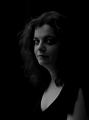
Hope Waiting in Shadowsby saracatComment: Very nice soft light on her face. I like that we can see both eyes, although the near side of her face is very shadowed. I like the touch of light on her cheek, too. Wonderful job keeping shadow detail in her hair. Her bare arm in the lower right hand corner is distracting to me. It would have been better to cover it. I think that a tighter crop, with a not so centered compostiion woould be stronger; I would take off some of the spacwe above and to the left of her. WIthout the basic editing restrictions, I would suggest burning down her chest a little, it is brighter than her face. Although I like the lines of her neckline, covering more of the skin on her chest would make the face a stronger part of the image. 7 from me. |
| Photographer found comment helpful. |
| 03/19/2006 12:37:19 PM |
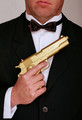
Bond. James Bond.by LeokComment: Cool effect and nice composition. The highlights on the right side of his face are blown out and missing detail. |
| Photographer found comment helpful. |
| 03/19/2006 12:35:54 PM |
|
| Photographer found comment helpful. |
| 03/19/2006 12:33:51 PM |
|
| Photographer found comment helpful. |
| 03/19/2006 12:32:34 PM |
Little Red Riding Hoodby fadedbeautyComment: Very nice. I love the muted colors. Maybe burn down that right spot on the right in the background. It distracts my eye away from her face. -7 |
| Photographer found comment helpful. |
| 03/06/2006 10:55:41 PM |
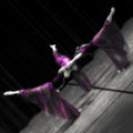
Arabesqueby woohoopepperComment: Stunning! I love the lines and composition. I like the selective color here (and I often find it overdone). Bumping to a 9. |
| Photographer found comment helpful. |
Home -
Challenges -
Community -
League -
Photos -
Cameras -
Lenses -
Learn -
Help -
Terms of Use -
Privacy -
Top ^
DPChallenge, and website content and design, Copyright © 2001-2025 Challenging Technologies, LLC.
All digital photo copyrights belong to the photographers and may not be used without permission.
Current Server Time: 08/05/2025 02:32:12 AM EDT.