| Image |
Comment |
| 06/07/2006 09:51:11 AM |
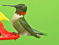
Hummer @ feederby JOHNBOY1970Comment: These little guys are so hard to catch! Well done. The sharpening halo around the bird's sillohuette is too prominent for me. Great green background. |
 Photographer found comment helpful. Photographer found comment helpful. |
| 06/07/2006 09:11:03 AM |
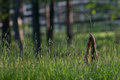
Find me in my field of grass- Mother Nature's Sonby scalvertComment: Very cool shot in its own right, and it suits the lyric perfectly. The quirkiness of the curving blade of grass really stands out against all the vertical lines, which really suits the light hearted mood of the image. |
| Photographer found comment helpful. |
| 06/06/2006 04:43:27 PM |
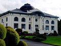
Pacific County Courthouse 2by KathycComment: Hello from the critique club,
A nice image of a beautiful building. FOr the challenge, it most definitely says 'architecture' to me.
I like your angle and composition very much. I like how much of the front lawn you chose to include, so that the building occupies the upper part of the frame. It makes it feel even more dominant and powerful, appropriate for a courthosue. I especially like the shrubs in the corner. It leads the eye into the frame very nicely.
I like the perpective you chose, with the building at an angle. I think it would have been nice tohave the rear corner of the building in the frame. IT feels a little unbalanced with it cut off like that.
The building seems a little underexposed. In curves, I think if you bring up the midtones and especially the quartertones, the building will pop more. You will have to mask the sky or it will blow out, I realize.
Please feel free to pm me with any questions about my comments.
Cheers,
Liza |
| Photographer found comment helpful. |
| 06/06/2006 04:35:54 PM |
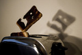
Burned Toastby ErnirComment: Greetings from the critique club,
Congratulations on such a funny and emotive shot. I think this is one of the higher scores I have seen for a shot that is not grain-free and technially perfect ala DPC standards. Here are my comments.
I like that the shot has grain and some technical imperfections. I think it fits the mood of the image. I like the blur on the toast popping up and the somewhat disorganized light sources. It all works really well for this image. Of course, the shadow makes the shot, and it is perfect. I even like the double shadow from the multiple light sources.
I always try to have some constructive ideas for improving, and it was hard with this shot. Although I like the motion blur on the toast, I think that your shallow DOF makes the focus a little bit off. Compositionally, I think maybe I would have cropped off a little more toaster. I think this would look great as a contrasty black and white print.
Please feel free to pm me with any questions about my comments.
Cheers,
Liza |
| Photographer found comment helpful. |
| 06/05/2006 11:59:31 AM |
Nude Study 5by MakkaComment: The angle is a little too 'up the nose' for me here. It would have worked better to shoot more over her head and have her look up at you. I think that since we can't see the rest of her body, the pose with her torso up in the air makes her body look too masculine (and that is saying alot with this model) and top heavy, and the angle accentuates it. Her bicep is much too pronounced for such a pretty girl. H
Again, your lighting is really nice. No shadows in the wrong places, and that is tough on a pose like this. |
| Photographer found comment helpful. |
| 06/05/2006 11:54:59 AM |
Nude Study 4by MakkaComment: Wonderful lighting on both your model and the white drop. Great skin tones and color as well.
I like the reflection of the foot, but it is a bit dstracting by her face, especially her eye. I realize you can't have one without the other.
Some minor points...
Her pose is very nice and works great with your angle and composition. I might try to use liquify a little on her little tummy pooch (and I do mean little tummy pooch). She is a beauitful and thin girl, but the pose makes the lines of her hips and belly a little bumpy. I think a clean, straight tummy line would be more flattering.
I would have asked her to take off the bracelet.
Excellent work!
Liza Message edited by author 2006-06-05 11:55:14. |
| Photographer found comment helpful. |
| 05/31/2006 08:08:37 PM |
Architecture IIIby MayaMComment: I like the composition. The building is underexposed and a bit flat, though. |
| Photographer found comment helpful. |
| 05/30/2006 09:23:08 PM |
The Gateway to the Westby youngnovaComment: Cool perspective. I think this would look even better with a little more contrast and possibly some saturation in the sky/clouds. 7 from me. |
| Photographer found comment helpful. |
| 05/29/2006 09:28:01 PM |
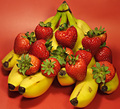
Strawberry Bananaby DigiFotoBuddyComment: Greeting from the critque club,
This is a very nice still life. I like the background color that matches the strawberries, and then the yellow of the bananas is there to contrast. It is a very visually interesting use of color. I like the overall 'shape' of the composition as a triangle. I think for this arrangement of fruit, a square crop with a symetrical composition was a very fitting choice.
A few things that I would suggest to improve it. I think the shadows cast in front of the banas are very distracting. The lighting in general is nice and even and the background is well lit, but the shadows should have been avoided by repositioning the lights.
I think it is just a little too closely cropped. I like the center, symetrical composition but I would like a little more breathing room around the edges. It feels a little cramped.
Although you list your aperature as F9, both ends of the bananas are out of focus. I think a little more DOF would have been better. It would be nice to have the whole thing sharp. Or, is you want shallow DOF, make it more deliberate in a way to add to the impact of the image. Here, I think the OOF parts detract.
Overall, I think this is a very nice image and meets the challenge wonderfully. I did not vote in this challenge, but I would have given this a 6.
If you have any questions, please feel free to pm me.
CHeers,
Liza |
| Photographer found comment helpful. |
| 05/26/2006 12:13:58 PM |
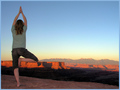
Successful Serenityby deepfrog17Comment: Very nice shot. I think maybe a slightly lower angle would have been better so that her knee clears the horizon. |
| Photographer found comment helpful. |
Home -
Challenges -
Community -
League -
Photos -
Cameras -
Lenses -
Learn -
Help -
Terms of Use -
Privacy -
Top ^
DPChallenge, and website content and design, Copyright © 2001-2025 Challenging Technologies, LLC.
All digital photo copyrights belong to the photographers and may not be used without permission.
Current Server Time: 08/04/2025 08:13:32 PM EDT.