| Image |
Comment |
| 09/05/2005 12:03:34 PM |
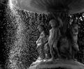
Underneath our Fountainby APComment: Nice photo. I'm not fond of the clarity of the statue tho. I find it has a soft or OoF feel to it. I really like the way you have stopped the water tho and think that is very well done. Good luck in this challenge. <6> |
 Photographer found comment helpful. Photographer found comment helpful. |
| 09/05/2005 11:42:34 AM |
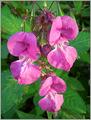
natures entryby p2jvrComment: The loss of detail would suggest the the slider was used to make the contrast higher rather then the camera. You can see what I'm refering to in the unopened flower buds just before the DoF get shallow. Good luck in this challenge. <4> |
| Photographer found comment helpful. |
| 09/05/2005 11:37:11 AM |
there is no grayby snowdogComment: To me the photo doesn't speak "high contrast". It is a well balanced photo and very pleasing to look at and one I would expect to see hanging on a wall. The hotspots from the above lighting are a little distracting with the reflection off the wooden pots. Good luck in this challenge. <5> |
| Photographer found comment helpful. |
| 09/05/2005 11:16:55 AM |
Red, white & blueby pacpintoComment: I find the subject in the photo lacks interest/subject. It is a nice macro shot but not one I'd hang on my wall. It does fit the challenge but fitting the challenge isn't everything. However it does have great clarity and the colors do POP. Good luck in this challenge. <5> |
| Photographer found comment helpful. |
| 09/05/2005 11:07:01 AM |
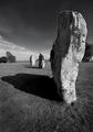
Megalithicby nordicComment: I usually like B&W photo but this one just doesn't do anything for me. I'm not sure if its the subject or the shadows but I'm not fond of it either way. I think it fits the challenge well. I figured out what it is... The positioning of the rock is distracting. The front one being more ground then sky and a little to close to the rock as well. It just gives an unbalanced feel to the photo. Actually that alone gives it more appeal. The rock in the middle also has a silohouette of a person standing there with a combatant stance. Well done and good luck in this challenge. <7> |
| Photographer found comment helpful. |
| 09/05/2005 10:55:28 AM |
Stone Windowsby hideoutComment: This photo has the appearance of being over post-processed. I find the contrast it definately high and it has beautiful colors but the focus is off. It could be because the contrast is to hi for the type of shot and IMO doesn't work in this challenge. The subject in the photo also lacks interest and I also find it very boring. There is also some noise or dirt in the top right hand corner of this photo. Good luck in this challenge. <4> |
| Photographer found comment helpful. |
| 08/24/2005 02:55:39 PM |
Autmn Abtract 2 dpc.jpgby BADDBOYY21Comment: I do like this shot and think it would make for an excellent calender shot. I find the darkness of the branch draws your eyes into the photo. well done. |
| Photographer found comment helpful. |
| 08/09/2005 09:40:45 AM |
|
| Photographer found comment helpful. |
| 08/09/2005 09:40:35 AM |
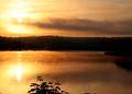
Misty Sunrise on the Lakeby marmalade1121Comment: Beautiful shot. I find if you decrease the brightness by _5 and increase the contrast by +5 you will see a little more silohouettes then what is shown. I also find it doesn't follow the rule of thirds very well even tho I kinda like the composition. I think the steam off the water is outstanding. |
| Photographer found comment helpful. |
| 08/07/2005 12:31:57 AM |
Night on the Townby JordanZComment: Looks like a nice place to hang out. Its to bad the sign wasn't fully lite tho. It's well composed with good coloring and level vertically. Well done and good luck in this challenge. <6> |
| Photographer found comment helpful. |
Home -
Challenges -
Community -
League -
Photos -
Cameras -
Lenses -
Learn -
Help -
Terms of Use -
Privacy -
Top ^
DPChallenge, and website content and design, Copyright © 2001-2025 Challenging Technologies, LLC.
All digital photo copyrights belong to the photographers and may not be used without permission.
Current Server Time: 08/01/2025 05:02:34 AM EDT.