| Image |
Comment |
| 01/20/2005 10:29:51 AM |
Reach for the topby cabaComment: An interesting picture to say the least but what are they??? I like it. I makes you think and I find that few and far between on this site. I am not fussy on the background being so dark but any more contrast would bring out the hotspot in the center. Well done and keep up the good work in 2005. <7> |
 Photographer found comment helpful. Photographer found comment helpful. |
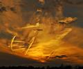
| 01/20/2005 07:58:10 AM |
sky on fireby jmritzComment: I think more trees and less sky would have had a greater appeal and would make for a more pleasing picture. I have similar shots to this taking from a moving car so I know how little thought goes into a shot like this. For abstract art i is neat but not really for this website, or at least in my opinion. |
| Photographer found comment helpful. |
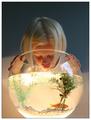
| 01/20/2005 07:48:55 AM |
give us a kissby arngrimurComment: An interesting shot but it does nothing for me. To me it says a kid looking into a fish bowl. However the shot is well compossed and outstanding clarity and contrast with vibrant colors. Best of luck and keep up the good work in 2005. Oh yea I also like the crop, centering and size. <7> |
| Photographer found comment helpful. |
| 01/20/2005 07:45:54 AM |
Clouded reflectionby NodeComment: Nice shot. I wish the boats on the right were a little brighter and the sun wasn't so centered. <7> |
| Photographer found comment helpful. |
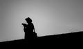
| 01/20/2005 07:37:40 AM |
Lone Rangerby helgihelgiComment: A tigter crop in my opinion would have made for a nicer appeal. I find there is to much wasted space and the nothing to look at other then a silhouette which makes for a fairly boring picture. I do however like te detail in the silhouette. |
| Photographer found comment helpful. |
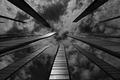
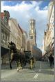
| 01/20/2005 07:33:47 AM |
Stepping Backby muur88Comment: What an odd angle. was this shot wish a fish eye lens? It looks kinda crooked which is kinda distracting but also kinda cool. It looks so fictional. well done and keep up the god work in 2005. <8> |
| Photographer found comment helpful. |
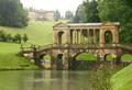
| 01/20/2005 07:30:47 AM |
Palladian Bridgeby photogooComment: Very nice photo except for the haze effect. I find it is washing out to much of the picture. Have you ever tried shoot thru a polarized lens? maybe this would reduce the haze. The photo also appears to be a tad on the blurry side or not as crisp as I think it should be. Beautiful shot tho. |
| Photographer found comment helpful. |
| 01/20/2005 02:44:46 AM |
American Psychoby rmtm333Comment: altho I didn't vote I find the image to be a little to dark and the crop to be a little to wide. I also find the blurr on the knife to be very distracting. The mouth on the face is also OOF. Actually the whole face is. I probably would have given this image a 4 as well. |
| Photographer found comment helpful. |
| 01/19/2005 10:47:18 AM |
Praying at the Altarby photomComment: great title for this photo. I don't usually see a match between titles and photo's but this one is really goes well. Great colors and clarity. Good job and keep up the good work in 2005 |
| Photographer found comment helpful. |
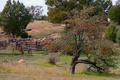
| 01/19/2005 10:41:20 AM |
Home on the rangeby pumaComment: I took a very similar shot when I was in the country for a drive and found it to lack subject and interest. I find these shots to look more snapshotish and not as planned. Maybe a selective desaturation would have improved this shot for my vote but not as it is. It is very sharp and the apples stand out but other then that, thats it. Keep trying and don't get discouraged by what others think. |
| Photographer found comment helpful. |
Home -
Challenges -
Community -
League -
Photos -
Cameras -
Lenses -
Learn -
Help -
Terms of Use -
Privacy -
Top ^
DPChallenge, and website content and design, Copyright © 2001-2025 Challenging Technologies, LLC.
All digital photo copyrights belong to the photographers and may not be used without permission.
Current Server Time: 08/07/2025 07:38:50 PM EDT.