| Image |
Comment |
| 07/05/2004 08:25:23 AM |
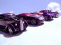
My Dream Collectionby timganierComment: Bottom right of the foreground is overexposed but adds strong contrast to the dark cars. Perhaps diffusing the light would've given softer highlights. Nice DOF but I would've liked to see the closest car (far left) in focus. Car 2nd from left seems to be the focus of your picture, regardless of the cars surrounding it. |
 Photographer found comment helpful. Photographer found comment helpful. |
| 07/05/2004 08:19:57 AM |
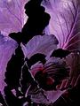
Purple is soooooo smooooooooothby PioneerComment: Certainly fits the challenge. I myself contemplated on photographing the same subject but opted not to.
Focus of your image feels a little soft. Background is also distracting and the slanted angle of the box is not effective as the image is too tightly cropped. |
| Photographer found comment helpful. |
| 07/05/2004 08:17:26 AM |
Purple Ballby AlexysComment: I notice some purple fringing but I suppose that's acceptable for this challenge ;)
Would've liked to see a bit wider angle and not so tightly cropped so the viewer could get some perspective or sense of proportion or scale of the image. |
| Photographer found comment helpful. |
| 07/05/2004 08:15:33 AM |
Sky Flowerby karmatComment: Seems a tad overexposed and oversharpened although that could be the effect of resizing. |
| Photographer found comment helpful. |
| 07/05/2004 08:14:14 AM |
shades of itby jjbeguinComment: Strong contrast and interesting use of negative space. I'm wondering how processed this image is as the reddish areas seem grainy and blown out. |
| Photographer found comment helpful. |
| 07/05/2004 08:12:24 AM |
Purple Fusionby C-town driverComment: Nice idea but the image is cropped a little too tightly, especially on the left side. I'm also wondering why the purple bottle has bits of green in it? Personally, I would've gotten lower in the shot and gave it more perspective, rather than shooting overhead but that could be personal preference. |
| Photographer found comment helpful. |
| 07/05/2004 08:09:58 AM |
Define Purpleby NeuferlandComment: This certainly suggests or depicts purple! Any reason the composition is not centered and slightly to the left? Also, I'm not sure if I like the layout of the bottom 2 swatches (single color cards). Would have been nice to have a consistent pattern. |
| Photographer found comment helpful. |
| 06/28/2004 06:44:56 AM |
Summer at the Farm by L1Comment: This is damn near flawless, I'm shocked that it received 11 votes under 5! Congrats Laurie, this is indeed one of my favorites :) |
| Photographer found comment helpful. |
| 06/27/2004 07:20:28 AM |
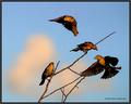
Gatheringby pitsamanComment: Looks like a painting. Whatever you did to it, me likes the effect!
One suggestion though, the bird at the top seems a bit out of place. I'd select him and bring him down a tad closer to his buddies. Experiment and find the best placement for him. You could even try mirroring him and placing him somewhere lower to the left to balance the composition. |
| Photographer found comment helpful. |
| 06/26/2004 06:21:59 AM |
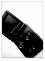
Onyx SPby HavokComment: Interesting composition but the contrast is a bit harsh as the bottom half of the gameboy almost disappears into the shadow. Not sure I would've cropped that much off the sides as well (specifically the left), especially if this were for an advertisement. |
| Photographer found comment helpful. |
Home -
Challenges -
Community -
League -
Photos -
Cameras -
Lenses -
Learn -
Help -
Terms of Use -
Privacy -
Top ^
DPChallenge, and website content and design, Copyright © 2001-2025 Challenging Technologies, LLC.
All digital photo copyrights belong to the photographers and may not be used without permission.
Current Server Time: 08/23/2025 01:59:11 PM EDT.