| Image |
Comment |
| 07/25/2005 07:54:40 AM |
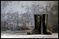
Faithful Servantsby NazgulComment: wonerful backdrop for these two weathered boots... placement in the frame works well -- one of my ribbon picks |
 Photographer found comment helpful. Photographer found comment helpful. |
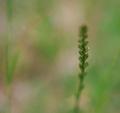
| 07/25/2005 07:53:37 AM |
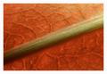
Stem and Leafby JackoComment: lovely tones and composition - border is a bit too wide and white has it stand out too much imho - one of my ribbon picks |
| Photographer found comment helpful. |
| 07/13/2005 10:19:20 AM |
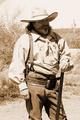
Cactus Jackby tfaustComment: Ingrid's right on the exposure aspects. I'd like to see the whole image burned a bit even if the face goes way dark -- could work as an "every-cowbow" study. The sepia is a great choice as it adds to the mood (old western). |
| Photographer found comment helpful. |
| 07/13/2005 10:15:58 AM |
Retiredby tfaustComment: B/W Club:
I second all of Ron's comments! This is fine "fill the frame" shot and a good use of B&W that brings out form, texture, etc. |
| Photographer found comment helpful. |
| 07/11/2005 03:37:55 PM |
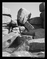
The Thinkerby KaveyComment: B/W Club!
Can't add much more than Rob's comments. The vacant, gray sky feels like a void with all the angular forms and frame-filling detail. Maybe it is the thick, black border that's highlight that for me?? I find the shadows and their play amongst the rocks to be very interesting -- b&w strengthens that element. |
| Photographer found comment helpful. |
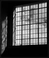
| 07/11/2005 03:32:34 PM |
Old Panesby KaveyComment: B/W Club!
(ignoring all the great elements of this shot - compostion, artistic feel, etc. in favor of B&W focus) :)
This shot really works in B&W - it keeps it simple. The lack of color forces the attention on the light (isn't that one of the best things about windows) and shadows. The boost of contrast drops a bit of detail in favor of cleaner lines between the shapes further highlighting the geometric and architechtural quality in the shot. |
| Photographer found comment helpful. |
| 07/11/2005 03:25:35 PM |
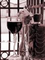
Intimate Settingby aboutimageComment: B/W Club!
The rosy dual tone highlights the element that "normally" is that color (e.g. the wine in this case) and give the shot a bit of a romantic feel. I'm wondering if rose/red/pink does that in general to shots. I like the light and dark tonal variety in the main elements. I'm wondering if you played around with the contrast (you notes don't mention that you did) and what effect did it have? |
| Photographer found comment helpful. |
| 07/11/2005 03:18:26 PM |
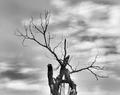
Deadwoodby TruegshtComment: B/W Mentor Group:
Full range of tones so I don't miss the color in the shot. I'm wanting to get closer to the "deadwood" and somehow I connect this with the B&W treatment. It's as if I'm wanting to see more of the tree detail? Maybe it's because the light gray sky is blurry and the tree is the main subject according to the title? I find the dark and light sky a standout - defineatly a powerful element in the shot. |
| Photographer found comment helpful. |
| 07/11/2005 03:13:09 PM |
It just breaks your heart....by TruegshtComment: B/W Mentor Group:
(I'm going to ignore the cute model, composition, dof in favor of B&W aspects) :)
I would agree with Kavey that the shot is overall dark with no punch - no pure black or white. No strong separation of subjects and areas of the photo - gives a blended, cloudy feel. I think this is what leads me to feel no drama or draw to the photo. |
| Photographer found comment helpful. |
| 07/10/2005 04:55:55 PM |
Meadowby hvauxComment: like a cool walk in a meadow on a summer's day -- one of my ribbon picks |
| Photographer found comment helpful. |
Home -
Challenges -
Community -
League -
Photos -
Cameras -
Lenses -
Learn -
Help -
Terms of Use -
Privacy -
Top ^
DPChallenge, and website content and design, Copyright © 2001-2025 Challenging Technologies, LLC.
All digital photo copyrights belong to the photographers and may not be used without permission.
Current Server Time: 08/14/2025 01:50:16 PM EDT.