| Image |
Comment |
| 01/03/2004 04:49:10 PM |
|
 Photographer found comment helpful. Photographer found comment helpful. |
| 01/03/2004 04:48:43 PM |
|
| Photographer found comment helpful. |
| 01/03/2004 04:48:14 PM |
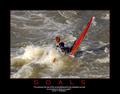
Celebrate life by timmiComment: WOW. The tryptic is creative, quote is moving and ties in well with the photo - nice job! 9 |
| Photographer found comment helpful. |
| 01/03/2004 04:47:54 PM |
|
| Photographer found comment helpful. |
| 01/03/2004 04:47:36 PM |
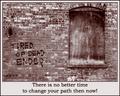
Tired of Dead Ends?by TooCoolComment: This one works well. The monochrome sends the "dead end" message along with the text. I think I would have liked this in Portrait vs. landscape. 9 |
| Photographer found comment helpful. |
| 01/03/2004 04:47:07 PM |
Be Yourselfby EddyGComment: One of the best. The type set for the title is the best. B&W images ties to the quote and the monocromatic layout gives equal weight to both the quote and the image. Sorry , no suggestions to improve! 10 |
| Photographer found comment helpful. |
| 01/03/2004 04:46:31 PM |
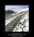
Determinationby agwrightComment: You got this one right! Bold frame sets off the photo. Only suggestion - I would have done something different with the title (all caps, different font?) since you use the word in the quote it needs to stand out a bit more. 10 |
| Photographer found comment helpful. |
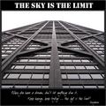
| 01/03/2004 04:45:08 PM |
Sky is the Limitby flip89Comment: Overall composition is very "poster" (a good thing) - I like the quote and the way you've chosen to display it. THe title font isn't complimentary to the quote or the poster IMO. I would like to see a more interesting sky (given sky is the motivation here) |
| Photographer found comment helpful. |
| 01/03/2004 04:40:30 PM |
|
| Photographer found comment helpful. |
| 01/03/2004 04:38:14 PM |
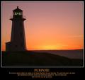
Imaginationby magnetic9999Comment: Excellent composition, photo nicely done but doesn't have a clear connection to the title/quote. |
| Photographer found comment helpful. |
Home -
Challenges -
Community -
League -
Photos -
Cameras -
Lenses -
Learn -
Help -
Terms of Use -
Privacy -
Top ^
DPChallenge, and website content and design, Copyright © 2001-2025 Challenging Technologies, LLC.
All digital photo copyrights belong to the photographers and may not be used without permission.
Current Server Time: 08/04/2025 04:34:45 PM EDT.