| Image |
Comment |
| 05/01/2007 06:10:13 PM |
Feline Fineby RompyComment: punchy tones and quirky composition -- one of my favorites this challenge |
 Photographer found comment helpful. Photographer found comment helpful. |
| 05/01/2007 06:08:34 PM |
Calmby StructorComment: dramatic sky and a subtle use of the "rule" - -- one of my favorites this challenge |
| Photographer found comment helpful. |
| 05/01/2007 06:07:43 PM |
Low Tideby wildirisComment: an interesting take on the rule - the silhouetted elements work well -- one of my favorites this challenge |
| Photographer found comment helpful. |
| 05/01/2007 06:06:41 PM |
California Sunshineby tinky2Comment: beautiful complimentary colors - like the dual rule (of thirds) -- one of my ribbon picks |
| Photographer found comment helpful. |
| 05/01/2007 06:05:44 PM |
|
| Photographer found comment helpful. |
| 04/30/2007 02:30:23 PM |
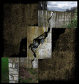
Crack'dby posthumousComment: this is an excellent example of montaged images with a clear theme - It's creative and powerful - tones and colors are interesting. Problem is I'm not sure how the triptych ties in |
| Photographer found comment helpful. |
| 04/30/2007 09:56:46 AM |
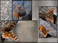
Bouquetby SJCarterComment: really like your use of the frames to highlight parts of the photo - well done |
| Photographer found comment helpful. |
| 04/30/2007 09:56:14 AM |
~*Life*~by KrystleComment: creative use of the three photos - extra points for the layout |
| Photographer found comment helpful. |
| 04/30/2007 09:54:24 AM |
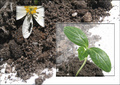
Signs of Springby ivale28Comment: this is a very creative take on the three photos - extra points from me for thinking this montage up. |
| Photographer found comment helpful. |
| 04/29/2007 11:11:01 AM |
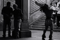
Thoth in Central Parkby samhallComment: there's a lot working together in this B&W - the light/dark areas create a great tension that pulls my eye into exploring the frame - don't mind the chopped foot of the performer or the cut off person far right, really like the two men talking on left - - one of my favorites this challenge. I am not really a "get out the ruler" on the topic but that's what keeps this one from being one of my ribbon picks - you make great use of the vertical thirds -- better than most -- but the interection points of the horizontal and vertical grid don't hold any interest for me and that keeps this one a bit shy in this contest. (sorry for the long explanation but I really like this one and was torn -- BOL) |
| Photographer found comment helpful. |
Home -
Challenges -
Community -
League -
Photos -
Cameras -
Lenses -
Learn -
Help -
Terms of Use -
Privacy -
Top ^
DPChallenge, and website content and design, Copyright © 2001-2025 Challenging Technologies, LLC.
All digital photo copyrights belong to the photographers and may not be used without permission.
Current Server Time: 08/01/2025 11:02:27 PM EDT.