| Image |
Comment |
| 05/24/2004 03:26:01 PM |
Something to Eat between Classesby tyt2000Comment: really like your use of blue to set off the yellow subject. interesting composition (would like a bit more room above the subject's head) One of my ribbon picks. |
 Photographer found comment helpful. Photographer found comment helpful. |
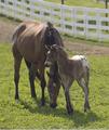
| 05/20/2004 09:49:22 PM |
Mother's Loveby shkelly587Comment: Hi Sharon,
Greetings from the Critique Club...
Congrat on your best score to date!
You've emphasised the "new" here in your fine shot. Reading the comments I have to agree that in terms of composition, you've told a great story with the position of your two subjects. You have the basis of a shot that would benefit from a bit of post-processing.
I would agree with many of your commenters about boosting the contrast to remove the hazy aspects. I would add that the fence, while it adds a "touch of the farm" is too bright and competes for my attention. Dulling or blurring this element even more than it already is would force my eye to stay on your sweet scene.
I look forward to more of your lovely countryside as seen by your photographic eye.
If you have any questions, feel free to pm me.
Regards,
Theresa |
| Photographer found comment helpful. |
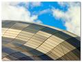
| 05/20/2004 09:41:44 PM |
Shapely Sageby osramComment: Paul,
Greetings from the Critique Club (and welcome to competition -- your first photo for Something New II)
I like your composition - the placement of the main subject (building) at an angle gives the shot an abstract quality (that several other comments seemed to like as well). I agree that the sky seems to detract. I think that it's a fine sky but doesn't "go" with the muted tones and geometric shapes so my eye fights back and forth from building to sky. A flatter sky (adjusted in post processing) may have provided a more neutral backdrop.
The lines that cross at the diagonals are distracting as they distrupt the curves and patterns you created in the rest of the shot. These curves and patterns are well done and the way the light changes the colors on them give the shot extra interest.
We all look forward to more of your work.
Please pm me if you have any questions on my comments
Regards,
Theresa
|
| Photographer found comment helpful. |
| 05/18/2004 07:16:15 PM |
May the implements of slavery rust to pieces!by fulcrumComment: Hi James,
Nice showing with your first entry -- welcome! (in case you don't know -- marking "helpful" the comments you received during the challenge that were helpful is a way of aknowledging those that took the time.)
I don't have much to add to the comments below -- I'll just highlight the ones that are true for me. The lighting, while harsh, gives the edge to the composition and let's it match your title (without this the title is contrived and without anchor in the frame)
The color and macro approach let me get close to the subject to study what you saw in it. The elements are complex enough to hold my interest and connected enough to paint a cohesive picture. I tried the shot in landscape format and wonder if it improves the composition?
All in all an excellent entry.
If you have any questions, feel free to pm me.
Regards,
Theresa |
| Photographer found comment helpful. |
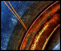
| 05/18/2004 07:03:06 PM |
Rusty Rainbowby larrylefComment: Hi Larry,
Greetings from the Critique Club... (I see you've made no comments on others' shots yet have asked for a critique on a shot with 25+ comments -- may I recommend you offer your perspective to others and comment? It's a great way to say "Thanks")
First I must confess I like abstract stuff and this fits that category very well.
The strengths of this shot are the colors (artistic mix of bold chromatic tones), the curves (creating the interest in the composition - placement in the frame is right on) and the soft focus (give it more of an abstract feel and softens the colors to blend into each other)
As for the needle elements -- I see they drove some folks nuts -- I happen to like their addition (thought it would be a fine shot without them) You've placed them in a way that breaks the curved lines and punches through the blue with the "opposite" orange color disturbing the symetry and creating a tension in what would otherwise be a "colorful tire shot"
I also think your border works as it is the same color and width as the rim that divides the red/orange area from the thin curves thus tieing it into the photo in an interesting way. The square format compliments the "modern art" feel.
If you have any questions on my comments, feel free to pm me.
Regards,
Theresa
|
| Photographer found comment helpful. |
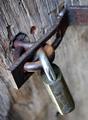
| 05/17/2004 09:23:57 PM |
Timeworn...by jmleliiComment: Hi Jeremy,
Greetings from the Critique Club...
Congrats on a new personal best with this shot.
You have composed an interesting shot here. You've used dof very well to isolate your main subjects against a pleasantly blurred background. I also like how the top part of the hinge is oof and the part connected to the lock is crisp. I helps pull my eye through the shot as does the angle of the elements.
I agree that the hot spot detracts a bit.
The blues and grays make a subtle color statement that completes the overall effect.
To make it a bit better? I think playing around with the location and angle of the light might add some punch to the rust tones and bring out some interesting shadows without interfering with your existing colors. The flat lighting, while effective, doesn't add depth or interest.
I hope you found my comments helpful. Please pm me if you have questions.
Regards,
Theresa |
| Photographer found comment helpful. |
| 05/17/2004 07:03:20 PM |
|
| Photographer found comment helpful. |
| 05/17/2004 06:59:19 PM |
|
| Photographer found comment helpful. |
| 05/17/2004 04:16:21 PM |
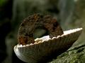
Cairn of entropyby StaralfurComment: Hi Mark,
Greeting from the Critique Club...
Congrats on your first entry and Welcome!
I feel your entry has a unique composition -- the tenuousness of the main subject creates a great tension in the shot. You have used out-of-focus areas (green foreground and background) to set your subject(s) agains well. The predominately green tones also set your subject(s) apart.
The washer would be a stronger subject if lit to stand out more from the background (not a lot but just a bit more). The shell isn't background but rather a key element so it needs space under the shell to avoid a chopped-off feel.
Please e-mail me with any questions you have on my comments.
Regards,
Theresa |
| Photographer found comment helpful. |
| 05/17/2004 03:31:35 PM |
Rusted But Still Trustedby ShakeyComment: Hi Tim,
Greetings from the Critique Club...
Congrats on your best showing to date with the shot. As I read the comments, I don't have too much to add.
If you were going for a purely "product" shot, I would agree that there are a few technical problems (dof and lighting) that detract a bit from it. The pure white background and simple - square on composition are sending the message that maybe that's what this shot is meant to be and so folks have an expectation that the other elements need to be there.
The oof red in the handles adds a bit of punch to the shot and the in-your-face angle give the shot its interest (I'd like the tips to be more in focus). I would fix the rotation so that it's level. The symetry of the subject's placement call for a squarer frame and a dead center placement.
Please contact me if you have any questions on my comments.
Regards,
Theresa |
| Photographer found comment helpful. |
Home -
Challenges -
Community -
League -
Photos -
Cameras -
Lenses -
Learn -
Help -
Terms of Use -
Privacy -
Top ^
DPChallenge, and website content and design, Copyright © 2001-2025 Challenging Technologies, LLC.
All digital photo copyrights belong to the photographers and may not be used without permission.
Current Server Time: 08/21/2025 11:00:10 PM EDT.