| Image |
Comment |
| 06/30/2004 02:26:19 AM |
|
 Photographer found comment helpful. Photographer found comment helpful. |
| 11/11/2003 10:36:15 PM |
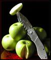
Sink Your Teeth Inby vonautschComment: Great pic. I'll elaborate about what I like and don't like. This is a very intersting concept and very well executed except for the shadows. In my opinion, they crowd the shot too much, and they definitely make weird designs that detract the viewer's attention from the knife. Also, this photo doesn't need that red dish (? i think it's a dish) at all. Zoom in, crop things out, and be bold with your statement of green, silver, and black. |
| Photographer found comment helpful. |
| 11/11/2003 10:31:37 PM |
Narcissistic Potato Masherby QuadrajetComment: Excellent example of still life, but it's just nowhere as good as some of the others. I would try to think more about what the challenge will mean to different people, and then think about what it will mean to you. This would probably be excellent for another challenge, just not this one. |
| Photographer found comment helpful. |
| 11/11/2003 10:27:44 PM |
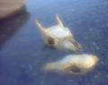
Predator and prey (deer and coyote) skulls in waterby WhidbeyPixComment: Way too blurry for it's own good. The thing about bone and skulls is that they have a texture all their own. I usually like seeing skulls photographed in black and white because it gives them this bleached, dry personality. But yours are wet. Fine. I just don't get what you were trying to accomplish with the blur...as a viewer, I'm confused. That shouldn't happen. |
| Photographer found comment helpful. |
| 11/11/2003 10:24:49 PM |
Just Add Breathby KoriyamaComment: I'm not sure why I gave this a four. I think I didn't like the black background at first. I look at it now and see that it's full of detail. It would have been better had you zoomed in more, and possibly projected the notes onto the flute. I don't know, maybe you did that, but it's not apparent. You get a 6. |
| Photographer found comment helpful. |
| 11/11/2003 02:25:37 PM |
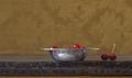
Cherriesby Sheila_LawsonComment: Very simple, very rustic, but that's about it. This isn't the type of beauty that wins these contests. In order to win, I'd ditch the minimal motif and get in close to your subject. Show us the velvetty texture of the cherries against the brushed metal of the dish. |
| Photographer found comment helpful. |
| 11/11/2003 02:23:53 PM |
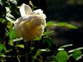
Shadowed Roseby banmornComment: Too much shadow if you ask me (and you are asking me, aren't you?) Good focus, though. That's something that a lot of people need to work on. You've obviously got a good grasp on it. |
| Photographer found comment helpful. |
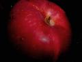
| 11/11/2003 02:22:23 PM |
Juicy appleby mecfcostaComment: It's very juicy, but it's very boring. Work to spice your photography up. |
| Photographer found comment helpful. |
| 11/11/2003 02:21:52 PM |
Tool Kitby agwrightComment: This looks like an ad for a leatherman...but beyond that, you started the ball rolling by making this still image full of action. Now, find a better background. Metal always looks good on even more weathered metal. But you have to be careful not to conflict colors and patterns. You might have kept this same setup, but taken the picture in b&w, merely because this background DOES have texture. B&W would have exploited that texture. |
| Photographer found comment helpful. |
| 11/11/2003 02:19:21 PM |
Dusty Guitarby JBosieComment: I don't see any dust. I see excellent use of shapes and perspective, however. |
| Photographer found comment helpful. |
Home -
Challenges -
Community -
League -
Photos -
Cameras -
Lenses -
Learn -
Help -
Terms of Use -
Privacy -
Top ^
DPChallenge, and website content and design, Copyright © 2001-2025 Challenging Technologies, LLC.
All digital photo copyrights belong to the photographers and may not be used without permission.
Current Server Time: 08/17/2025 02:30:04 PM EDT.