| Image |
Comment |
| 07/16/2012 08:36:10 PM |
Staying independent by jagarComment: This is almost exactly the shot I wanted to do for this challenge, but didn't get around to taking it. So clearly I like the concept. The lighting and processing also are on a different level than your competition. Based on the entries I've seen so far, it would be SHOCKING if this did not ribbon! Very well done. For the technical details as well as the emotion...I'm giving this a perfect 10 |
 Photographer found comment helpful. Photographer found comment helpful. |
| 07/16/2012 08:28:31 PM |
I Believe I Can Flyby fngood83Comment: This is adorable. The clean lines with the single non subject object works very well. The processing however I think could have been a bit better. A little bit more on the bottom end of the histogram would have really helped, and the colors could use a little work... but compared to most of the other entries I've seen so far, this is fine art! lol Good job overall, you got a 7 from me :) |
| Photographer found comment helpful. |
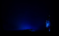
| 07/16/2012 08:19:29 PM |
My Country, 'Tis of Theeby ThatTroySmithComment: Your concept is strong, as is the perspective, the sky, and the focus... but my favorite thing is the lighting on the building. The slow fade works really well and is very dramatic. The only thing that I think is wrong with this image is the horizon line. Looks like it could use a few degrees tilt clockwise. And I think it would have been really cool to find a way to accentuate the sun flare. I think the people that notice the sun shining on the flag will score this a few points higher than the people who don't. I'm giving it an 8. Very well done. |
| Photographer found comment helpful. |
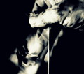
| 07/16/2012 07:53:06 PM |
American Beautyby elizadebComment: Not a big fan of the processing in this. The white vignette, the highlights in her hair clipping, the extra striped hoola-hoop at the bottom is a bit distracting, as is the thing in the top left corner and the pair of legs just above her head. I think cropping those things out would have made this a much stronger and more focused image. Cute moment captured however, keep at it! |
| Photographer found comment helpful. |
| 07/16/2012 07:46:42 PM |
Free as the Windby JuliBocComment: A bit more blurry than I would like. Also not a big fan of the color choices in post. A wider shot, or having the subject look at the camera I think are a couple ways to have more of an impact. |
| Photographer found comment helpful. |
| 07/16/2012 07:44:02 PM |
The Shot Heard 'Round the World by vawendyComment: My favorite so far. Absolutely love how you captured the smoke cloud, especially by his hat. I may have desaturated his face a bit as it seems a bit red and it would bring more impact to the other colors. But a good concept, and well executed. |
| Photographer found comment helpful. |
| 07/09/2012 05:00:17 PM |
Glass Through Glassby craigdmComment: Really wanted to like this. I definitely like the very dark/low key feel to it. I'm afraid it's just too dark to make out much. |
| Photographer found comment helpful. |
| 07/09/2012 04:57:27 PM |
in the lookingglassby cutoutComment: This is a superb image. Probably my favorite I've seen in this "genre" in quite a long time. Well done! |
| Photographer found comment helpful. |
| 07/09/2012 04:56:15 PM |
|
| Photographer found comment helpful. |
| 07/09/2012 04:50:45 PM |
A Game of Two Halvesby eyestrangeComment: Was a little torn on this one. It's not quite low key it seems, so maybe could have used a slight adjustment to pure white (maybe 244ish?) to give it a bit more pop. Nice use of shadows, blacks are very nice and I love the focus. A cool image for sure, I scored it a 7. :) |
| Photographer found comment helpful. |
Home -
Challenges -
Community -
League -
Photos -
Cameras -
Lenses -
Learn -
Help -
Terms of Use -
Privacy -
Top ^
DPChallenge, and website content and design, Copyright © 2001-2025 Challenging Technologies, LLC.
All digital photo copyrights belong to the photographers and may not be used without permission.
Current Server Time: 08/20/2025 12:56:42 PM EDT.