| Image |
Comment |
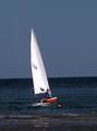
| 09/05/2005 01:23:15 PM |
Sail awayby stupotComment: wish you had changed the color balance the sky would be cooler blue, instead of grayish blue. I might have cloned out the person in the water, they take away from the feeling of islolated journey you could have portrayed quite well. |
 Photographer found comment helpful. Photographer found comment helpful. |
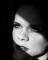
| 09/05/2005 01:19:57 PM |
Waiting For Youby mandyturnerComment: good idea. personally, i don't think you went far enough...i would have gone with everything black except the strip of light. you would have had to move the lips more into the light so they weren't cut in half. the dodging on the shoulder is a bit harsh. sorry for being critical. |
| Photographer found comment helpful. |
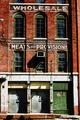
| 09/05/2005 01:12:28 PM |
Train Yard Storiesby KaDiComment: there's alot to like in this shot. the high contrast definitely helps add to the mood. you're going to hear that you should have slightly rotated ccw and adjusted the skew at the top so that shadow line on the right was more parallel. |
| Photographer found comment helpful. |
| 09/05/2005 10:39:30 AM |
Out of the Darkby thomaspeopleComment: i think you were on the right track ;) but your blacks needed to be more black. also your foreground looks strangely smudged or blurred...though i can't figure out why. |
| Photographer found comment helpful. |
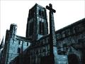
| 09/05/2005 10:35:26 AM |
Durham Cathedralby fredandaudComment: really like the shadow line you found and how your pic is very well balance between light and darker areas. also really like your choice for post-process. i only wish the cross better complimented the smaller tower, as it competes with and is very close to the larger one...perhaps that kind of angle wasn't possible |
| Photographer found comment helpful. |
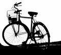
| 09/05/2005 01:30:12 AM |
Bikeby charmayneComment: great angle and detail. i so wish you had chosen not to leave the water bottle in the basket. nothing places meback in reality like a water bottle or a cel lphone...sorry. nice pic none the less. |
| Photographer found comment helpful. |
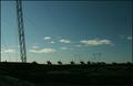
| 09/05/2005 01:22:14 AM |
Dawnby DufusComment: stunning view. unless you were shooting for the radisson i would have just worried about the top half of the pic. perhaps you were going for the contrast of nature and man...but i don't think it was fair to downplay nature in this case. |
| Photographer found comment helpful. |
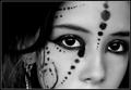
| 09/04/2005 09:50:06 PM |
d o t s -&- l i n e sby annahComment: nice detail. editing your neat image copy on another layer in your photo editor and erasing around the eyebrows, tip of the nose, and some of the paint would really help remove the overly doll like appearance and improve your score...if you care about that. |
| Photographer found comment helpful. |
| 09/04/2005 09:42:08 PM |
Dark & lightby StructorComment: your scene is very interesting, though probably more so without the foreground column. more of a zoom on what currently is the focus of the shot and a bit more saturation to accentuate the blue sky and green grass would have made for a very intriguing pic in my opinion |
| Photographer found comment helpful. |
| 09/04/2005 09:18:44 PM |
Dumb & Lazyby LadeeMComment: i really like your choice of contrasting background...though i wish you used it more compellingly. I'm sure it was unintended but your shot needs a window because pc just got thrown out of it. |
| Photographer found comment helpful. |
Home -
Challenges -
Community -
League -
Photos -
Cameras -
Lenses -
Learn -
Help -
Terms of Use -
Privacy -
Top ^
DPChallenge, and website content and design, Copyright © 2001-2025 Challenging Technologies, LLC.
All digital photo copyrights belong to the photographers and may not be used without permission.
Current Server Time: 08/05/2025 10:06:17 PM EDT.