| Image |
Comment |
| 11/18/2003 02:06:44 AM |
The Red and The Blackby MichaelsComment: Very nice.... I like this one... Feels like spinning around when the surroundings cease almost to exist. Well done! |
 Photographer found comment helpful. Photographer found comment helpful. |
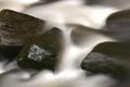
| 11/16/2003 12:35:11 PM |
Time can smooth all rough spotsby joannadivaComment: Greetings from The Critique Club
Water flowing past rocks... Good subject for the challenge. It has an infinite continuity.
I like the contrast between the softened water, like a smooth white fabric and the sharply focused stone in the left. I think that in general, the blurred water is loosing most of its charm, but here it works just fine as a replacement of flowing time.
I would say that a bit faster shutter speed would have prevent the apparition of the blown out spot on the water surface. Also, I would have tried to insert in the composition something to stand out a bit more, to add more drama.
Is still a good picture and I want to congratulate you on the very good finish. Keep up the good work!
Message edited by author 2003-11-16 21:04:35. |
| Photographer found comment helpful. |
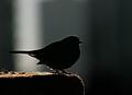
| 11/14/2003 08:09:12 PM |
A Little Bird Told Me by Ana Maria Machadoby ellamayComment: Very nice feeling to it. I like the lighting also. Nice coloured background. A wee bit noisy though. But this is the price to pay for taking a picture in such a low light I suppose. Good work! 9 |
| Photographer found comment helpful. |
| 11/14/2003 08:02:30 PM |
In A Lighter Veinby MWittComment: Very nice detail of the leaf, good lighting and also good use of the negativ space. The black background enhances the colours of the leaf and makes it pop out more. 10 |
| Photographer found comment helpful. |
| 11/14/2003 07:56:13 PM |
"Same Time, Next Year" - a romantic comedyby jefalkComment: The picture looks great, clear and crisp. Composition looks very good but I am not sure I want to see a shadow of each page for a whole year. In painting and drawing there is a rule that says: "Few is more". Sometimes is better to follow some rules anyway. But, your picture looks good so will get a 9. |
| Photographer found comment helpful. |
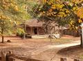
| 11/14/2003 07:50:04 PM |
Little House in the Big Woodsby croutonComment: I wish I could have seen it better. Looks too small to me and probably was rated low because of this. The photo is pretty as a picture though and the colours are so warm and pleasantly related. Had it been bigger would have been one of the favourites around. I will give it a 7. |
| Photographer found comment helpful. |
| 11/14/2003 07:46:50 PM |
|
| Photographer found comment helpful. |
| 11/14/2003 07:45:24 PM |
Cool Cocktailsby EddyGComment: My daughter watched me voting and when she so this one she said: "This looks nice! Cool!".So here you have two comments in one. It does look nice. The colours used makes it appealing. The lighting is good and the focus soft and nice. I see what you've tried to create here, that sort of optical illusion which is not stiking but does exist if someone takes the trouble of looking deep enough in order to try and understand the composition and determine which glasses are in foreground and which in background. I hope my english didn't make what I wanted to say too unclear. Gook luck with it and 10 from me. I will see it again somewhere among the first ones. |
| Photographer found comment helpful. |
| 11/14/2003 02:42:59 PM |
Message in a Bottleby SharonSComment: Excellent composition and great ideea. I like the net and the warm tones do just fine but their elegance is a wee bit on the dull side. Maybe you should have had a spot of colour somewhere. But I still like it enough as to give it a 10 |
| Photographer found comment helpful. |
| 11/14/2003 02:39:20 PM |
The Fellowship of the Ringby ColeyComment: Very good picture, I like the warm tones of the hand and gold against the black background. But after the competition you would want to remove that distracting piece of skin on the finger. 8 |
| Photographer found comment helpful. |
Home -
Challenges -
Community -
League -
Photos -
Cameras -
Lenses -
Learn -
Help -
Terms of Use -
Privacy -
Top ^
DPChallenge, and website content and design, Copyright © 2001-2025 Challenging Technologies, LLC.
All digital photo copyrights belong to the photographers and may not be used without permission.
Current Server Time: 08/19/2025 05:18:29 PM EDT.