| Image |
Comment |
| 01/08/2005 10:18:07 PM |
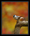
Autumn-Nuthatch.jpgby rscorpComment: A really terrific shot! Birds are hard to catch (for me, anyway). Not only did you catch him, he's very clear. I just love the dof and the watercolor look of the background. I think this is bokeh. :-) Well done. |
 Photographer found comment helpful. Photographer found comment helpful. |
| 01/08/2005 09:59:05 PM |
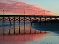
pier at sunsetby wkmenComment: I like this one alot. I have a thing for piers. :-) I love the sunset, the colors are right on and pretty. The reflection you caught in the wet sand is very nice. Good silhouette of the pier. I like all of the lines and the little people on the top. This one does appear to be leaning a teeny bit to the right...by looks of the lamp posts. This and the wildflowers are my favorites. Good work. |
| Photographer found comment helpful. |
| 01/08/2005 09:56:55 PM |
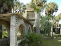
estate courtyardby wkmenComment: I'm also not too crazy for this one for reasons already mentioned and because the sky seems a bit blown out. Also, just looking at your notes and I see you used f/2.8. This appears to be a bright day with harsh sun. Perhaps using a smaller aperture would have prevented some of the loss in colors. Also, a smaller aperture would have kept the entire image in focus. Now, as we go into the image, things get out of focus. |
| Photographer found comment helpful. |
| 01/08/2005 09:53:38 PM |
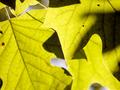
backlit leavesby wkmenComment: Nice backlighting and shapes. I think I would prefer all of the these to be in focus, though. |
| Photographer found comment helpful. |
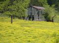
| 01/08/2005 09:53:05 PM |
old barn and buttercupsby wkmenComment: Other than the blurry bit in the bottom right, I don't think I would change anything. I quite like this one. The bright, pretty flowers contrast nicely against the monotone barn. Nice shot. |
| Photographer found comment helpful. |
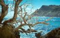
| 01/08/2005 09:51:05 PM |
life's ebb & flowby wkmenComment: I'm seeing what I believe to be a cyan tint to this image. If you look at the clouds they are not white, but cyan. The image is pretty, has good fg and bg images, and the water looks beautiful. I would try to tweak the colors, maybe using this tutorial to correct the cast. Nice job. |
| Photographer found comment helpful. |
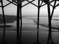
| 01/08/2005 09:47:23 PM |
pier reflectionsby wkmenComment: Nice choice for b&w. I like all of the lines and reflections. I'm not sure if Ron/TooCool is correct about the tilt. When I look at it, it appears that both main beams are tilted...one to the right and one to the left. The houses look pretty straight to me. It's hard to tell for sure but I'm wondering if all of those beams are actually crooked. |
| Photographer found comment helpful. |
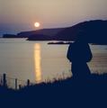
| 01/08/2005 09:44:46 PM |
solitary sunsetby wkmenComment: On my monitor this image has a very noticeable blue cast to it. Imo, the silhouetted areas should be more black, not blue, and the sunset should be more 'warm' - meaning orange or red. I'm not sure what you use but if you have Photoshop or can figure out something similar with what you use, try this: Go to Color Balance, choose Shadows under "Tone Balance" and then move the cyan/red slider between +20 and +40. That will get rid of the blue cast and will also warm up the shot.
Roberts suggestion to try Neat Image is also a good one.
I also agree about the person's head being lost on the mountain. Both images are so dark that they blend together and become one. Perhaps if you had just moved a bit to the right the person would have a backdrop of water instead of mountain or rocks.
A very good attempt. Sunset/Sunrises can be tricky. |
| Photographer found comment helpful. |
| 01/08/2005 09:36:24 PM |
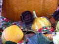
summer is doneby wkmenComment: I'd have to agree with what some of the others have said. There's too much competing in this image - colors, in/out of focus subjects, and just random 'things'. The out of focus gourds in the front are distracting; the corn cob on the left is barely in the image, I would have either included it or not; the ribbon sort of winds through the image without purpose, half facing us, half away; and there seem to be two or three different colored towels(?) peeking through from beneath the gourds and pumpkin. I think better organization and more attention to the little things could have really made this a great image. Sometimes simplicity is best. :-)
Edit: I meant to comment on the roses. As with the corn cob, I would have done something about the rose on the right edge of the image. I'm not really sure they fit into the image well, though. Part of thinks they may somehow have a chance - you know, the death of the rose representing the beginning of fall. Just not sure about them... Message edited by author 2005-01-08 21:38:32. |
| Photographer found comment helpful. |
| 01/08/2005 09:29:25 PM |
a touch of autumnby wkmenComment: Nice shot. I don't really have any suggestions for this one. I will comment on the blue though. It's a little distracting to me, but at the same time, blue and orange are complimentary colors so maybe it could work...? You capture fall well. |
| Photographer found comment helpful. |
Home -
Challenges -
Community -
League -
Photos -
Cameras -
Lenses -
Learn -
Help -
Terms of Use -
Privacy -
Top ^
DPChallenge, and website content and design, Copyright © 2001-2025 Challenging Technologies, LLC.
All digital photo copyrights belong to the photographers and may not be used without permission.
Current Server Time: 08/22/2025 06:33:54 AM EDT.