| Image |
Comment |
| 07/30/2004 05:53:05 AM |
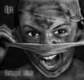
DPC - Demerging Personality Conflict by kiwinessComment: Excellent shot! Looked at this one a few times, thinking before I commented.
I really like this, the lighting here is brilliant, really shows of the dirty looks, while showing the perfect whites. Her eyes and teeth really stand out, would look good from a distance to grab your attention if it was actually sitting in a record store.
The font you've used is great, the bandage's texture is really brought out. Definately full marks from me!
|
 Photographer found comment helpful. Photographer found comment helpful. |
| 07/30/2004 04:22:48 AM |
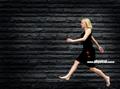
Devine Physical Controlby arnitComment: Can definately see this being a good album cover. The text is great, simple yet effective. I like the blur on the woman too. Full marks! Message edited by author 2004-08-02 05:00:08. |
| Photographer found comment helpful. |
| 07/30/2004 04:21:00 AM |
|
| Photographer found comment helpful. |
| 07/28/2004 05:56:31 AM |
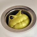
Drain Pipe Creatures by scalvertComment: A great shot for the challenge! Simple, funny and very effective with the etched looking text around the plug hole. |
| Photographer found comment helpful. |
| 07/28/2004 03:34:20 AM |
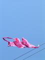
Hot Pinkby rileyComment: Excellent use of negative space, the colous here are nice and clear. A bot distracting having the two washing lines, don't know if you could have helped that though. 9 |
| Photographer found comment helpful. |
| 07/28/2004 03:25:23 AM |
The Drinking Straw by aKiwiComment: Such a simple idea, but VERY effective!! I really like this, the different colouring through the straws is amazing, I predict high things for this one.
Only a little nit pick, some of the straws seem to have little hairs or something at the end of it, just me being fussy. A very good shot, simple, eye catching and well done!! |
| Photographer found comment helpful. |
| 07/27/2004 10:54:05 AM |
Dark Priestess of the Choirby magnetic9999Comment: Really like this, was just looking through the shots just now, not actually voting but this grabbed my attention.
Your lighting is perfect! Natural light behind her brings out the details in the curve of her back and the hair at the back of her head. The lighting in the front is subtle enought to highlight everything that's essential for the shot on the front of her body.
This shot had a kind of cute look, but at the same time a devious feel to it. I like that her arm goes out of the frame, but you can just see her hand on her lower back, The dark neclace is also a good touch.
Well done! Full marks for this, added to favourites! |
| Photographer found comment helpful. |
| 07/20/2004 10:46:20 AM |
Yes, absolutelyby shoylesComment: Good idea for the challenge, good DOF and white balance, the dimples in the ball are nice and clear.
A few things to maybe score higher... The green bits at the bottom are distracting and the Absolutely Straight text would have been nicer if it was actually straight... 8 |
| Photographer found comment helpful. |
| 07/19/2004 04:27:10 AM |
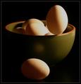
egg-scapeby instepsComment: Good idea or the challenge, great lighting and I think the colours in the bowl are ideal and a good match for the eggs. The image does seem a little oversharpened though? |
| Photographer found comment helpful. |
| 07/16/2004 06:44:34 AM |
Mae West Said it Bestby L1Comment: Good idea, took a minute to realise what it was on the lower RHS. Maybe a larger DOF to get everything in focus? 7 |
| Photographer found comment helpful. |
Home -
Challenges -
Community -
League -
Photos -
Cameras -
Lenses -
Learn -
Help -
Terms of Use -
Privacy -
Top ^
DPChallenge, and website content and design, Copyright © 2001-2025 Challenging Technologies, LLC.
All digital photo copyrights belong to the photographers and may not be used without permission.
Current Server Time: 08/27/2025 11:45:16 AM EDT.