| Image |
Comment |
| 05/08/2005 04:37:47 PM |
Cinco d(ic)e Mayoby theSajComment: composition looks a little cluttered here. could have looked more in balance if they were all layed out into a number 5 perhaps? |
 Photographer found comment helpful. Photographer found comment helpful. |
| 04/29/2005 07:53:43 PM |
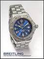
Who says girls have all the fun? by snackwellsComment: No improvements what so ever to this yet the only thing that is distracting is the bezel hanging out yet I know that to get the 10 to 2 position and freeze this in motion this is the only way, send this to Breitling you might get a job :0) Good luck. |
| Photographer found comment helpful. |
| 04/29/2005 07:47:12 PM |
Bulova for ever..!by joaquinComment: 10 to 2 position would really help the face to break this up and proportion it somewhat better. like the element with the rock as it tones up the watch but an overall lack of focus on the hands and brand name of the time peice itself spoils thi sa little but a great image none the less. |
| Photographer found comment helpful. |
| 04/29/2005 07:45:19 PM |
The Three C'sby PollyBeanComment: WOW ! Shadow, crispness and the basic-ness of the shot works so well. I can see this up there at the top, I would have liked to see the BG or surface area with a slight blue tint to reflect a little colour into the stone but thats simply preference. |
| Photographer found comment helpful. |
| 04/29/2005 07:43:33 PM |
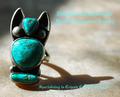
Southwesternby vtruanComment: Text dissappearing into the BG but the texture of the stone looks fantastic. Great shadow too, shame the challenge didn't allow more special text to be used as a dropped shadow on the text would really set this off. Good luck anyhow :0) |
| Photographer found comment helpful. |
| 04/29/2005 07:41:59 PM |
Go Aheadby StrikeslipComment: excellent work with the capture of the stone. a hard shot to pull off and it has been well captured. |
| Photographer found comment helpful. |
| 04/29/2005 07:40:40 PM |
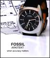
Arkitektby sbeaumontComment: The 10 to 2 position would really have helped out here, alot of people say that watches are not jewellery but I disagree. Having a look through a few watch panflets would show you that the 10 to 2 breaks up the watch evenly and frames the brand name at the top as a somewhat focal point, the shot however is remarkable as there are no hotspots and the small amount of refelction in the white under the watch helps out too. good effor tan hope it does well none the less. |
| Photographer found comment helpful. |
| 04/29/2005 07:38:04 PM |
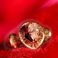
Diamonds Are A Girl's Best Friendby DeniseBernadetteComment: Great idea and although my eye is atratced to the jewellery as a focla point there is too much reflection off the side of the ring unfortunately yet a great take on the challenge and not as boring as many of the others, a good eye for a good shot / idea. good luck |
| Photographer found comment helpful. |
| 04/29/2005 07:36:28 PM |
Iceby bruskiComment: Now this is a Jewellery shot awesome DOF and lovely white BG, I can almost picture this in the next major Jewellery TV Commercial. Excellent job no suggestions though sorry !!! |
| Photographer found comment helpful. |
| 04/29/2005 07:03:59 PM |
Fire and Iceby msdoubletroubleComment: Not quie crisp enough im afraid around the stone although great use of DOF here as seen in the material you have chosen to use with some good reflections into the ring off the material. maybe its the light source im unsure but would really love to have seen this a little sharper. |
| Photographer found comment helpful. |
Home -
Challenges -
Community -
League -
Photos -
Cameras -
Lenses -
Learn -
Help -
Terms of Use -
Privacy -
Top ^
DPChallenge, and website content and design, Copyright © 2001-2025 Challenging Technologies, LLC.
All digital photo copyrights belong to the photographers and may not be used without permission.
Current Server Time: 08/04/2025 09:26:03 PM EDT.