| Image |
Comment |
| 11/10/2003 01:34:30 AM |
Winning Lifeby Melly8522Comment: Nice arrangement and someone is very good at baseball. Next time try to diffuse the light through a sheet or something, to minimize reflections. Maybe would have stood out more with a black background; with velvet you would not have had the light reflecting back either; . Lastly, needs a bit more sharpness IMHO. Perhaps just a matter of doing more USM wihen resizing if the original was sharp. |
 Photographer found comment helpful. Photographer found comment helpful. |
| 11/10/2003 01:21:15 AM |
|
| Photographer found comment helpful. |
| 11/10/2003 01:19:52 AM |
|
| Photographer found comment helpful. |
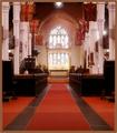
| 11/10/2003 01:16:42 AM |
Mt. Carmelby scrum8Comment: Shadow detail could have been brought out via a different exposure; I can't see the statute, and I don't know this place (a church?). The symbol on the right should have been included in it's entirety. I'm not really sure what you are trying for here, sorry. I hope you find this crit constructive, |
| Photographer found comment helpful. |
| 11/10/2003 01:13:47 AM |
God Bless England.by BobsterLobsterComment: Nice shot, a bit overexposed in the windows. Difficult exposure but you might have caught it at a different time of day. |
| Photographer found comment helpful. |
| 11/10/2003 12:41:21 AM |
the simple red barnby jpb323redComment: Nice scenery, seems a bit unsharp though, especially the barn, which as I see it is the focal point. Also, the foreground framing would work better without that one bare branch that goes through the middle of the photo. Lasly, I'm not too sure why it's sacred, it might have helped to say something in the title. |
| Photographer found comment helpful. |
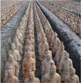
| 11/10/2003 12:27:11 AM |
Infinite Chinese Soldiersby CamComment: This is an awesome shot. I felt it stated infinity better than all of the others combined. You were my bet to win, next to mine ;-) |
| Photographer found comment helpful. |
| 11/07/2003 12:26:19 AM |
connectionsby SeanachaiComment: This is very good, and very funny. Better still if it wasn't staged.
The only element out of place here is the lady who's head we can't see. She looks like she may be on the phone too, but even if we could, I'm not sure she fits in with this group. Since its not for a challenge, you might just consider cloning her out. |
| Photographer found comment helpful. |
| 11/06/2003 12:22:25 AM |
Still life, running faucet.by HavokComment: Nice capture. Excellent idea. But the straight on centered presentation is not very dramatic. And I am not sure it is technically a still life. |
| Photographer found comment helpful. |
| 11/06/2003 12:21:26 AM |
Nikeby ArnayComment: Good idea! I think it might have worked better with a touch more space around and a sharper feel. (I know it's hard when reducing to 640 by x.) Also, while I like the two color theme, I wonder how a slightly different tone light might have looked? |
| Photographer found comment helpful. |
Home -
Challenges -
Community -
League -
Photos -
Cameras -
Lenses -
Learn -
Help -
Terms of Use -
Privacy -
Top ^
DPChallenge, and website content and design, Copyright © 2001-2025 Challenging Technologies, LLC.
All digital photo copyrights belong to the photographers and may not be used without permission.
Current Server Time: 08/28/2025 04:37:47 AM EDT.