| Image |
Comment |
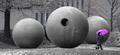
| 12/14/2003 08:39:06 PM |
In the Garden of Globesby magnetic9999Comment: I like this idea, and the desaturation you've achieved. What I think would have really improved this photo is catching her on the way in to the frame rather than the way out. The crop and execution is otherwise excellent. There is still a bit of blue iin the background which would have been nice to get rid of but I understand it's tricky while following the rules! |
 Photographer found comment helpful. Photographer found comment helpful. |
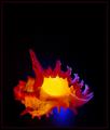
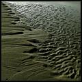
| 12/14/2003 11:51:53 AM |
Murex Ramosusby timmiComment: Pretty. I think this meets the challenge, and with some flare, but the emphasis here to me is color, not shape! |
| Photographer found comment helpful. |
| 12/14/2003 11:47:56 AM |
Out of Shapeby alanfreedComment: Good one, it made me laugh! Then I looked in the mirror.... :(
Aesthetically/Compositionally, I think if you had caught more to the left of him, where his shirt is off the frame and put him on the right, it would have been stronger. |
| Photographer found comment helpful. |
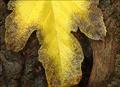
| 12/14/2003 11:45:26 AM |
Shapes of Autumnby ChrisW123Comment: Very nice shot; Not a criticism, but I think the colors and textures are more salient and more the focus of this shot than the shapes. |
| Photographer found comment helpful. |
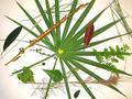
| 12/14/2003 11:33:26 AM |
Shape of Leaves to Comeby kayceeComment: I like the layout here and your very nice design. I wonder how this might have looked without the overexposure in the center background? I think a natural looking background would have been better.
|
| Photographer found comment helpful. |
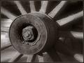
| 12/14/2003 11:31:40 AM |
|
| Photographer found comment helpful. |
| 12/14/2003 11:31:11 AM |
Hanging Aroundby SonifoComment: Wonderful image. A 10 from me, and one of my top choices. Slight overexposure on the white area background top, but not significant. |
| Photographer found comment helpful. |
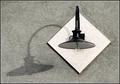
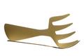
| 12/14/2003 11:30:08 AM |
monster shadowby ursulaComment: Nice effect. I think it would have been good to shoot from a higher perspective than here, so you have a bit more of the real fork. I showed this to someone and I had to point out that the shadow was actually a shadow. If the real fork wasn't shot from the edge only, there would also be a complementary symmetry. |
| Photographer found comment helpful. |
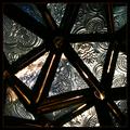
| 12/14/2003 11:28:04 AM |
Abstract Starby mariomelComment: An interesting idea and good pattern study. I find the lighting you chose works against this though. The overexposed areas are distracting, and yet many of the other areas of the glass are too dark. Actually, if I hold a sheet of paper over the left 1/3 or more where most of the overexposed area is, it looks like that might have been a good crop. |
| Photographer found comment helpful. |
| 12/14/2003 11:21:01 AM |
1859 Sunriseby sherComment: Nice shot. It could use a bit more DOF IMHO. Also, I think it would work better as a geometric/abstract shot (shape) if the background elements weren't there on the left, as well as the detail in the floor. |
| Photographer found comment helpful. |
Home -
Challenges -
Community -
League -
Photos -
Cameras -
Lenses -
Learn -
Help -
Terms of Use -
Privacy -
Top ^
DPChallenge, and website content and design, Copyright © 2001-2025 Challenging Technologies, LLC.
All digital photo copyrights belong to the photographers and may not be used without permission.
Current Server Time: 08/29/2025 01:00:45 PM EDT.