| Image |
Comment |
| 10/13/2005 05:37:53 PM |
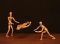
The Amazing Woodies!by CEJComment: There you go--a woody shot that did well! And so well done.
And now we're all looking at your profile... ;) |
 Photographer found comment helpful. Photographer found comment helpful. |
| 10/13/2005 12:27:50 PM |
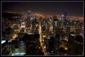
"back to that same old place, Sweet Home Chicago"by fotodudeComment: Beautiful night shot of "my town" (well, I never lived there, but I was born there at Michael Reese--I grew up in Gary, Indiana). I am mixed about the tilt, I really like the dynamic it adds, but it draws attention to itself too, perhaps because it's not tilted enough to say: this is purposefully tilted (though I am sure it was).
Overall, a great night city scene: hope you have a big version of this hanging on your wall! |
| Photographer found comment helpful. |
| 10/13/2005 12:21:47 PM |
|
| Photographer found comment helpful. |
| 10/12/2005 01:09:44 PM |
|
| Photographer found comment helpful. |
| 10/12/2005 09:19:52 AM |
PAD-09-treespin.jpgby ArtanComment: Wow, excellent results too! Good colors and contol, and a nice, stable tree shadow to anchor the DPC viewer. |
| Photographer found comment helpful. |
| 10/12/2005 09:14:22 AM |
Blue or Brown ?by gaurawaComment: Were you really trying for a brown. If so, I'm embarrassed to say I like this :(
If not, perhaps it got punished for being abstract, or perhaps too many people looked for "something" besides color in the shot. But the beautiful continuous tones and combinations in the color are very nice. Perhaps a crop on the left to making it close to square, with the two colors playing against each other and combining in the bottom right quadrant might have been a bit compositionally stronger. (Still may not have done well in this crowd, but a good pic anyway.) |
| Photographer found comment helpful. |
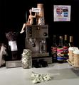
| 10/12/2005 09:03:38 AM |
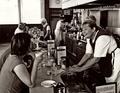
Where Juan Valdez Meets Benjamin Franklinby Art RoflmaoComment: Very good idea! Sharp wit and focus.
I think overall this is a very good image. I think you were penalized for having a woody ;)
Compositionally, however, I think this could have been a little stronger. I'm not fixated on the rule of thirds, but this image could be balanced better by using it. My first thought is that the paper goods on the left weren't needed and don't provide compositional balance, and you could have thus cropped on that side and tried to get woody in the sweet spot--right now he and the coffee maker are too close to center.
Second, I think the brown/dark background makes the beans on the left less effective. If I were to imagine arranging the scene, I might have done the following (but realize this is not easy to previsualize so I may be totally off base): ditch the paper cups on the right, put the beans there in a more prominent position, shifting the maker left, and balancing the maker on the left with the beans on the right. Put in a very nice expresso cup, either filled with steaming coffee or money. The latter idea has me thinking a little bit: to make a statement about coffee costs, the jar isn't really "unambiguous" because it is associated with tips, not the cost of coffee. So maybe the coffee cup idea filled with money, or some foreground with money and coffee somehow intermingled in either a natural or artistic statement way.
Alternate title: Hey buddy, can I have $5 for a cup of coffee? ;) |
| Photographer found comment helpful. |
| 10/12/2005 08:42:41 AM |
Reflecting Crystal Dreamsby madison461Comment: I'm not sure I agree that this is "too blurry". As is, I think it has the right ingredients for an abstract. I'd have to see how it came out sharp to see if that was better!
You could play a bit with this shot to possibly make it stronger. Since color is the primary focus of this abstract, perhaps you can try adjusting the white balance or levels so that the crystal does not appear toned (it has a yellow-tan tone on my monitor), and let the shape of crystal alone serve to texture the greens and reds in the background (along with some perhaps stronger greens which can also be adjusted in PS).
This was a good idea! |
| Photographer found comment helpful. |
| 10/12/2005 01:16:47 AM |
stre`am·lineby RikkiComment: I think it's a great finish! And a great abstract as well. Well done setup! |
| Photographer found comment helpful. |
| 10/12/2005 12:41:25 AM |
|
| Photographer found comment helpful. |
Home -
Challenges -
Community -
League -
Photos -
Cameras -
Lenses -
Learn -
Help -
Terms of Use -
Privacy -
Top ^
DPChallenge, and website content and design, Copyright © 2001-2025 Challenging Technologies, LLC.
All digital photo copyrights belong to the photographers and may not be used without permission.
Current Server Time: 06/27/2025 08:56:19 PM EDT.