| Image |
Comment |
| 11/06/2003 11:35:33 AM |
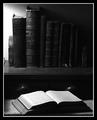
Literatureby Firstrich1Comment: ligthing good
the empty space on the left side of the photo could be cut off right at the end of the first book
black and white works well here |
 Photographer found comment helpful. Photographer found comment helpful. |
| 11/06/2003 11:34:17 AM |
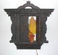
Be Stillby PoobaComment: I think you could have focused more on the statue, there is just so much vegetation in this photo it is taking my eyes off the statue |
| Photographer found comment helpful. |
| 11/06/2003 11:32:58 AM |
Doorway To No Whereby RoosterComment: the white background isn't consistent - its darker in some places than others and it looks off...
I think this may look better on a different angle
|
| Photographer found comment helpful. |
| 11/06/2003 11:29:12 AM |
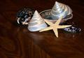
Tiny treasuresby wolfenComment: I don't like the wood surface, especially since the grain is not aligned straight
the lighting could be improved |
| Photographer found comment helpful. |
| 11/06/2003 11:26:33 AM |
Red Beansby guobinComment: Nice composition, and the focus here is great. I think more black could be cropped off the top to make a more widescreen look. 7 |
| Photographer found comment helpful. |
| 11/06/2003 11:24:34 AM |
Luxuryby Lo IatoComment: I am not sure I like the subject here. The pavement like surface doesn't look good as a background.. |
| Photographer found comment helpful. |
| 11/06/2003 11:22:14 AM |
Socket Setby browntComment: nice composition. Lighting and subtle shadows are effective, and I like the hint of color on the bottom surface. Nice job. |
| Photographer found comment helpful. |
| 11/06/2003 11:19:28 AM |
Merlotby KonadorComment: nice...just too much black for my liking though. 7 |
| Photographer found comment helpful. |
| 11/06/2003 11:12:42 AM |
|
| Photographer found comment helpful. |
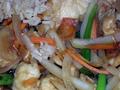
| 11/06/2003 10:52:35 AM |
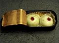
Szechuan Chickenby Glen KingComment: Its too .... shiny or something. There is too much lighting shone directly on the food, it is shining too much and making in unappealing
A better selection of colors would make this subject look better. They don't mix well.
|
| Photographer found comment helpful. |
Home -
Challenges -
Community -
League -
Photos -
Cameras -
Lenses -
Learn -
Help -
Terms of Use -
Privacy -
Top ^
DPChallenge, and website content and design, Copyright © 2001-2025 Challenging Technologies, LLC.
All digital photo copyrights belong to the photographers and may not be used without permission.
Current Server Time: 08/05/2025 07:54:18 AM EDT.