| Image |
Comment |
| 11/14/2003 10:24:49 AM |
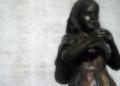
Anil's Ghost - by Michael Ondaatjeby darcyComment: nice subject for the book title, it suits well. I think the shadows would look better if they were a little lighter, and I would prefer the shot without the head cropped off. |
 Photographer found comment helpful. Photographer found comment helpful. |
| 11/14/2003 10:22:38 AM |
Like Water For Chocolateby pcodyComment: awesome!!! Only critism IMO is the lighting - i wish it weren't so dark on the right side and the would like to see a tighter crop. 8 |
| Photographer found comment helpful. |
| 11/14/2003 10:17:07 AM |
|
| Photographer found comment helpful. |
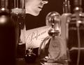
| 11/14/2003 10:16:18 AM |
Pefumeby CorwynComment: lovely shot, the woman cropped at the top works perfectly. 8 |
| Photographer found comment helpful. |
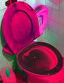
| 11/14/2003 10:11:18 AM |
Potty Book for Boys. 2 by Alyssa Satin Capucilliby kinksComment: Whatever look you were going for here just doesn't work for me ... The colors are way too saturated and the pink toilet just doesn't look good anyway. The extensive amount of grain is a huge turn off, I'm sorry, this one doesn't do anything for me. |
| Photographer found comment helpful. |
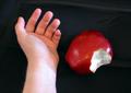
| 11/14/2003 10:08:22 AM |
Snow Whiteby GinxComment: way too blurry. The layout of this picture should look more elegant to give a feeling of "Snow White". RIght now it just looks like someone was holding the camera and took a picture of their hand stuck out next to an apple. Background, focusing, and better lighting would really improve this photo, because the title you have chosen is a good one. |
| Photographer found comment helpful. |
| 11/13/2003 07:44:53 PM |
steamy sanctuaryby darcyComment: nice colors, and there is something about that pink rose that makes this photo work. I feel that there is nothing really \"focused\" here though ... every element in the photograph seems to be blurred/softened too much, I think if the sink tap was more focused this would look better. |
| Photographer found comment helpful. |
| 11/06/2003 11:42:08 AM |
Forgottenby SonifoComment: Nice!! IF it were up to me, this would be my choice for winner so far. I just love the colors and focus. The lighting is brilliant .. this one really makes you think. :) I do with the black on the left side was a tad bit lighter, but its not a big thing. Excellent job! 9 |
| Photographer found comment helpful. |
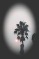
| 11/06/2003 11:38:40 AM |
The Smoke Stands Stillby yamahondamomComment: the lens flare (or whatever it is) in there looks bad
The contrast seems to be a little low, could be boosted
the object cut off to the bottom right is a distraction and doesn't need to be there
the plant would look better centered in the oval light |
| Photographer found comment helpful. |
| 11/06/2003 11:37:06 AM |
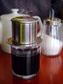
Vietnamese coffeeby RipiComment: nice DOF and subject is nice and sharp
would probably look nice with a different background than the checkered type material that is there now .. perhaps a brigther material
7 |
| Photographer found comment helpful. |
Home -
Challenges -
Community -
League -
Photos -
Cameras -
Lenses -
Learn -
Help -
Terms of Use -
Privacy -
Top ^
DPChallenge, and website content and design, Copyright © 2001-2025 Challenging Technologies, LLC.
All digital photo copyrights belong to the photographers and may not be used without permission.
Current Server Time: 08/05/2025 01:55:51 AM EDT.