| Image |
Comment |
| 02/25/2006 11:42:31 AM |
Twist and Spinby CamComment: Great presentation, I like the angular, simple feel to the image. Nice use of a mirror. Everything looks very clean and crisp for the most part. I do wish that the colors and the white in the background were just a bit brighter though. I think if that looked a true bright white, it would've made the colors pop and thus the whole image take on an even higher "Wow" factor. I gave a 6. |
 Photographer found comment helpful. Photographer found comment helpful. |
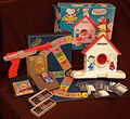
| 02/25/2006 11:33:31 AM |
Playthings of the Eightiesby olddjComment: Wow do those bring back memories. I like the idea behind the image. The colors seem a bit muted as does the lighting - maybe it needed a different white balance mode? Its got a brownish hue to everything. There are many points of interest to examine which is nice but I'm finding the composition - how they have been laid out to be a bit lacking. There's no drama to the image, mostly a flatness that doesn't draw me in. It feels more like an image I'd use if I were trying to sell the items on eBay than as an art image I'd put on a wall. That said, I DO think if there was an adjustment to how the lighting was used (maybe complete darkness with a number of small lights spotlighting each individual item) or if they were arranged in a different manner to give it less of a static feeling then this image could have a greater impact. I voted a 4. |
| Photographer found comment helpful. |
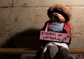
| 02/25/2006 11:28:05 AM |
The Cabbage Patch Hostage Crisis of '86by tateComment: Mine's name was Bettina Wendy... Cute take on the challenge. Cabbage Patch Kids were certainly all the rage! I like the environment, the gritty and barren look to it helps further the "hostage" feel. It feels a little too contrived though for me. Not sure why, but after the initial, "ha that's funny/cute" the image doesn't invite me in to explore - it feels a bit two dimensional, I don't know how to explain it better, sorry! That said I did like the environs, the idea is fun, the focus and lighting work well too. I gave a 5 |
| Photographer found comment helpful. |
| 02/25/2006 11:23:20 AM |
Bon Jovi, 1986by mfairbanksComment: Ha. I love Bon Jovi. That's their best album too! I like the take off of their album cover. It looks as if you did an actual writing on wet window? instead of just an image of the album, if so - nicely done. I like the high contrasty/noisy background too, makes an excellent foil for the lettering. I gave a 5. |
| Photographer found comment helpful. |
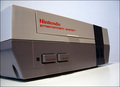
| 02/24/2006 12:29:05 AM |
Nintendo Entertainment System Circa 1985by ggbudgeComment: Static and fairly dry. Good take on the challenge, lighting is pretty good - maybe a fill light near the bottom to light the face of the Nintendo up more. The background is a bit uninspiring and may be why I find the image as a whole sort of distant and boring. A very servicable photograph. I gave a 4. |
| Photographer found comment helpful. |
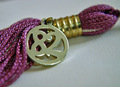
| 02/24/2006 12:27:34 AM |
Class of 82 RULES!by dassilemComment: Brings back memories eh? I like this image, its simple and nice but it does feel a bit dry. There is some spark with the purple coloring and gold highlights but it still seems like something is missing. Perhaps if it was lying across a graduation invitation/announcement or something? Just a bit of something to add a little more dimension instead of the flat, boring white surface. The focus is good as well but I do wish the DOF was just a smidge greater so that section in the bottom left wasn't blurry - its drawing my eye and is a bit distracting. Nice take on the challenge though! I gave a 5 |
| Photographer found comment helpful. |
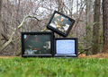
| 02/24/2006 12:24:56 AM |
I want my MTVby tjmuellerComment: Woo! Great image. I love the focus and the use of natural lighting is good. The contast between the electronic and nature is wonderful as is the green/browns versus the black of the TVs. The only thing I'd really change would be to crop out that blurred portion along the very bottom, I find my eyes wandering to it and it becomes a distraction. I gave a 5. |
| Photographer found comment helpful. |
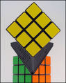
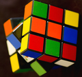
| 02/24/2006 12:23:01 AM |
Remember Rubiks?by permapierComment: Nice image! I like the close up view and the brilliance of the colors. The lighting is good and the focus seems to be good too (a teensy bit soft but that could be upload compression). I'm wondering if it would've been a more interesting look if you'd had the side with that white yet colorful square that you can just barely see beyond the main focused section as the main area. As it is now I find my eye wandering over there trying to make out what is beyond the blur. Nice work. I gave a 5. |
| Photographer found comment helpful. |
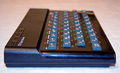
| 02/24/2006 12:20:45 AM |
1982 Sinclair ZX Spectrumby bob_bobskiComment: Dang.. now that's old.
I like the subject matter, the focus is nice with the shallow DOF. I wish however the composition was different. Whether a different background was used or I'm not sure.. a different placing of the actual computer/keyboard thingie.. There's something very flat and static about the image, it doesn't draw me in other than to think, "huh that's old". Maybe a silvery background or dark grey so it still had contrast with the black body of the electronic device.. maybe use of a mirror somehow? Not sure, just feels like something is missing. I gave a 4. |
| Photographer found comment helpful. |
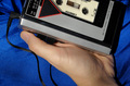
| 02/24/2006 12:18:17 AM |
Chillin . . . 1981by glad2badadComment: Ha, talk about old school. Great lighting and focus. The color of the background is brilliant and makes for a very nice contrast. The composition I'm not too fond of, seems that the walkman & tape should be the focus of the image, moreso than the hand holding it, so I think it'd have better impact if the entire walkman was visible. There is impact with the focus being on the walkman's contest with the Journey tape being so prevalant but when I look at the image my eyes tend to wander and see the hand taking up a large portion of the photo. Very nice idea! I gave a 6 |
| Photographer found comment helpful. |
Home -
Challenges -
Community -
League -
Photos -
Cameras -
Lenses -
Learn -
Help -
Terms of Use -
Privacy -
Top ^
DPChallenge, and website content and design, Copyright © 2001-2025 Challenging Technologies, LLC.
All digital photo copyrights belong to the photographers and may not be used without permission.
Current Server Time: 08/07/2025 03:04:44 PM EDT.