| Image |
Comment |
| 07/31/2006 09:39:50 PM |
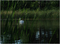
Shhhh...Quiet...by tfarrell23Comment: Very delightful. I like this image in general outside of a challenge mindset. That said it definitely has zen aspects to me. I think I understand that you wanted to depict hiding behind the brush and peeking in on the zen moment the swan creates but I find the grass being the most focused part of the image to be a bit distracting because I'm wanting to see beyond it and have the swan more in focus. I'm not sure how that dynamic change would play out and if the grass would then become an irritant as being an out-of-focus barrier of sorts. I like the way you handled the natural light and I think the composition is great. I am bumping this up from a 5 to a 6 |
 Photographer found comment helpful. Photographer found comment helpful. |
| 07/31/2006 09:37:16 PM |
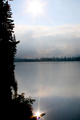
Morning Starby Len ScapComment: I like the balance of the 'star' below and the sun above. I also really like the placid look of the lake. That portion really speaks of serenity and stillness and thus aspects of zen to me. The colors are a bit muted and in this instance I'm not sure if that helps the image. I wish the colors, in the sky particularly were a little more vibrant, just to give the eyes something more to get lost in. Also, though I do like the balance the star offers, the way it is so bright and contrasted to the still water makes it a bit jarring which pulls me out of the zen mood. Overall I gave a 5 |
| Photographer found comment helpful. |
| 07/31/2006 09:34:33 PM |
Ahhhhh... Hot Rock Massageby SunnieeComment: I can find zen in the way the rocks line up and contrast the curve of the body, I also like the tones between the rock and the skin. I don't really like the candles. While they help set the stage of the image in general I don't find them to add anything to the zen and in fact I find them distracting me from the main subject of the rocks. I would love to see this with a more balanced image of just the body with rocks on it, no towel/material on the hip and no candles on towel/material in the background. Just black, curving skin, line of rocks and more skin. I think the lighting is a bit too harsh for the image, maybe something a bit softer would give an added glow to the skin, or if not softer more of a fill from the lower hidden shoulder area.. I'm not sure. The focus isn't completely there, so if that could be a bit more clear I think it'd really make this image pop. I really like the idea and potential of this shot and while it isn't spot on for me, I think its very nice. I've bumped it from a 5 to a 6 |
| Photographer found comment helpful. |
| 07/31/2006 09:13:43 PM |
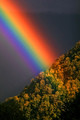
Satoriby zeuszenComment: I adore the brilliant colors of this rainbow. Gorgeous. Unfortunately, I'm not receiving a very zen vibe from the image. I think you used the natural light very well and the focus is good, especially with the subject you chose. I like the composition, but I'd suggest cropping off about an inch and a half so that the vegetation is in a compact corner and the rainbow acts as a bit of a balance and growing out of that corner. Well.. it makes sense to me! Heh. At first I didn't like the blandness of the background (not that there was much you could do about that) but now I think it does a suitable job as foil for the bright colors. I gave a 5 |
| Photographer found comment helpful. |
| 07/31/2006 09:10:32 PM |
Zen Gardenby massmediakid31Comment: I think the essense of this is zennish with the negative space and floating flower. I don't however like the background color at all. With the paleness of the flower (pale purple and white) the background feels very washed out and dirty which competes with the serenity the composition of the image is portraying. The lighting is good, the focus looks a bit soft around the flower edges. I gave a 5 |
| Photographer found comment helpful. |
| 07/31/2006 09:10:20 PM |
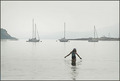
Path of Learningby whiteroomComment: I think this is a very sweet image. There is some nice balance to it with your two models and the emotive quality is very nice. I think the use of natural lighting was well handled and the focus looks pretty good. I don't get a strong sense of zen from the photo though, more a depiction of a zen-like action. I find the rolling waves in the background to contradict the stillness or serenity the actions of your models might be helping to create as well. I'm not sure how this looked in color, but the washed out nature of the waves is also a detraction for me, though I DO like the way it makes your models stand out. All told I gave a 5. |
| Photographer found comment helpful. |
| 07/31/2006 08:59:25 PM |
Nature's Harmonyby samanwarComment: I love the vivid colors in this image and I like the contrasts between the sky and the grass but I'm not really getting a zen feel from the photo. I think it is a nice landscape and it certainly has some aspects of stillness since its rather wide open, but the very things I like about it, the extreme contrasts in color, texture, etc between the sky and ground, make it much 'noisier' than I would think a zen photo would have. Again this is just my opinion as a viewer. There seems to be a bit of either over saturation or something else because the colors though nice and vivid do have a strange quality to them, not sure what. I also am not at all fond of the border. The bright color of it really takes away from the shot and puts it at the forefront rather than the landscape it is bordering. I gave a 5 |
| Photographer found comment helpful. |
| 07/31/2006 08:55:47 PM |
zen-sur-zeeby xtineComment: There is some wonderful zen here. I really like how the boats are lined up, almost as if the two on the ends are paying homage to the center one and I like how the center one is lined up so its masts are making a lovely line in the center of the image. Normally things so centric wouldn't be nearly as interesting but I think it works here with the dynamic of the other two boats. I like the sort of hazy cloudy feel to this as well, gives it an almost dream-like quality. Unfortunately, and this has no bearing on your model specifically, I don't like the addition of the girl. I find it jars me away from the mood the rest of the seascape is presenting, both in its darkishness compared to the other tones and also in what seems to be a lot of sharpness around it (and slight turbulence in the water behind her). She just looks rather out of place in the image and that IMO detracts from the stillness and harmony the rest of the shot is instilling in me as the viewer. I do think its an excellent photo all the same, I gave a 6 |
| Photographer found comment helpful. |
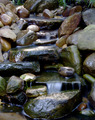
| 07/31/2006 03:40:20 AM |
Flow of the Zenby jusdino4itComment: I can easily see the zen of this image. The play of earth and water is perfect. It has a lot of aspects but they tend to meld together into the two subjects, rock and water so that helps it boil down into a semi-simple photo. The lighting and focus is perfect. I do wish more of the top and bottom were cropped off, I can't exactly explain why, I guess it'd make the image more solid to me if it began and ended in a rock slab, like the water was cradled in stone. I gave a 6 |
| Photographer found comment helpful. |
| 07/31/2006 03:37:52 AM |
Floatingby banmornComment: Zennish in its simplicity. I think the colors are great, nice vibrancy between the blue and greey. The stillness of the water is highlighted by the leaf floating on the top of it. Lighting and focus is wonderful. I do wish there was a bit more negative space and the leaf was a little less centered. Its not exactly centered now but if it was a bit more pushed to one of the corners I think that'd make the image that much stronger. I gave a 6 |
| Photographer found comment helpful. |
Home -
Challenges -
Community -
League -
Photos -
Cameras -
Lenses -
Learn -
Help -
Terms of Use -
Privacy -
Top ^
DPChallenge, and website content and design, Copyright © 2001-2025 Challenging Technologies, LLC.
All digital photo copyrights belong to the photographers and may not be used without permission.
Current Server Time: 08/04/2025 11:32:10 PM EDT.