| Image |
Comment |
| 04/25/2005 10:04:43 AM |
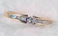
Promise Ringby LEONJRComment: Hope you don't mind. This might be received as a rude comment and for that I am sorry. This is a members challenge and there isn't a reason I can think of to leave dust spots in the submitted picture. |
 Photographer found comment helpful. Photographer found comment helpful. |
| 04/25/2005 09:59:32 AM |
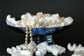
Pearls are imortalby NunoComment: Love the setting and dof. The lighting is good. In my mind, the stryofoam peanuts imply if I buy that necklace, I'll never have any money to do anything else. I'm not an expert, but this might be something you might want to try if you reshoot. Same bowl, same pearls, same background and same lighting. Use popcorn as the filler and as a prop, use a picture of an old b/w movie star. If they are real pearls, you might not want to use greasy popcorn because the oils wouldn't be so good for them. Move the bowl to the right of the frame. |
| Photographer found comment helpful. |
| 04/25/2005 09:45:25 AM |
PURE PEARLSby mkirdalComment: This has a lot of potential. The rich burgundy cloth contrasts nicely with the pearls. The pearls are exposed well. What I see as problems are the noise, the glare from the light and the reflection of the photographer in the glass. Oh. And the two gray x marks. A suggestion for the light. Place it somewhat above and behind the glass and use a light reflector (poster board) in front the light up the pearls. Stand back and use the self timer on the camera. |
| Photographer found comment helpful. |
| 04/25/2005 08:13:24 AM |
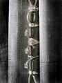
Something Old...Something New...by RKTComment: Really a nice set up. Love the contrast of the gold ring and the vertical arrangement. IMO, the dark left side could have been cropped out. The texture of the curtains compete to much with the rings and become a distraction. I think it would have looked better with a very limited on the line of rings. |
| Photographer found comment helpful. |
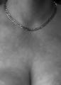
| 04/25/2005 08:06:55 AM |
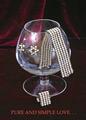
All You Need Is Goldby Mr_PantsComment: The lighting is ok. Don't read any futher if you are of a delicate temperment.
These are just a few things I see that could be improved. Mind you, I'm not an expert. The drastic change from in focus to out of focus is not pleasant to look at for more than a few miliseconds. The necklace looks silver. I think the product doesn't get it's share of real estate. The composition is static. Hope this helps. Keep shooting. |
| Photographer found comment helpful. |
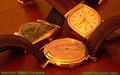
| 04/25/2005 07:55:05 AM |
Hamilton Watch Company circa 1958by bcobleComment: Beautiful watches in a interesting setting. The teardrop watch, to me, should be the center of focus because it is the lightest of the three and the lightest part of a picture draws the eyes first when it's surrounded with dark. It would have been nice to have all the watches have the same time on them. That would imply that they were still working. Personally, I might have used a sepia toning. |
| Photographer found comment helpful. |
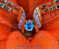
| 04/25/2005 07:47:26 AM |
The Giftby GolferDDSComment: Nice concept. The lines between the flower and product go good together. I think there is a problem in the clarity of the flower. To me it looks a bit oversaturated and the lighting is flat. This might have been improved with a little backlighting. The color of the text doesn't seem to complement the picture. |
| Photographer found comment helpful. |
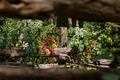
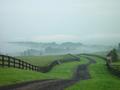
| 04/16/2005 07:26:18 PM |
Respiteby rblantonComment: ditto. I'm getting a headache. It might have been ok to include the foreground fence if it had been as focused as the rest of the picture. But this is only my opinion. |
| Photographer found comment helpful. |
| 04/09/2005 04:35:12 PM |
|
| Photographer found comment helpful. |
| 03/05/2005 10:51:10 AM |
|
| Photographer found comment helpful. |
Home -
Challenges -
Community -
League -
Photos -
Cameras -
Lenses -
Learn -
Help -
Terms of Use -
Privacy -
Top ^
DPChallenge, and website content and design, Copyright © 2001-2025 Challenging Technologies, LLC.
All digital photo copyrights belong to the photographers and may not be used without permission.
Current Server Time: 08/27/2025 11:48:00 AM EDT.