| Image |
Comment |
| 11/13/2003 06:15:09 PM |
"A Dog So Small"by GinaRothfelsComment: Cute pup. The hand gives shows how small he is. What happened to the grass? I would like to see the original. The green should have been a nice contrast with the brown pup. |
 Photographer found comment helpful. Photographer found comment helpful. |
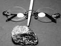
| 11/13/2003 04:02:35 PM |
Harry Potter and the Sorcerer´s Stoneby cimarron98Comment: Sometimes you guys surprise me. Here I was, thinking how the light on the glasses are really distracting, but you placed them perfectly. The only thing I would change; should be in portrait orientation to make it more obvious. |
| Photographer found comment helpful. |
| 11/13/2003 03:57:18 PM |
Animal Farmby DebN2003Comment: Cute and funny. Plus the lighting is good. Love the attack cat! 8 |
| Photographer found comment helpful. |
| 11/13/2003 03:54:34 PM |
Turkey, between east and westby frankhComment: You would not have lost much information if you had cropped out the dark corners. It would improve the perceived quality of the picture. Nice concept. |
| Photographer found comment helpful. |
| 11/13/2003 03:49:24 PM |
Don't Sweat This Small Stuffby yamahondamomComment: I want to laugh at this, but find I'm not able to. Did you try rotating it clockwise so it looks more like he's sailing out into open blue? Might not work because he's so high. It's ok but not a "wow" photo. |
| Photographer found comment helpful. |
| 11/13/2003 03:39:05 PM |
|
| Photographer found comment helpful. |
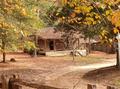
| 11/13/2003 03:34:43 PM |
Little House in the Big Woodsby croutonComment: I like seeing photos displayed at the appropiate size for their resolution. Nice job. Don't listen to those that might say it's too small. I might like to see this with more saturation and contrast. |
| Photographer found comment helpful. |
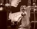
| 11/13/2003 03:22:26 PM |
Pefumeby CorwynComment: The choice of focus is the best thing about this photo. Brilliant. And then the color adds a silence to the image and lets us enter into this intimate moment in time. The only things I think could be improved is the tilt of the picture, it seems to be leaning over to the left. The title says all that has to be said about the picture so I feel the sign distracts and might cause the viewer to feel stupid, as if we aren't smart enough to get the connection. But maybe I am. ;o |
| Photographer found comment helpful. |
| 11/13/2003 11:34:03 AM |
|
| Photographer found comment helpful. |
| 11/13/2003 11:31:52 AM |
|
| Photographer found comment helpful. |
Home -
Challenges -
Community -
League -
Photos -
Cameras -
Lenses -
Learn -
Help -
Terms of Use -
Privacy -
Top ^
DPChallenge, and website content and design, Copyright © 2001-2025 Challenging Technologies, LLC.
All digital photo copyrights belong to the photographers and may not be used without permission.
Current Server Time: 08/25/2025 09:28:01 AM EDT.