| Image |
Comment |
| 02/19/2004 10:20:39 PM |
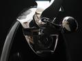
Elegant Openingsby JaguarComment: I want to like this because I think the technical side of things are well done. But when I look at it, I get confused. I hate to say that. The amount of detail says I should be able to identify the object, but I can't. It might be improved if the table wasn't reflected in the chrome parts, that seems to be what's confusing me. |
 Photographer found comment helpful. Photographer found comment helpful. |
| 02/19/2004 10:05:25 PM |
Coffee, BLACK...by tfarrell23Comment: Love the composition. Cutting off all the curves reduces the object to a pleasing abstract where one is forced to look at the darkness within the cup. Not such a big fan of the overworked colors. I would like to see an unaltered version after the challenge is over. |
| Photographer found comment helpful. |
| 02/18/2004 08:24:03 PM |
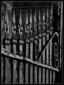
Gated Communityby sherComment: My eye started in the upper right down to the center left and then to the lower right. Exactly what should happen with a well composed photo. One thing that I would like to suggest would be to have the right side a little more in focus? |
| Photographer found comment helpful. |
| 02/18/2004 08:18:21 PM |
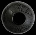
Black Pottery of Northern Mexicoby lwkimagesComment: Wonderful simplicity and complexity. It would be hard to say what this was without the title. Good choice to show the light source within the composition. Everything is perfect, imo. It was a pleasure to look at this. |
| Photographer found comment helpful. |
| 02/18/2004 07:51:50 PM |
|
| Photographer found comment helpful. |
| 02/18/2004 07:50:51 PM |
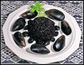
Black Rice Paella with Black Mussels and Black Olivesby flip89Comment: Presentable. A good choice of foods and they look yummy. Hope you don't mind if I say some things about the picture. The two light sources are competing. You have created two sets of shadows. Maybe if one of them had been diffused you wouldn't have that problem. While the arrangement of the food on the plate is attractive, the picture itself lacks interest, I know because I have been told this lots of times. The green touch is nice but doesn't add enough pizzaz. Don't be afraid to get up close and let some of the image get oof. Food is one of the hardest things to photograph and this is a good attempt. |
| Photographer found comment helpful. |
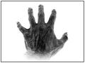
| 02/18/2004 07:41:12 PM |
Hands of Sorrow...by theodor38Comment: The texture is spectacular. The reduction of the dynamic range makes this look edgy and tense, which is very good. I don't know if I personally like the composition. The angle makes the fingers look short whereas if they were coming towards me they would look long as in "a long road of suffering". Ah well, that's just my opinion. It's still an awesome photo. |
| Photographer found comment helpful. |
| 02/18/2004 12:07:51 AM |
The Roseby MarjoComment: Nice composition. Looks like s/he has nice eyes. I'd like to see them. Fantastic that the rose isn't in shreads. It would have taken no time at all for my cat to destroy the it! |
| Photographer found comment helpful. |
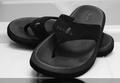
| 02/17/2004 11:43:44 PM |
Shower shoesby cabaComment: Good light control, excellent dof but a little soft, good composition. The only thing that might be improved is the darkness at the front. It would be good as a product shot but lacks pizazz. |
| Photographer found comment helpful. |
| 02/17/2004 10:03:54 AM |
|
| Photographer found comment helpful. |
Home -
Challenges -
Community -
League -
Photos -
Cameras -
Lenses -
Learn -
Help -
Terms of Use -
Privacy -
Top ^
DPChallenge, and website content and design, Copyright © 2001-2025 Challenging Technologies, LLC.
All digital photo copyrights belong to the photographers and may not be used without permission.
Current Server Time: 08/26/2025 07:20:28 AM EDT.