| Image |
Comment |
| 06/29/2004 05:54:08 AM |
Tamaraby PhilosComment: Beautidul little girl, but I find your crop way too tight for my liking. I would have rather seen a short in portrait orientation where you could have conserved the top of her head and her chin. |
 Photographer found comment helpful. Photographer found comment helpful. |
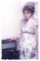
| 06/29/2004 05:51:44 AM |
1860's in technicolorby ladpupmoeComment: Nice concept, but if I remember well, portraits done in those days were shot quite so thight. I would have liked seeing a little bit more background around your subjects. |
| Photographer found comment helpful. |
| 06/28/2004 10:28:50 PM |
Her eyesby MiinervaComment: Too bad you chose this shot that hides a pretty face. I find that the hand adds nothing to this shot. Good high key attempt, althought her hair at her temple is going green from the editing. Beautiful eyes. |
| Photographer found comment helpful. |
| 06/28/2004 10:25:44 PM |
Save a Horse, Ride a Cowboyby L1Comment: Interesting composition, but his skin looks way too smooth, as if he were a wax statue. I'm not sure how you achieved this through photo editing, but it takes some masculinity away from this shot. The bridge of the nose between the eyes is also a bit to pale and could have been burned slightly. |
| Photographer found comment helpful. |
| 06/28/2004 10:21:49 PM |
A Penny For Your Thoughtsby BooZonComment: This image is clear, but the light is dark and flat. Too bad, since the model seems to have nice blue eyes (that seem to have been PS'ed in...?) |
| Photographer found comment helpful. |
| 06/28/2004 10:09:18 PM |
Mr. Mattby postoakinversionComment: Too bad you didn't button down that collar cuz it's kind of distracting. Good job on lighting. |
| Photographer found comment helpful. |
| 06/28/2004 10:08:36 PM |
MyTootsieby neilmwilsonComment: Nice idea, but lighting is way too harsh for a black backdrop. If you were going for a high key shot you might have wanted to use a white background. There also seems to be some sort of weird smudge/reflection on top of her head. It could have easily been edited out. |
| Photographer found comment helpful. |
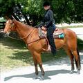
| 06/28/2004 04:54:24 PM |
Samantha's Challengeby NeuferlandComment: Your outside. Challenge clearly sated that you had to be indoors. Also, the tree's sahdow fooled your camera and the shot is slightly overexposed.
The angle used to shoot your subject is too perpendicular to your subjects. A suggestion if you would like to shoot this again: use a low angle shot (shoot from on your knees, looking up) in front of the horse and just capture the horse's head , bridal (sp?), part of te reins and the rider from waist up. Another idea would have been a waist-up shot of the rider standing on the ground with both horse and rider looking (or not) at the camera. Both these shots would permit you to get closer to your subjects and put more emphasis on facial features. |
| Photographer found comment helpful. |
| 06/24/2004 07:15:47 AM |
Not in Kansas Anymoreby neilmwilsonComment: Interesting image with sex appeal. However, I find that the red is a tad overbearing, just a bit to harsh. Could have been toned down just a tad. What is that white blob near the top left portion of the photo? That would have been so easy to clone out. |
| Photographer found comment helpful. |
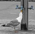
| 06/24/2004 07:05:22 AM |
Parchedby BikeRacerComment: This is a funny shot! The first thing that came to mind was "Mine? Mine? Mine? Mine?" a la Finding Nemo. Great work on capturing the pose. |
| Photographer found comment helpful. |
Home -
Challenges -
Community -
League -
Photos -
Cameras -
Lenses -
Learn -
Help -
Terms of Use -
Privacy -
Top ^
DPChallenge, and website content and design, Copyright © 2001-2025 Challenging Technologies, LLC.
All digital photo copyrights belong to the photographers and may not be used without permission.
Current Server Time: 08/12/2025 01:37:42 PM EDT.