| Image |
Comment |
| 09/11/2012 04:20:29 PM |
The New Westby Yo_SpiffComment: Spiff!! I am starting to like your portrait style that you have been showing us. The bicycle theme is great stuff! One thing I am noticing is you are going to have to invest in a nice low light lens... your shutter speeds are dragging way too low and showing a lot of motion in the subject. Unless that is what you are going for... |
 Photographer found comment helpful. Photographer found comment helpful. |
| 09/10/2012 03:03:09 PM |
Scratch by gyabanComment: Originally posted by gyaban:
Originally posted by mqnaufal:
Fantastic one and well deserved crown! I would love to read Post-processing tutorial on this. I know I am asking for too much. :)
Congrats buddy! |
Thank you very much :-)
A complete tutorial would be very long to write and I unfortunately can't afford that time, but I made the PSD file available (added the link at the end of my notes). Just disable all the groups, then enable them one by one to see how that was constructed. It should be quite easy to follow, but you can always PM me for some information if needed. |
It was very generous of you to make the file available Christophe! What a way to give back to and mentor a community of lifetime learners! Thank you very much for your generous offering of the photoshop file! |
| Photographer found comment helpful. |
| 09/07/2012 02:41:38 PM |
The Mask of Warby cowboy221977Comment: From the critique thread: Issues with this shot include lack of sharpness, lack of contrast. Just because it was suggested by the OP, I worked up an edit to show where I would have went with this shot in PP to give it some pop. Obviously I introduced banding in the sky by working on the small image... but here it is:
 |
| Photographer found comment helpful. |
| 09/06/2012 10:50:03 PM |
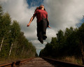
Leaving tracksby snafflesComment: From the critique thread... I like the dynamic aspect of the person hanging in the air but looking up as this person is doing provides no engagement with the viewer.
I can only second what  vikas vikas said below and add that I feel the shot is a tad underexposed and somewhat red overall. (viewing on an IPad.) Message edited by author 2012-09-06 22:50:31. |
| Photographer found comment helpful. |
| 09/06/2012 10:36:12 PM |
Over the Riverby cowboy221977Comment: From the critique thread... I think you have great color here and a nice crisp shot. Sky is interesting with the clouds and yes, the horizon is off. This is a good standard shot that will work well as a backdrop for a portrait. I think it needs something to add interest like a person, a train, or something else. This has good elements... Composition, color, exposure. It is missing that necessary dynamic fourth element... |
| Photographer found comment helpful. |
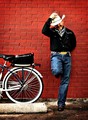
| 09/06/2012 10:29:49 PM |
Bryanby Yo_SpiffComment: Great light and shadows in this natural light setting. The brick wall is a great backdrop. But I agree with others about the sharpness. Pulling the subject off the wall would have helped. Your exif info shows you at f6.3. So the field of focus extended further behind the subject than in front of him (distance depending on you focal length any where from infinite to 1 1/2 ft.) creating the sharper wall.
I think you did well with the full length portrait, however I am torn between whether it should be oriented portrait or landscape. This is through no fault of your own. There is a conflict to me with the horizontal width of the bike and the vertical height of the person. It seems to be somewhat out of balance and weighted heavily at the bottom. The only way to change that is to reorient the bike so that he and the bike are both facing you to get only the front plane of the bike, or changing your position by shooting at him down the length of the wall. |
| Photographer found comment helpful. |
| 09/06/2012 10:08:46 PM |
tis the seasonby bmartuchComment: I am assuming you created the frame by rotating your shot thereby creating a bigger canvas size. High points for creativity and out of the box thinking but the frame does not add anything to this shot.
As for the shot it self, you did good to rotate the camera to get a more creative view on the subjects, however there is no other compositional elements in the shot to make it stand out. The shot is all background with no real depth. I do like all the lines of the skis but they do not serve to enhance a subject. Here the skis are the primary element of the shot when they should be the secondary element used perhaps as a background for an environmental portrait. |
| Photographer found comment helpful. |
| 09/06/2012 09:58:29 PM |
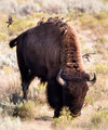
yellowstone1by vawendyComment: [viewing on Ipad] Critiquing because of the critique thread...
Pro's: I really like the pose of the buffalo and your chosen angle of view to shoot at. Compositionally you used the Creature's back to create a nice line to the birds and created a good focus point on the birds. You chose to expose the subject well and let the background overexpose, which was a wise choice to get the necessary detail in the dark and back/side lit subject.
Con's: You chose to put the focus point on the birds but the subject was more than just the birds. I feel that the depth of field should have included the plane from the buffalo's face to his hind quarters and letting it taper off from there. Easier said than done In the heat of the moment I am sure. Also, maybe adding some light to the darker fur areas could have brought out some detail in the eye. Additional light could have been added in post with adjustment layers and masking or by having your assistant get up close and personal with the reflector. ( I kid! I kid!)
Overall I feel the shot is a good one due to the strong compositional elements and the cons are not strong enough to take away from that. |
| Photographer found comment helpful. |
| 09/05/2012 03:41:31 PM |
|
| Photographer found comment helpful. |
| 09/05/2012 12:51:05 PM |
A Last Sentinalby LawtonComment: Sentin el. Spell checkers rock! You did get great light and the clouds are awesome. Very nice exposure. I wonder why you didn't use the full 800 pixels on the long side??? The size really takes away from the detail. |
| Photographer found comment helpful. |
Home -
Challenges -
Community -
League -
Photos -
Cameras -
Lenses -
Learn -
Help -
Terms of Use -
Privacy -
Top ^
DPChallenge, and website content and design, Copyright © 2001-2025 Challenging Technologies, LLC.
All digital photo copyrights belong to the photographers and may not be used without permission.
Current Server Time: 12/21/2025 03:10:06 PM EST.